.0wtcdguz5p7fu.png&w=1080&q=75)
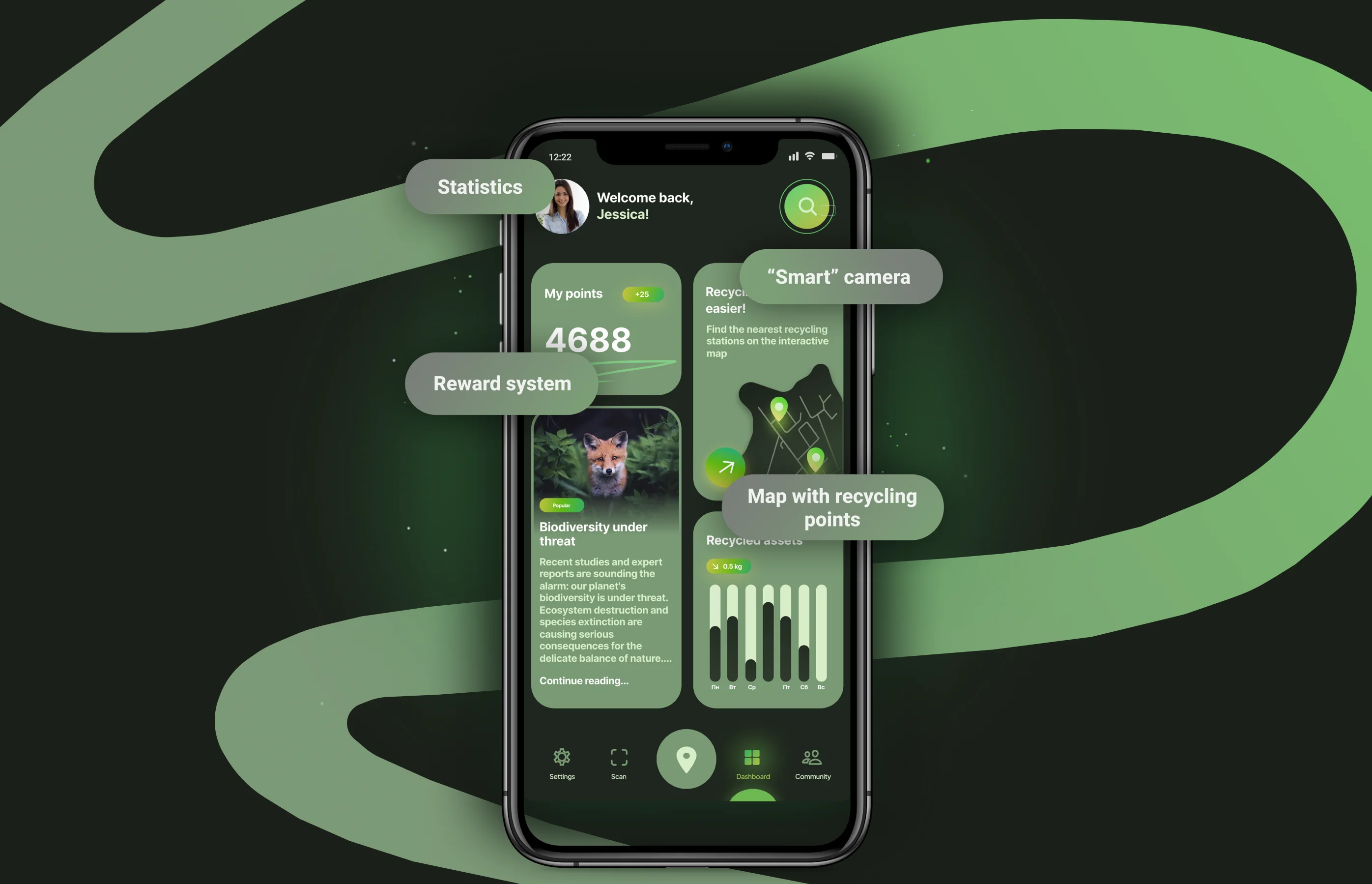
Ecospace
Making recycling rewarding and easy
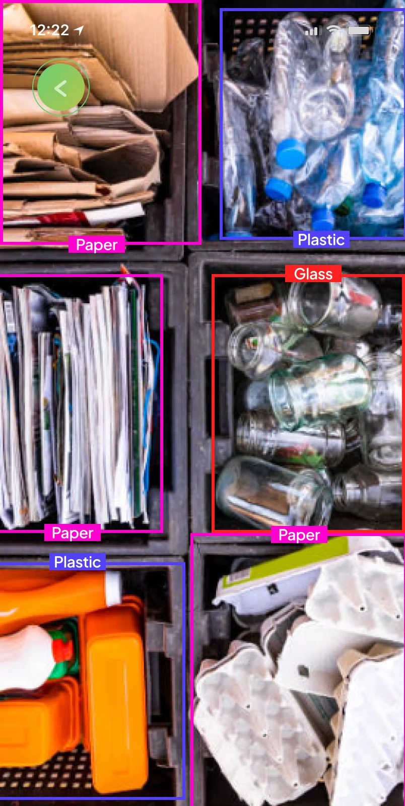
In the final year of my bachelor's degree, my university hosted a hackathon with a challenge that immediately caught my attention: to design a mobile application powered by a smart camera that could identify waste materials and guide users toward proper recycling. The competition lasted three weeks, and I joined a team consisting of a team leader, an economist managing the project budget, and a marketing expert conducting competitor research.
Overview
Ecospace is a hackathon concept for a mobile recycling app that combines guidance, motivation, and an AI-powered camera into one experience. The project focused on making sustainable action feel simpler and more actionable for first-time and occasional recyclers.
Team
Hackathon team of four: team lead, economist, marketing teammate, and me as the product designer.
My role
End-to-end product design: research framing, UX strategy, information architecture, wireflows, visual direction, and high-fidelity mobile interface design.
The problem
Hypothesis
Constraints
1. The concept needed to communicate a broad sustainability space without overwhelming first-time users with too many categories at once.
2. The product had to balance education, action, and motivation inside a mobile-first experience with limited screen real estate.
3. The app had to include an AI camera capable of recognizing different materials.
Research
User survey
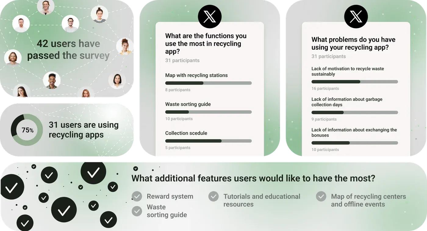
I began with a quantitative survey to understand user behavior and pain points. Forty-two participants completed it, and 31 of them, about 75%, were already using some form of recycling app.
The most used features were maps of nearby recycling stations, waste sorting guides, and collection schedules, showing that utility was the main reason people used these products.
The biggest frustrations were low motivation and unclear information about collection days, reward systems, and the recycling process itself. People could find resources, but the apps did little to keep them engaged.
The most requested additions were rewards, better sorting guidance, educational content, and maps of recycling centers and events. That mix of utility and motivation became the foundation of Ecospace.
User Interviews
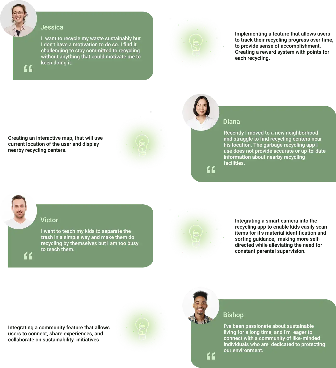
Users do not need more guilt. They need orientation. When a product turns sustainability into concrete, bite-sized choices, the emotional barrier drops and action becomes more likely.
That insight influenced both content structure and interface hierarchy: lead with clarity, reduce the number of competing actions, and keep each next step specific enough to feel achievable.
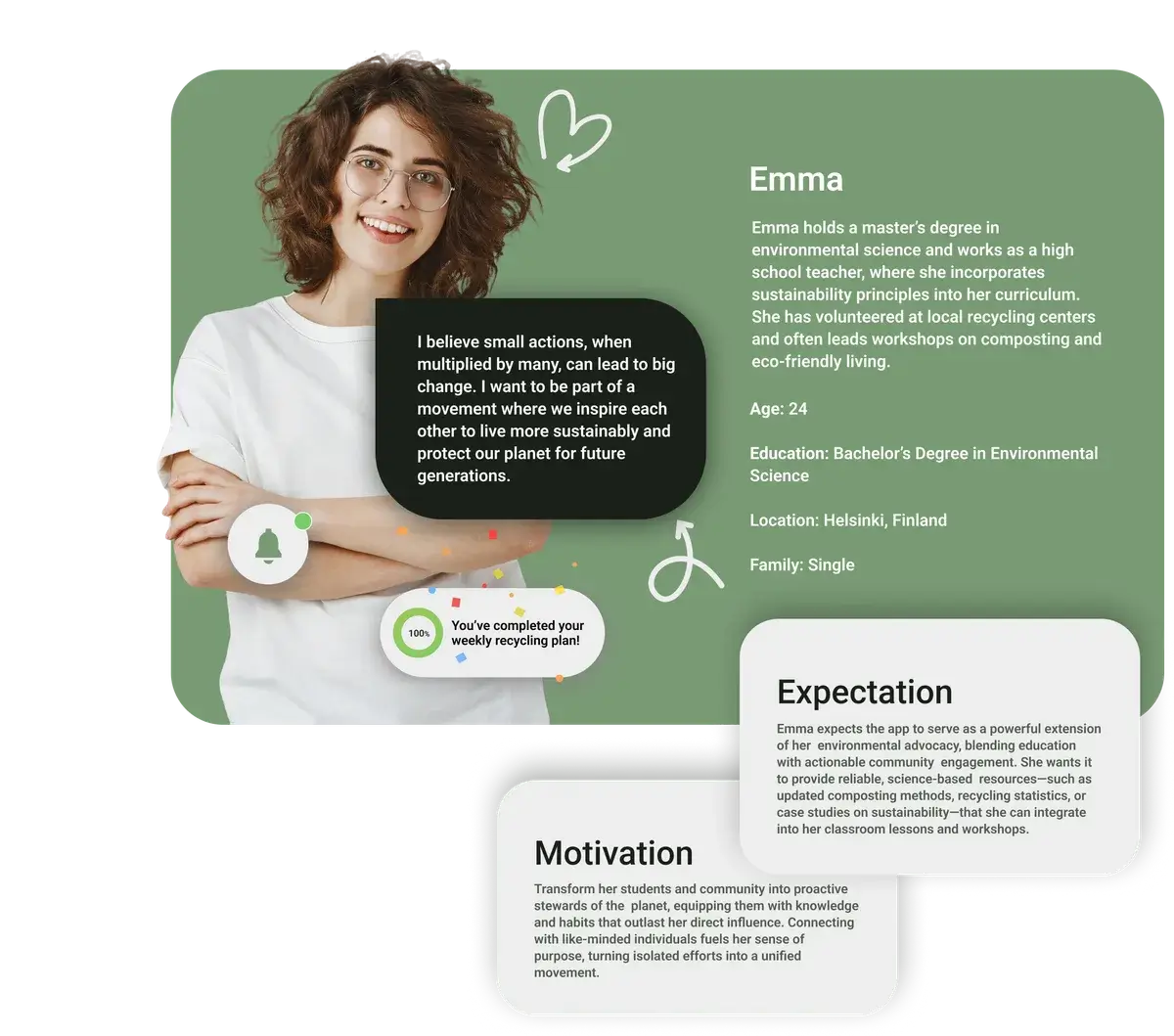
User Personas
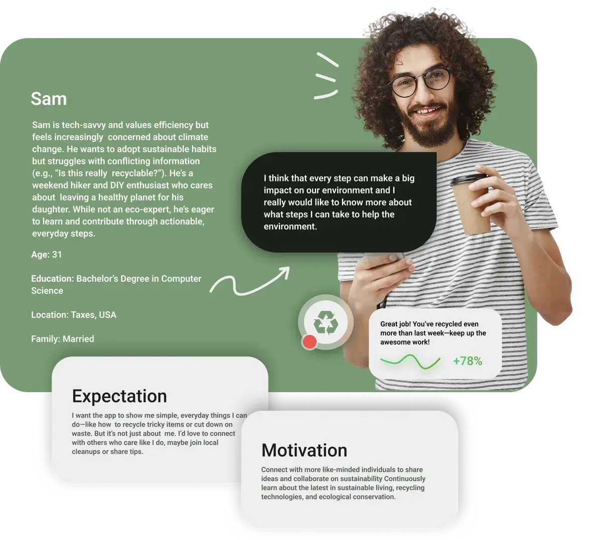
From these interviews I developed two primary personas that would guide my design decisions throughout the project.
Competitor analysis
| Ecoplatform | Ubery | Ecolabel Guide | SLOG | |
|---|---|---|---|---|
| Purpose | Focuses on fast and incentivized recycling of plastic bottles and aluminum cans. | Helps sort household waste and find the nearest recycling drop-off points. | Created for consumers who want to understand eco-labels on products. | "Eco social network" that helps send packaging and other recyclables for processing. |
| "Smart" Camera | - | Neural network. | Learn the meaning of eco-labels. | User submissions. |
| Rewards | Eco-bonuses that can be redeemed for partner offers. | Eco-coins. | - | Payment for collecting all fractions of "useful" waste. |
| Additional Features | Own reverse vending machines Map User rating system | Integration with the "RT-Invest" vending machine network Map Label reference guide Ability to report issues and illegal landfills to the Ministry of Natural Resources | - | SLOG user or SLOG PROFI carrier Map |
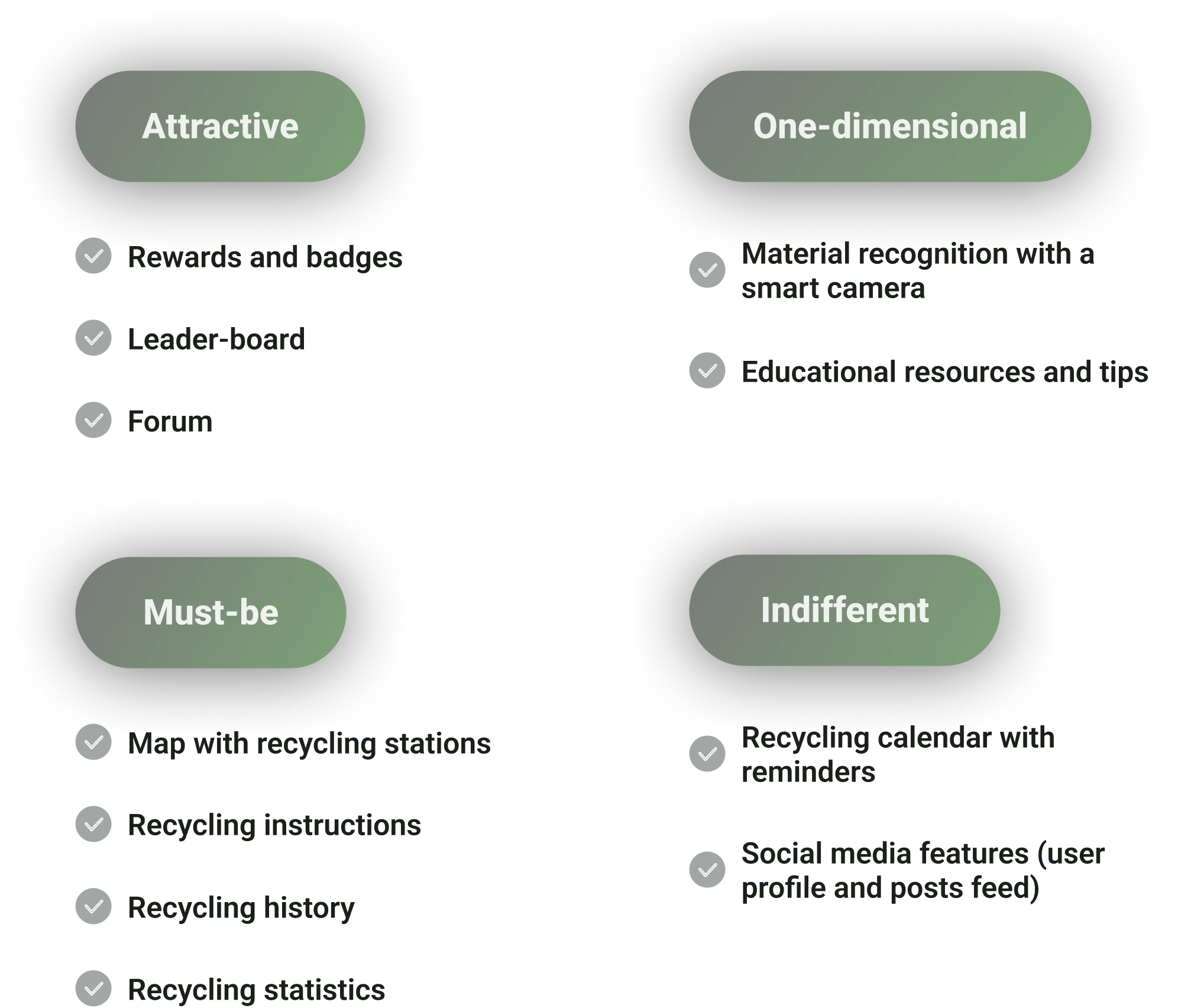
Feature prioritization
Given the tight timeline, I used a Kano-style prioritization to keep the MVP focused on the core loop: scan → clear sorting guidance → map to act on the result.
Motivation and community features were treated as secondary, because they add value only after the basics work and require longer-term validation.
Structure
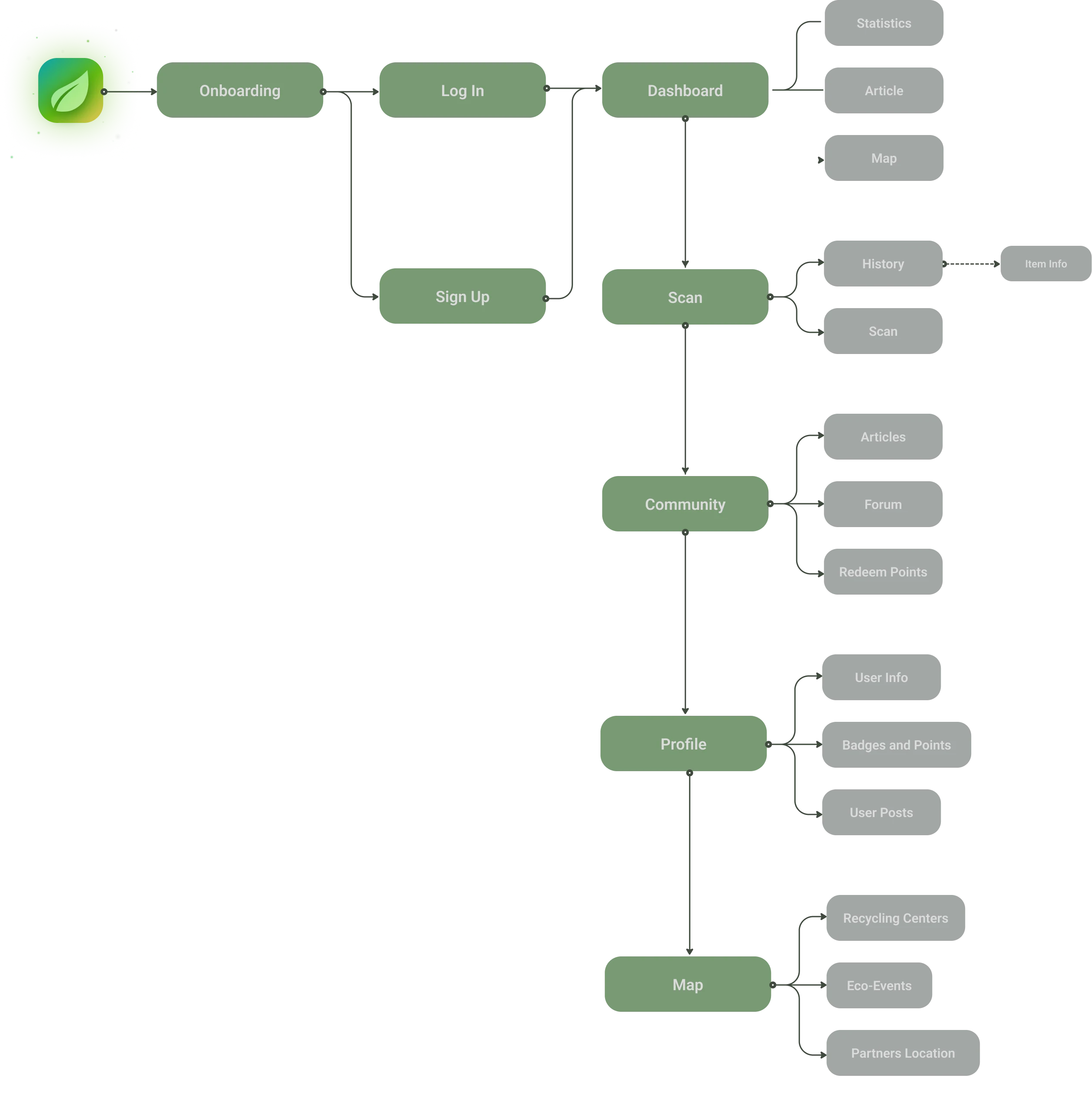
Information architecture
With features confirmed, I mapped the complete user flow. The app's architecture centered on five primary areas: the Dashboard (entry point), the Scan feature (the AI camera), the Map (recycling station locator), the Community space (forum and eco-events), and the User Profile (badges, points, and history). Onboarding, sign-up, and log-in flows fed into the Dashboard, from which users could access any core feature naturally.
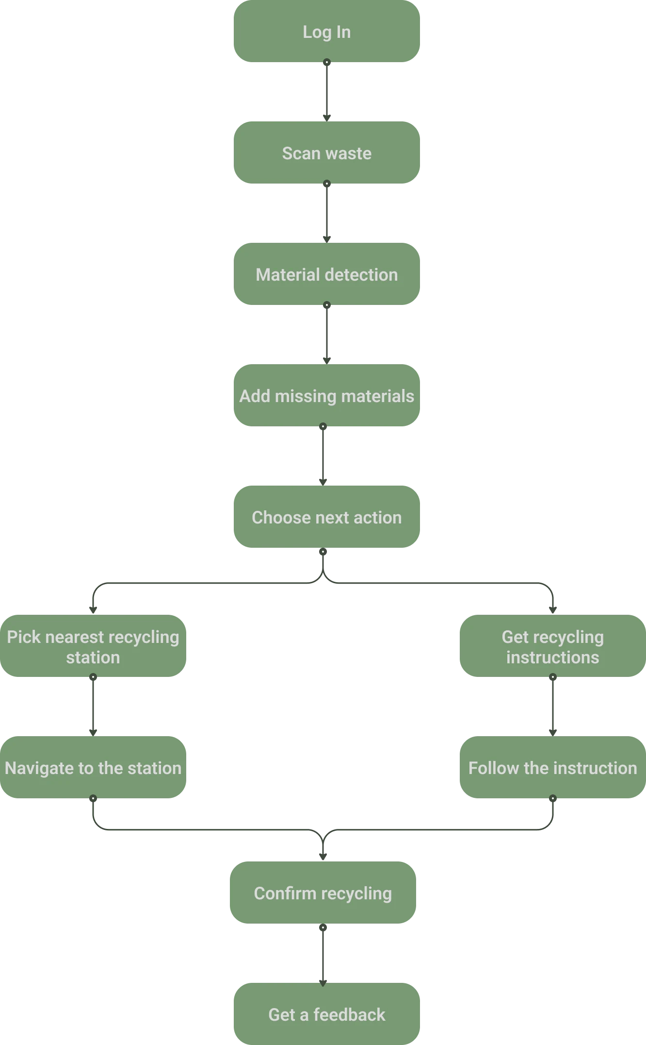
The flow was deliberately simple. I wanted a user to be able to open the app, scan an item, locate the nearest recycling bin, and deposit it - all within a few taps.
Visual Design
For the visual language of Ecospace, I built a system grounded in clarity and warmth. I chose Inter as the typeface for its high legibility across screen sizes. The grid system used a 10-point baseline with 11pt and 22pt margins for internal elements and 17pt padding for full-screen layouts - a structure that gave the UI a sense of rhythm and order without feeling rigid.
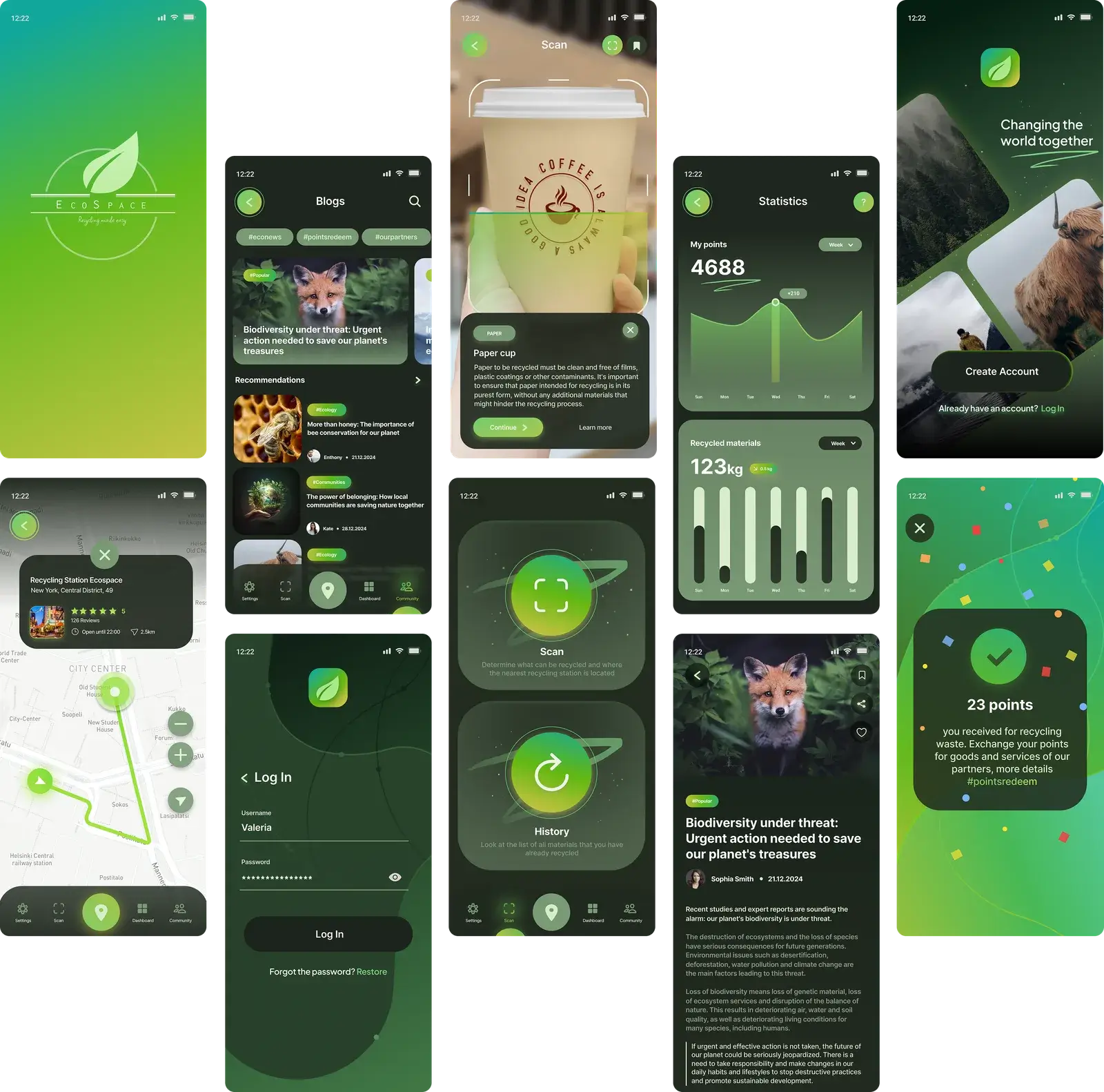
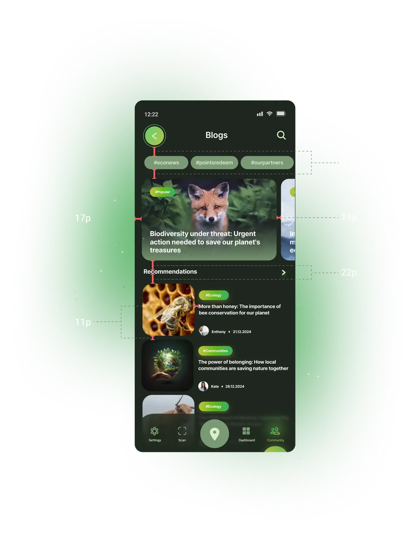
The color palette was designed to evoke both nature and technology: clean, fresh tones that felt appropriate for an eco-focused product, paired with clear contrast ratios to ensure accessibility.
Accessibility
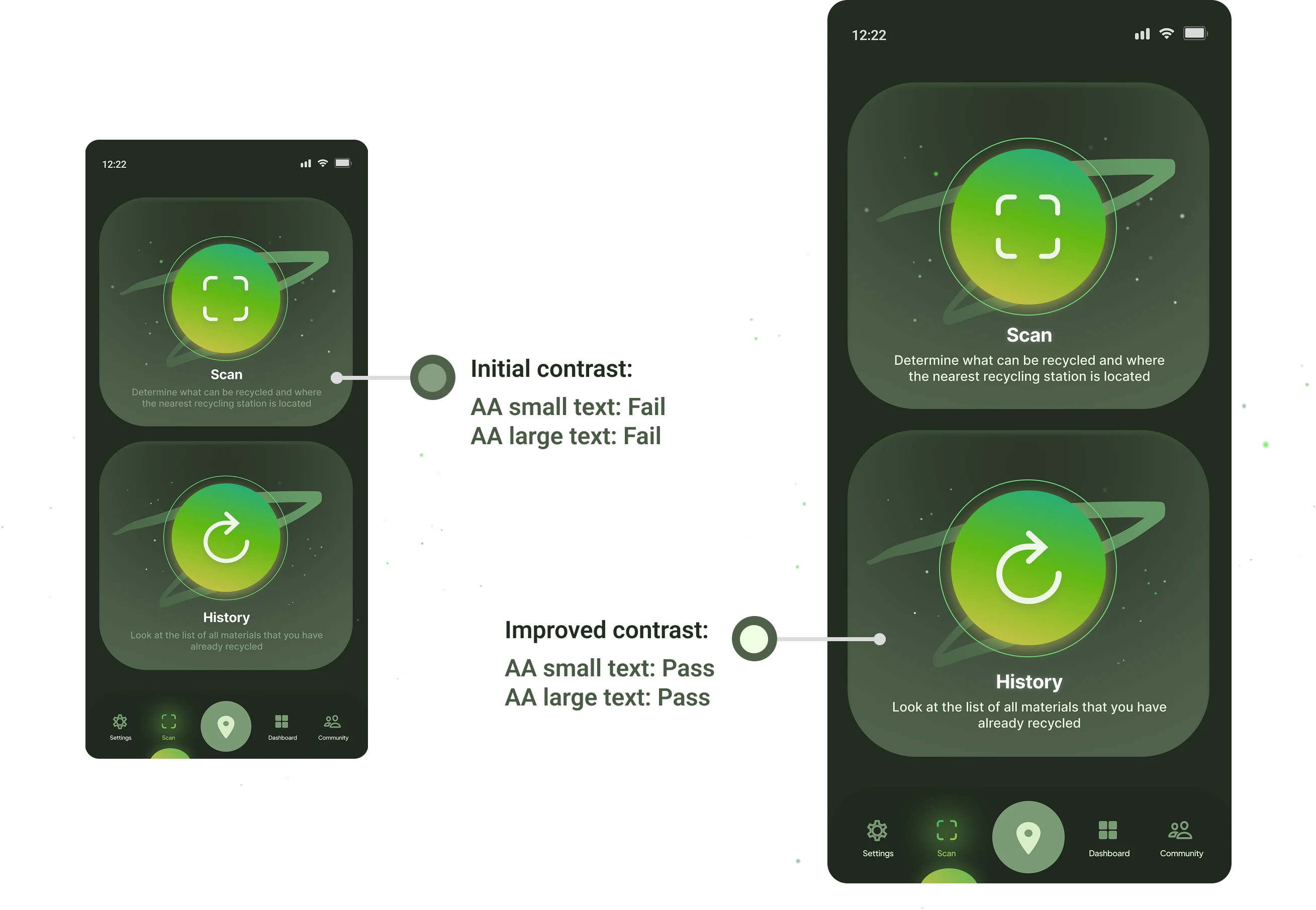
Accessibility was not an afterthought. I evaluated the prototype against WCAG AA standards, and in my audit I identified areas where the initial contrast ratios were failing particularly for small text.
I revised those elements until both small and large text passed AA requirements. The result was a more inclusive product that maintained its visual character without compromising legibility.
Testing
User Testing and Prototype Iteration
Before the hackathon concluded, I validated the prototype with four users through a structured task-based testing session. Participants were asked to complete a set of defined scenarios: scan an item, find the nearest recycling station, and locate information about a previously scanned item.
Two significant usability problems emerged. First, 57% of users found it difficult to navigate the history section and locate a specific previously scanned item. The original design presented items in a flat, undifferentiated list, which made scanning for a specific entry slow and frustrating.
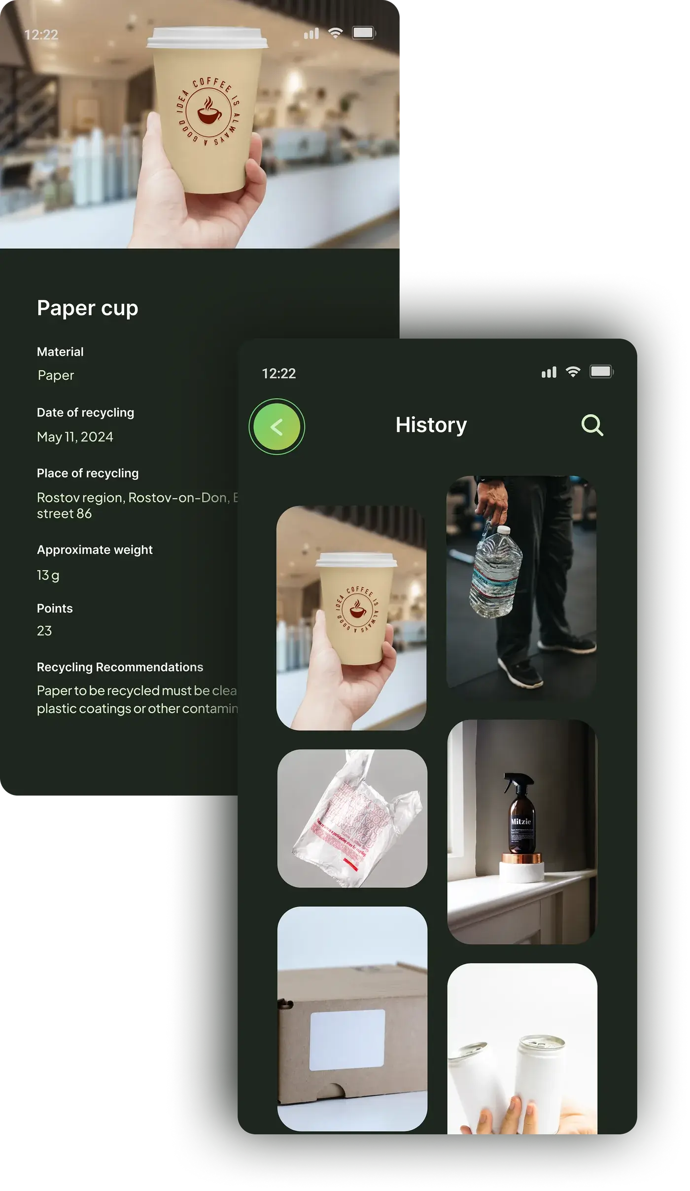
Second, 78% of users said they did not understand how to recycle the item they had scanned. The recycling instructions were buried within the item detail page rather than presented as a clear, dedicated next step. These were not minor issues, they touched the core utility of the app. I addressed both before our final presentation.
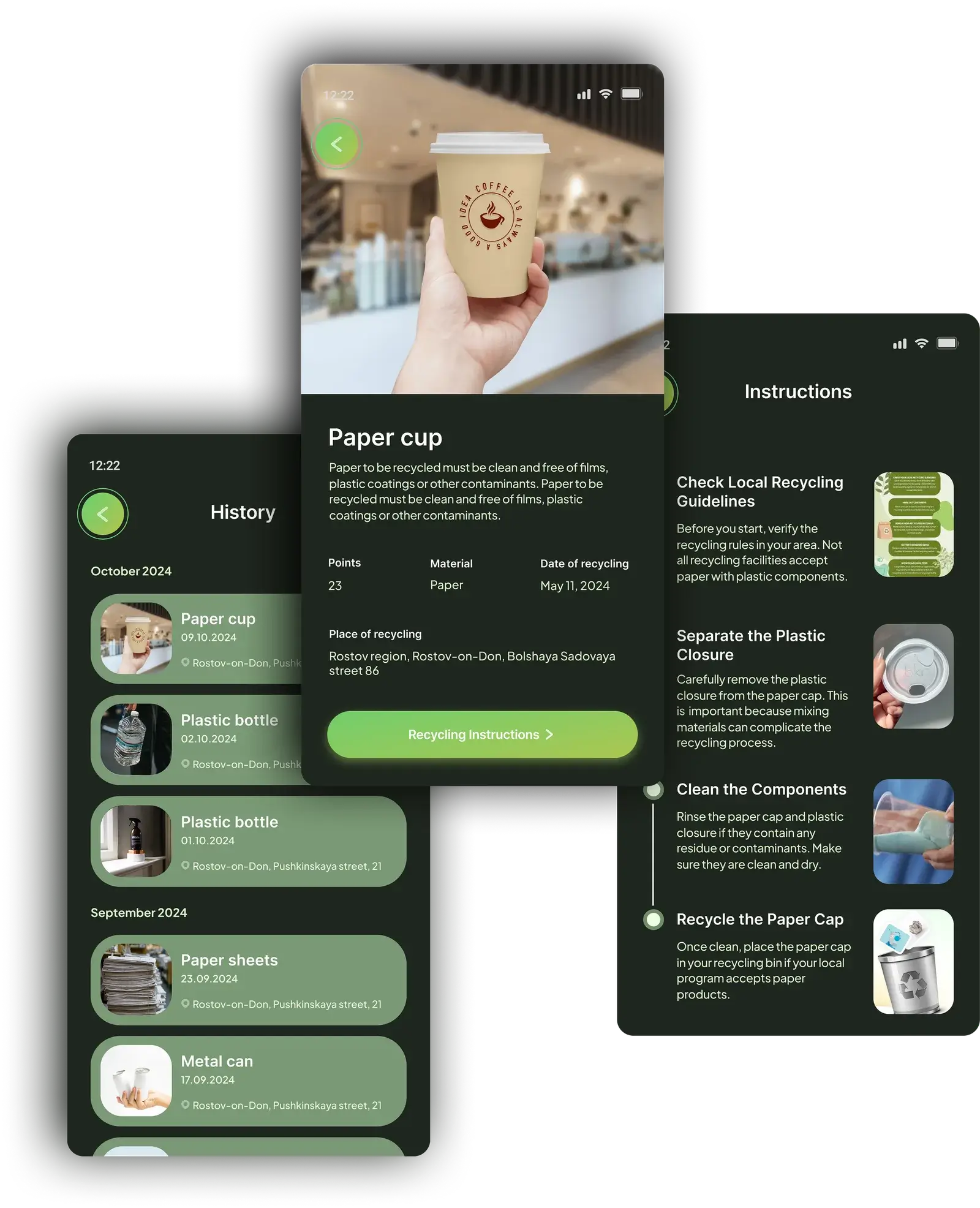
For the history redesign, I introduced date-based grouping so users could navigate by time rather than scrolling through an undifferentiated list. I also added item titles and recycling location labels to each entry, giving users the context they needed at a glance.
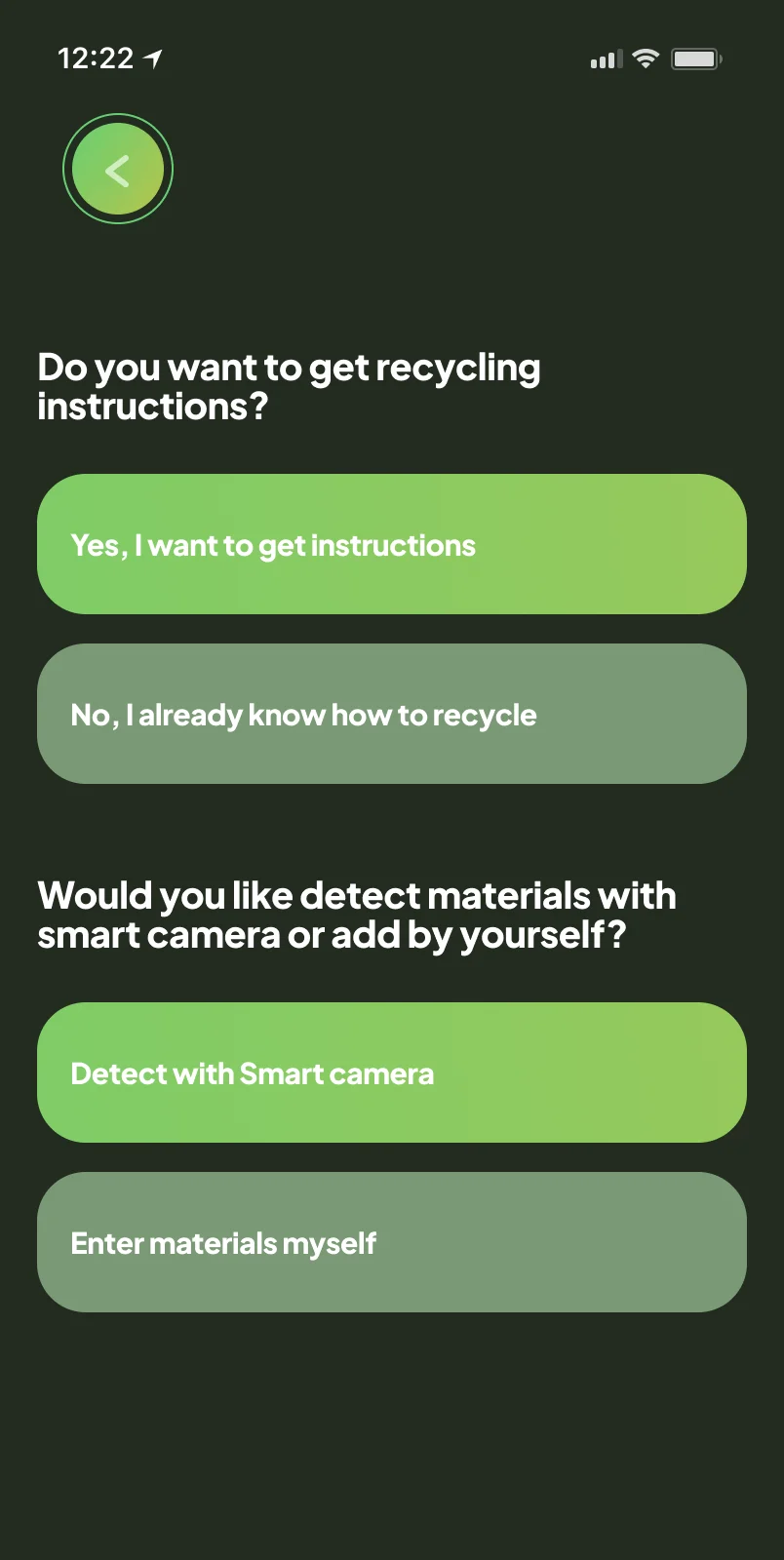
For the item information page, I restructured the information architecture entirely, moving recycling instructions to their own dedicated sub-page so that guidance was never buried beneath other content. Users could now arrive at clear, actionable sorting instructions in a single tap.
It meant that I needed to find a new solution for the whole user journey of recycling and history.
Solution
User testing revealed that the original, item-centric design did not align with how people think about or perform recycling. Even after improving navigation, naming, and visual clarity, users continued to struggle because they do not conceptualize recycling as a list of scanned items. Instead, they think in terms of recycling sessions, locations, and consistency over time.
This insight led to the conclusion that incremental UI improvements were not enough. The product required a fundamental redesign of the recycling journey, shifting from item-based tracking to a session- and habit-focused experience that prioritizes speed, clarity, and behavior formation.
Users do not recycle in items - they recycle in moments.
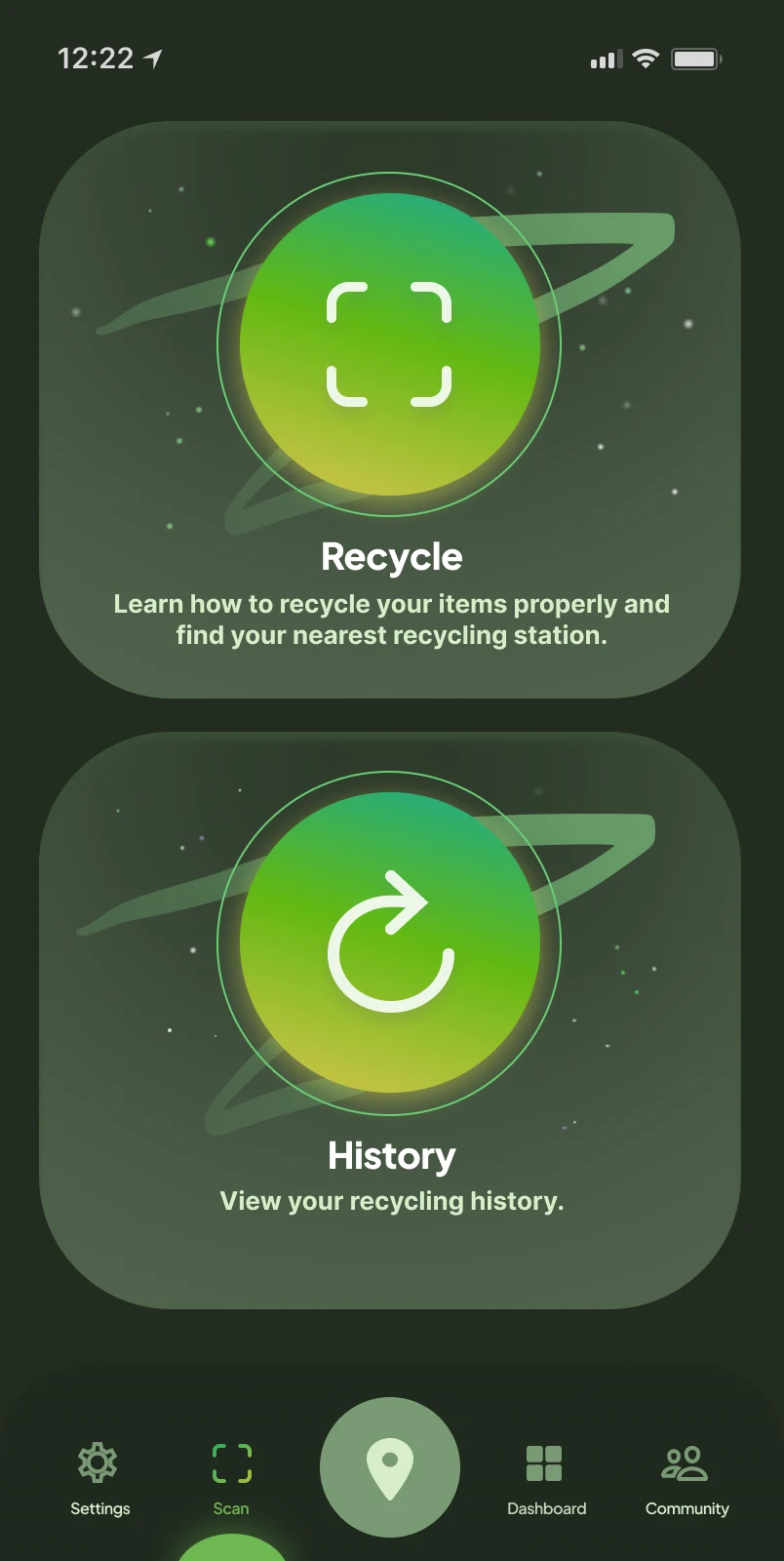
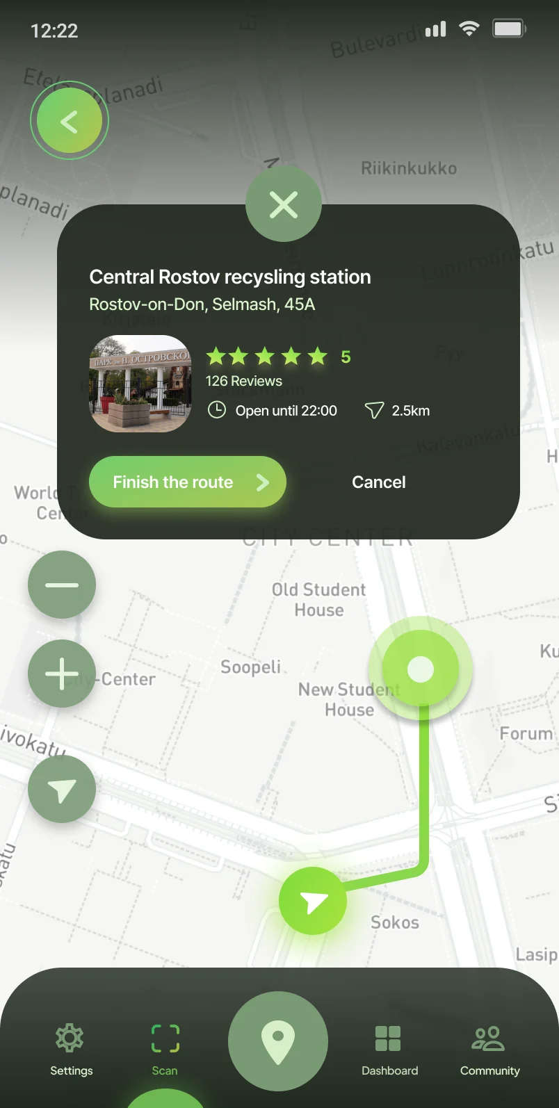
To improve the experience, I needed to design around the whole recycling session, not a particular item.
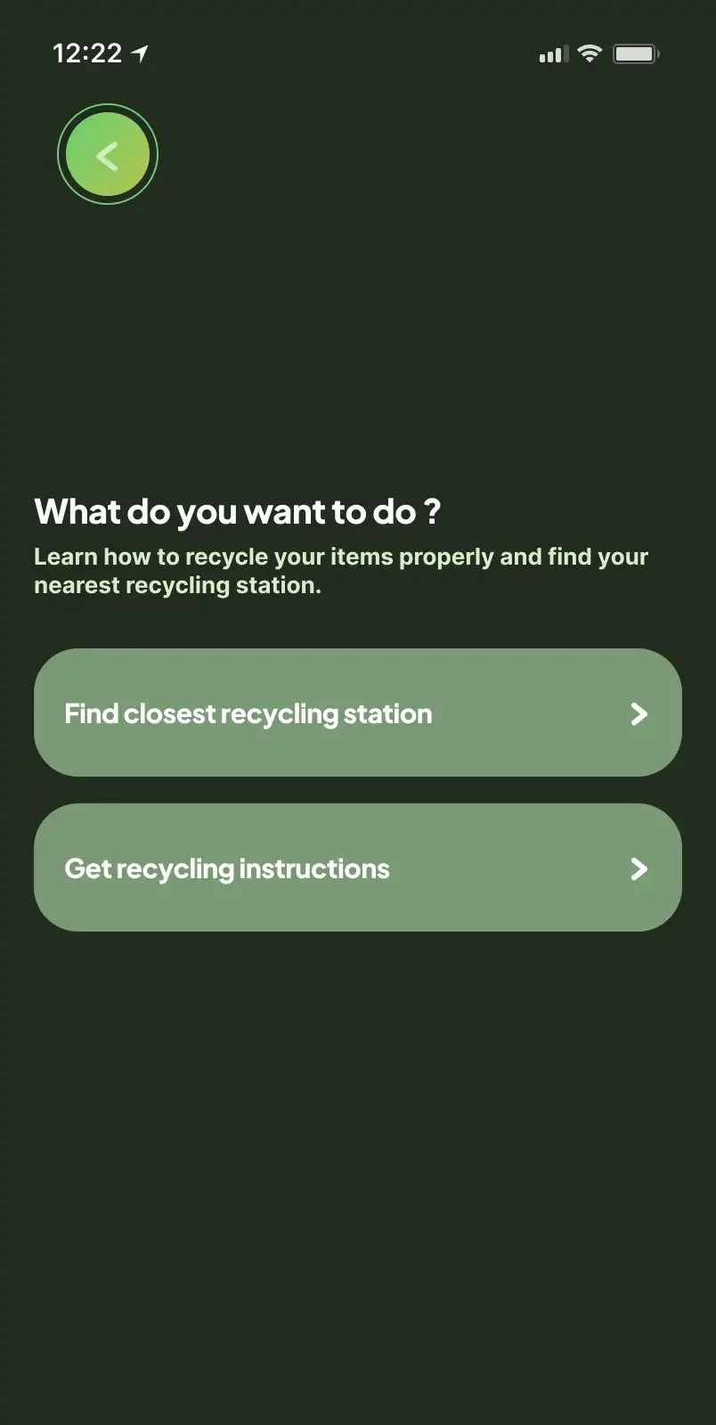
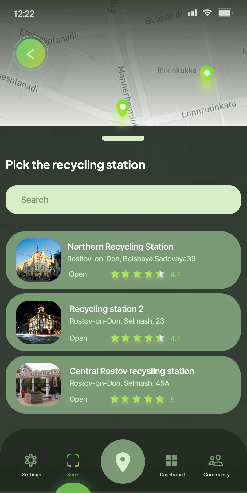
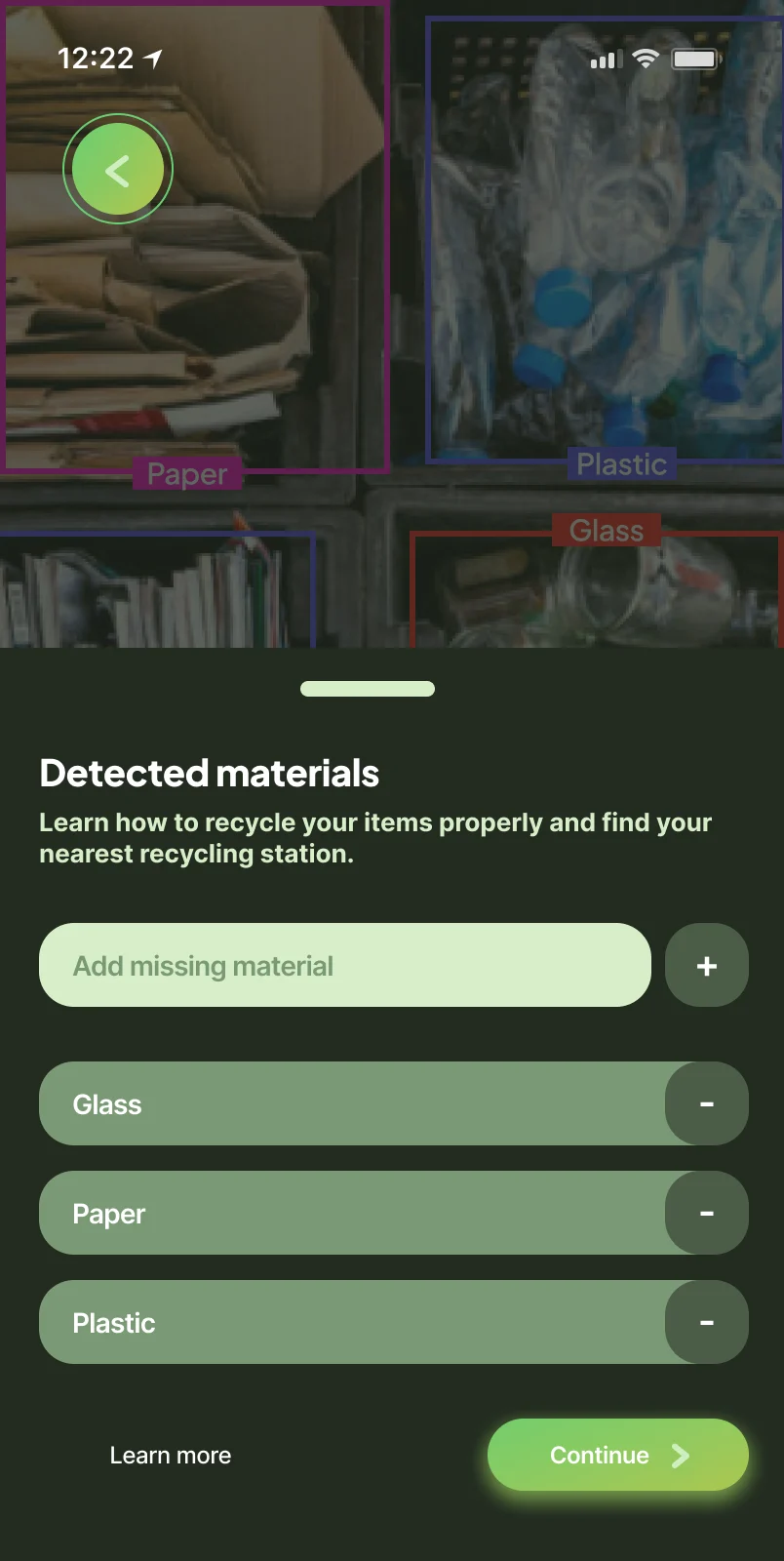
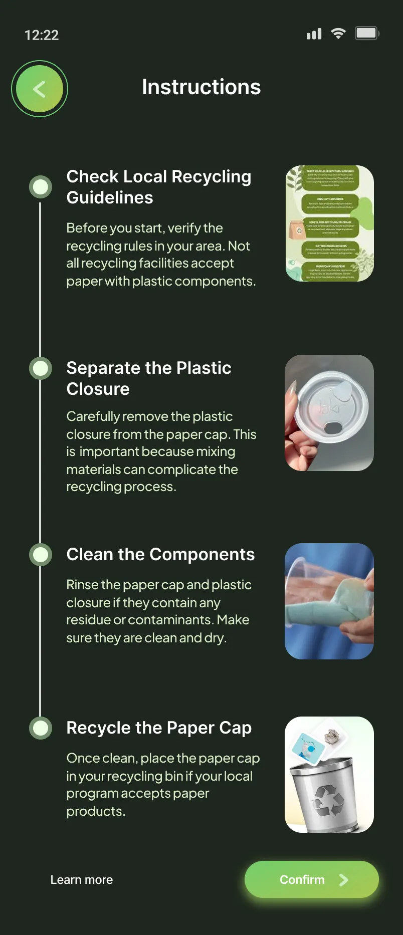
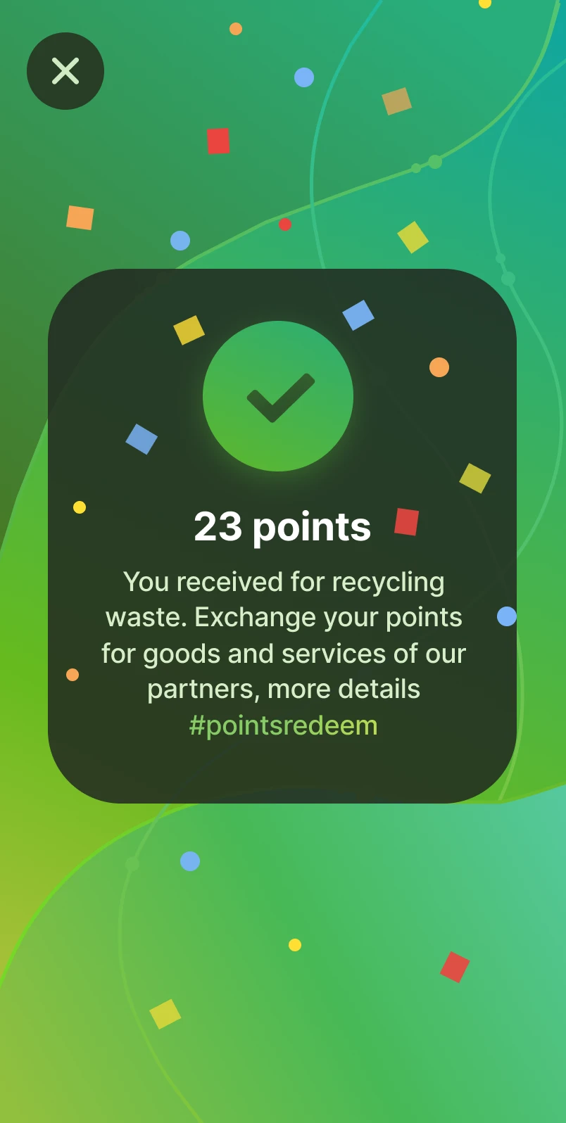
Improved user flow
User testing after change
After revising the user flow, we tested it again with users by giving them real items to recycle. As a result, 100% of participants successfully found the nearest recycling station, and all users recycled their items correctly.
The application was not developed, but the prototype and revised flow were presented at the hackathon final.
The outcome of these changes was also reflected in qualitative feedback. Every tester praised the app's simplicity, interface quality, and ease of navigation. All four said they would use the app regularly if it were available, including two who described themselves as not particularly interested in recycling before the session.
One tester said the app would help them educate their daughter. Another praised the eco-events feature as a standout that made them feel connected to something larger than their individual recycling habits.
Jury Feedback
After presenting to the hackathon jury, we received detailed feedback that shaped my thinking about the product's future. The judges challenged the reward system, arguing that points alone were not sufficient motivation. They suggested partnerships with local businesses to offer tangible rewards such as coupons, discounts, or gift cards redeemable through the app.
Another juror raised a practical issue with the scanning flow: requiring users to scan each piece of waste individually would be too time-consuming for anyone recycling more than a few items at once. A better long-term direction would be multi-item recognition from a single camera frame.
On the business model, the jury pushed us to think more seriously about monetization. They suggested a paid promotional package for local businesses wanting to showcase recycling efforts through the app, and a donation feature that would allow users to contribute to environmental organizations, with part of in-app purchases directed toward those causes.
These were the kind of challenges that do not diminish a project - they mature it.
Reflection
Learnings
This project was formative far beyond the product itself. Working in a cross-functional team under significant time pressure accelerated my growth across several dimensions.
I learned to collaborate across disciplines. Coordinating with a team leader, an economist, and a marketer meant translating design thinking into the language of budgets, markets, and business logic. I also strengthened my ability to communicate design decisions clearly and persuasively.
The research process gave me hands-on experience with both quantitative and qualitative methods - understanding not just what users do, but why - and taught me how to synthesize that data into actionable design decisions. The Kano Model exercise, in particular, sharpened my instinct for feature prioritization.
Finally, the hackathon's pace forced adaptability. Problems emerged that were not anticipated, and solutions had to be found quickly. That sustained pressure over three weeks is something no classroom exercise can fully replicate.
Result
Overall, 78% of tested users said they would love to use the application and felt it would motivate them to recycle more often by simplifying the entire process, from waste separation to clear recycling instructions and guidance to the nearest recycling location.
The remaining 22% reported that points redeemable for bonuses with partner companies were not a strong enough incentive on their own to motivate recycling.
Although the app was never developed beyond a prototype, presenting it at the final helped validate its direction. Most users reported that such an app would help them feel more confident about recycling and more motivated to take action, while some still felt that an app alone would not be enough to change their habits.
What I would do differently
The scanning mechanic was central to the product's architecture from the beginning, but in retrospect it was a solution in search of validation. If I approached this again, I would pressure-test the core interaction model earlier and explore alternatives such as QR-code receipts issued by recycling facilities, which users could scan to confirm completed actions.
That approach would reduce friction, work within existing recycling infrastructure, and avoid the compliance burden of item-by-item scanning.
More significantly, the research revealed that a substantial portion of users were more drawn to the app's educational content than to its recycling confirmation mechanics. That is a meaningful signal about where the real product opportunity might lie, and one I would pursue more deliberately in a second iteration.
What I would test next
The next research focus would be habit formation rather than session-level engagement. The open question is not whether users find the app motivating in a single session, but whether the product supports consistent, repeated behavior over time.
I would design studies around long-term usage patterns, specifically looking at how the app can reinforce recycling as a routine rather than an occasional action. The variables I would prioritize are progress visibility, friction reduction in repeat interactions, and consistency cues that fit naturally into users' existing routines.
What this taught me about UX
Three things stayed with me from this project.
First: users do not conform to the mental models we build for them. Designing for behavior means designing for people as they actually are, not as we assume they will respond.
Second: reducing friction does more work than increasing motivation. The simpler the action, the more likely it is to happen. Complexity, however well-intentioned, creates the conditions for abandonment.
Third: the most valuable output of research is not validation - it is the moments when data challenges the product direction entirely. That kind of challenge, taken seriously, is what separates good design from meaningful design.

Get in touch
Have a project in mind or just want to chat? Drop me an email.
How to Find Me
Email Me