
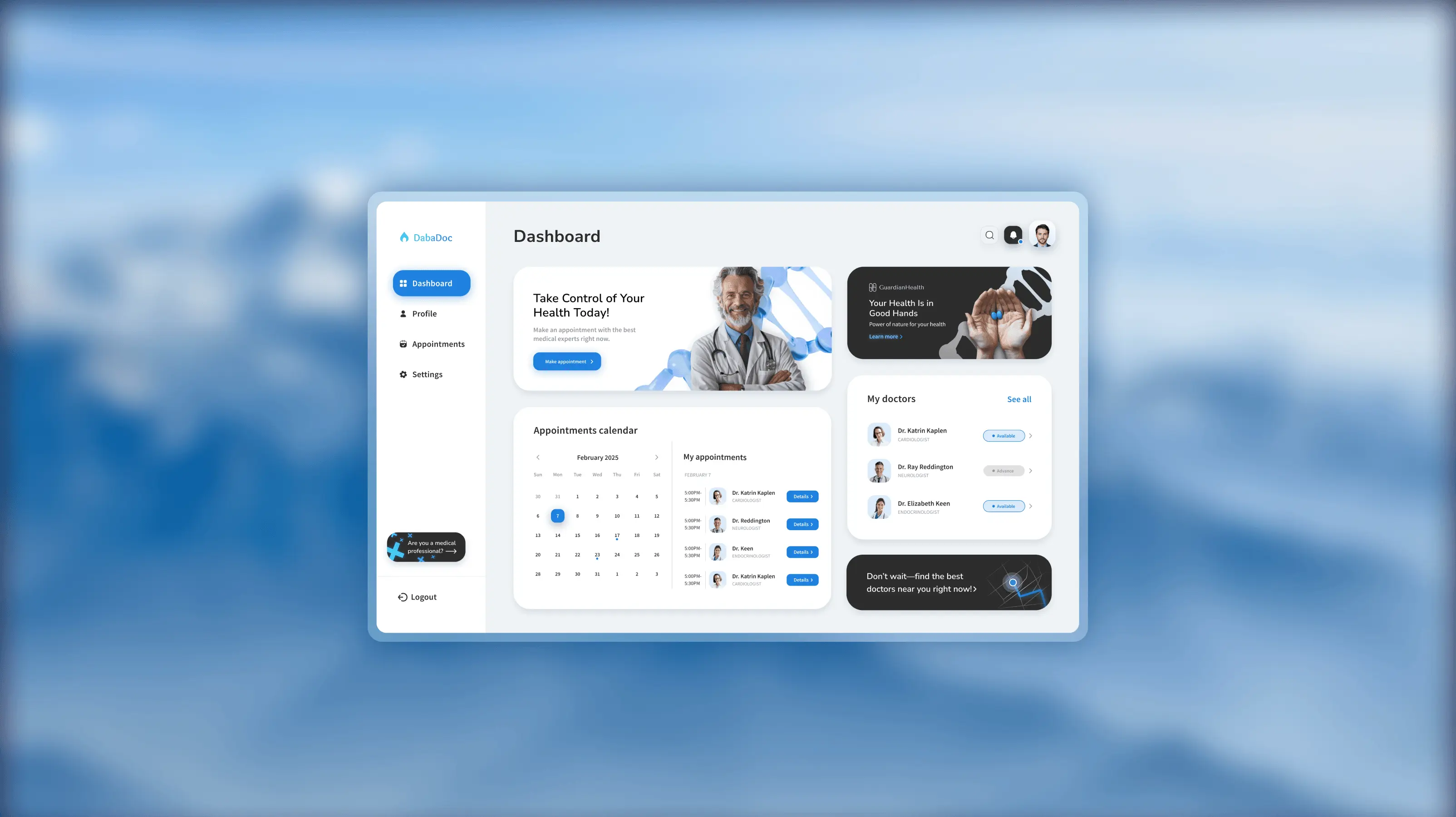
Dabadoc
Simplifying healthcare access for 50 million patients across North Africa
Dabadoc is a digital healthcare platform focused on helping patients find the right doctor and book appointments with more confidence and less friction.
Overview
DabaDoc is a digital healthcare platform connecting patients across North Africa with private doctors for in-person and virtual appointments. The redesign focused on building more confidence for patients searching for care and reducing friction across booking, family members, and rescheduling flows.
Team
Product redesign: research synthesis, patient journey refinement, information architecture, wireframes, and final high-fidelity prototypes across key flows
My role
Product redesign: research synthesis, patient journey refinement, information architecture, wireframes, and final high-fidelity prototypes across key flows
The problem
Hypothesis
Constraints
1. The product had to work for multiple markets and languages across North Africa with diverse digital literacy levels.
2. Provider-side workflows and business rules for appointments were already established and could not be rewritten lightly.
3. Key flows needed to remain mobile-first since most patients access the platform through a phone.
Website link (Old interface)
https://www.dabadoc.comTeam
Product redesign: research synthesis, patient journey refinement, information architecture, wireframes, and final high-fidelity prototypes across key flows
My role
I owned end-to-end redesign, from research to final prototypes
What is Dabadoc?
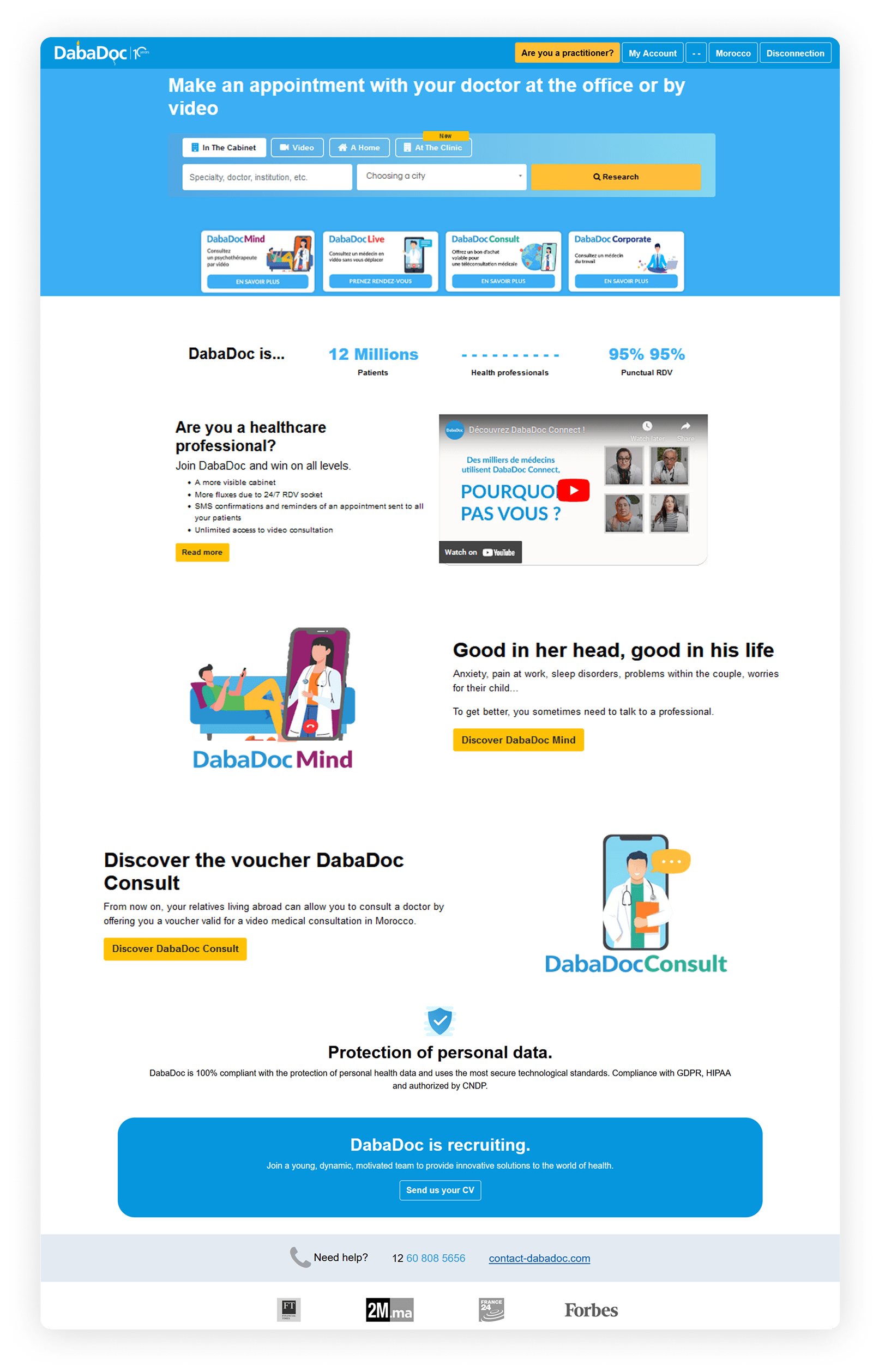
Dabadoc is a digital healthcare platform based in North Africa which connects patients with private doctors for in-person or virtual appointments.
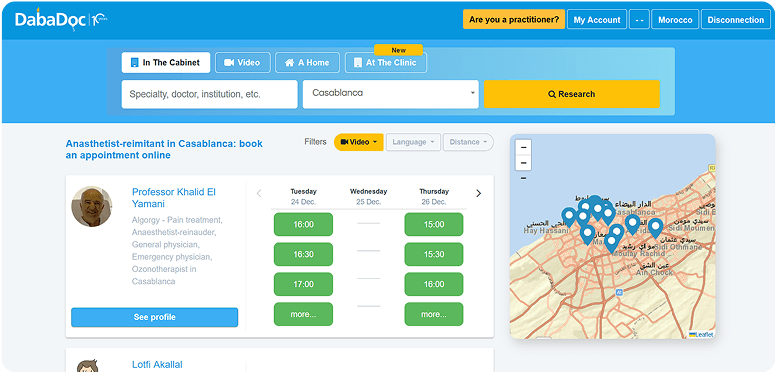
On the screenshot presented original landing page of the service:
User research
To empathize with users, I analyzed 217 Google Reviews of Dabadoc users.
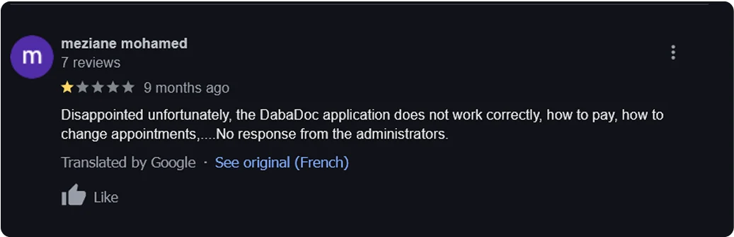

Most of the comments about the service were positive. I found only 2 comments about the platform, and were not positive.
Analyzing the platform
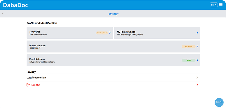
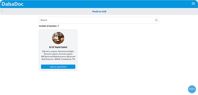
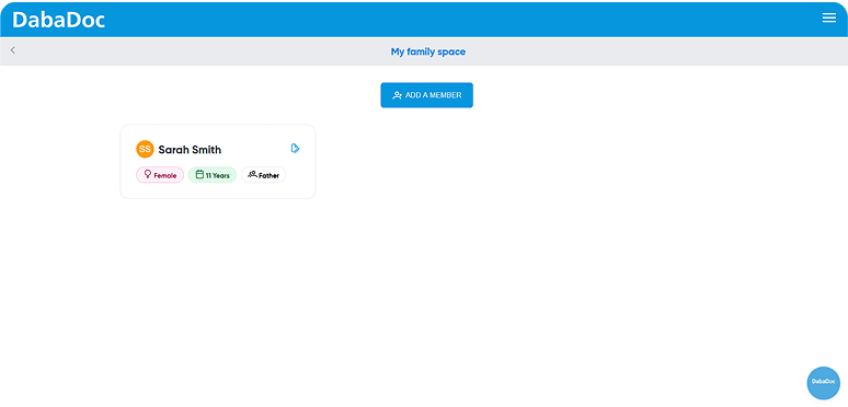
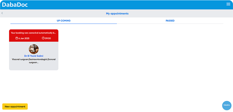
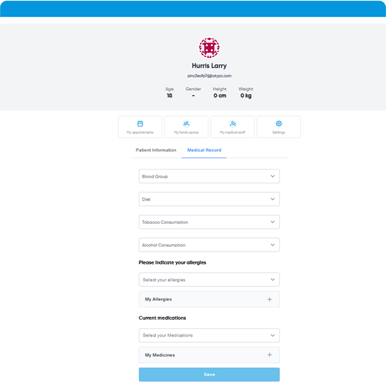
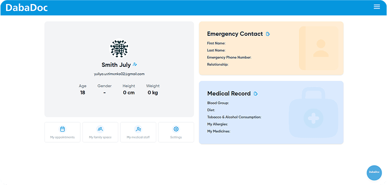
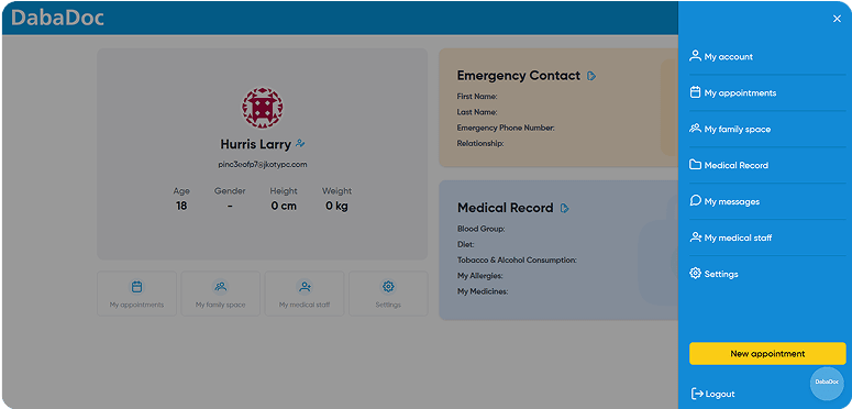
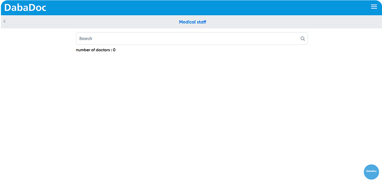
To analyze the platform, I tried to:
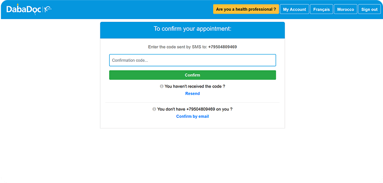
1. Make an appointment with doctor of my choice.
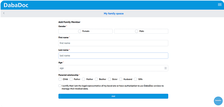
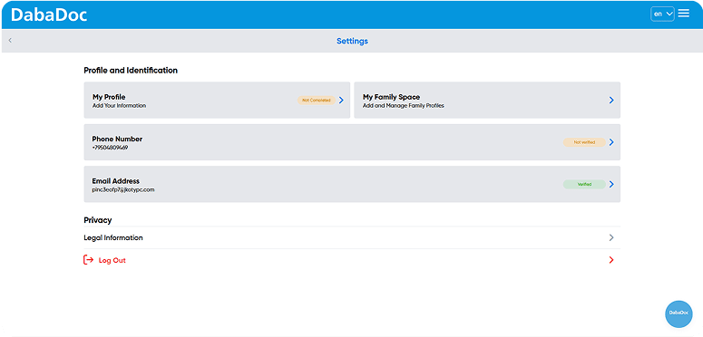
2. Add “my family member” to my account and make an appointment for her.
3. Change the appointment date and time.
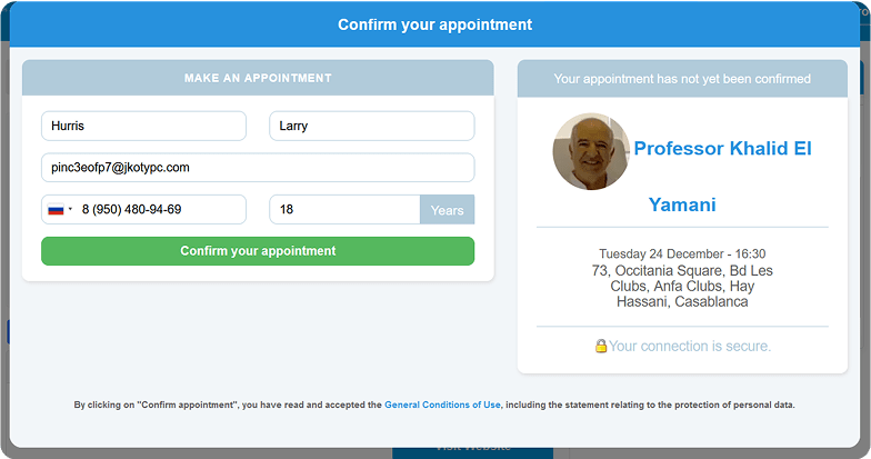
Problems
During the analyze of the service I defined next problems:
-Confusing, inconsistent navigation: The menu disappeared on key pages (e.g., during checkout), forcing users to restart their journey. I spent 2+ minutes hunting for the ‘My appointments’ section because the navbar is not accessible on some pages.
-Inflexible appointment management: No option to edit dates/times post-booking.
-Impossible to assign family member to the appointment, despite ability to add a family member to “My family space”.
-No detailed information about passed appointments such as doctor prescriptions
The goal of a redesign
Simplify the process for patients to schedule and manage appointments—both for themselves and family members—select the right healthcare providers, and securely organize and access their medical information, all to streamline their healthcare experience.
The challenge
The redesign challenge is to unify fragmented healthcare systems into a seamless, intuitive platform that allows patients to manage appointments, select healthcare professionals and access medical data.
Solution
Designing an integrated digital health platform that centralizes patient-provider interactions, medical data, and administrative tasks into a single, intuitive ecosystem.
Final design
User dashboard
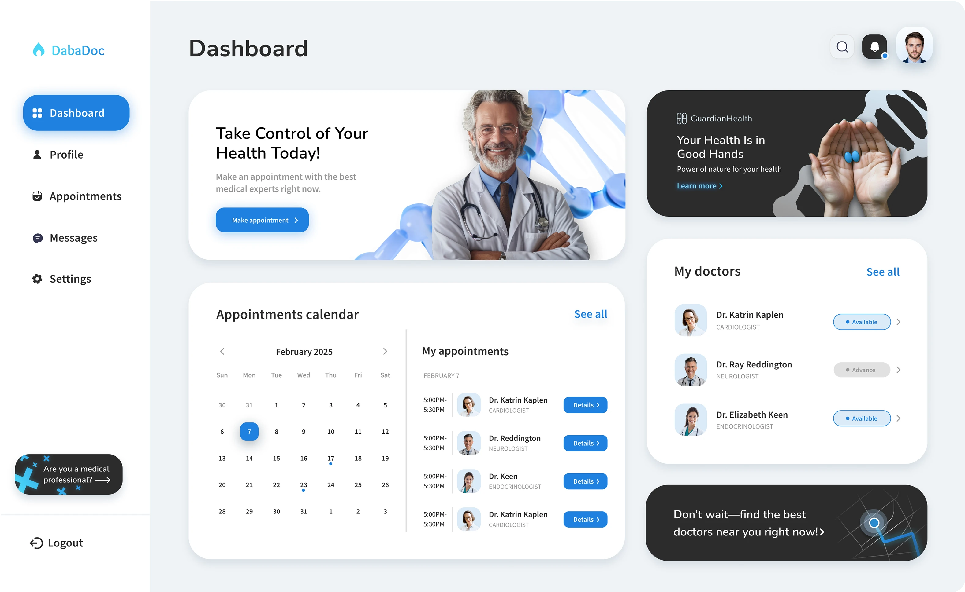
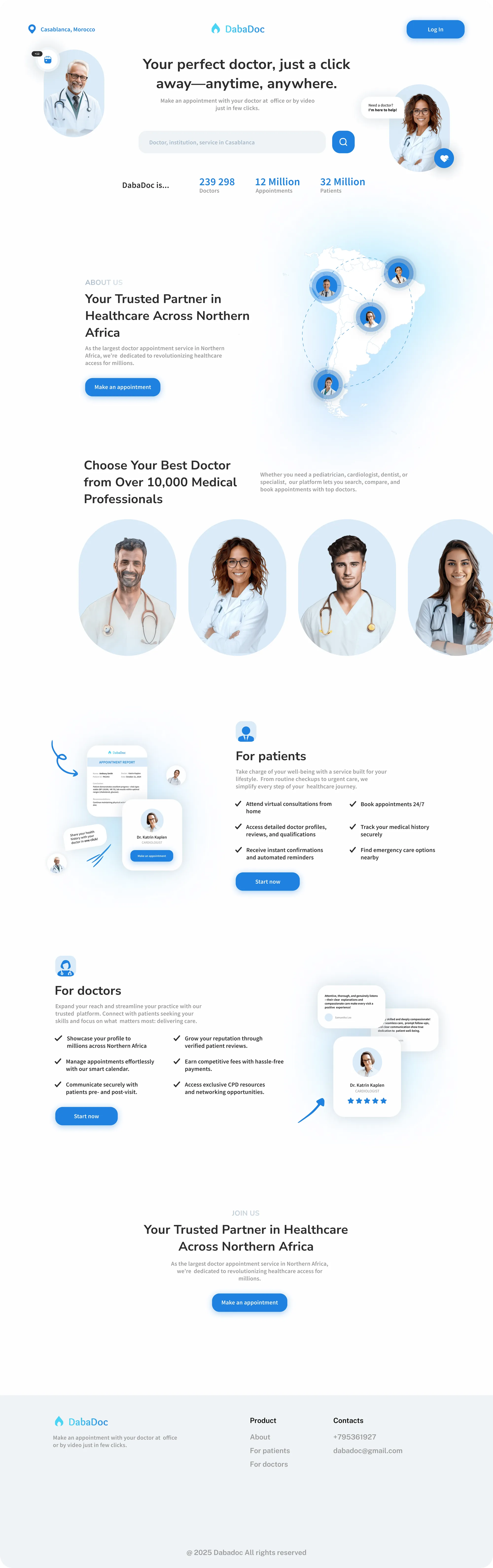
As a redesign solution I decided to create a platform that consist from 2 parts: 1-st part is a page where user can search for needed doctor in his location and 2-d is a dashboard where user can manage his appointments, medical information and access the details and prescriptions from past appointments.
User profile
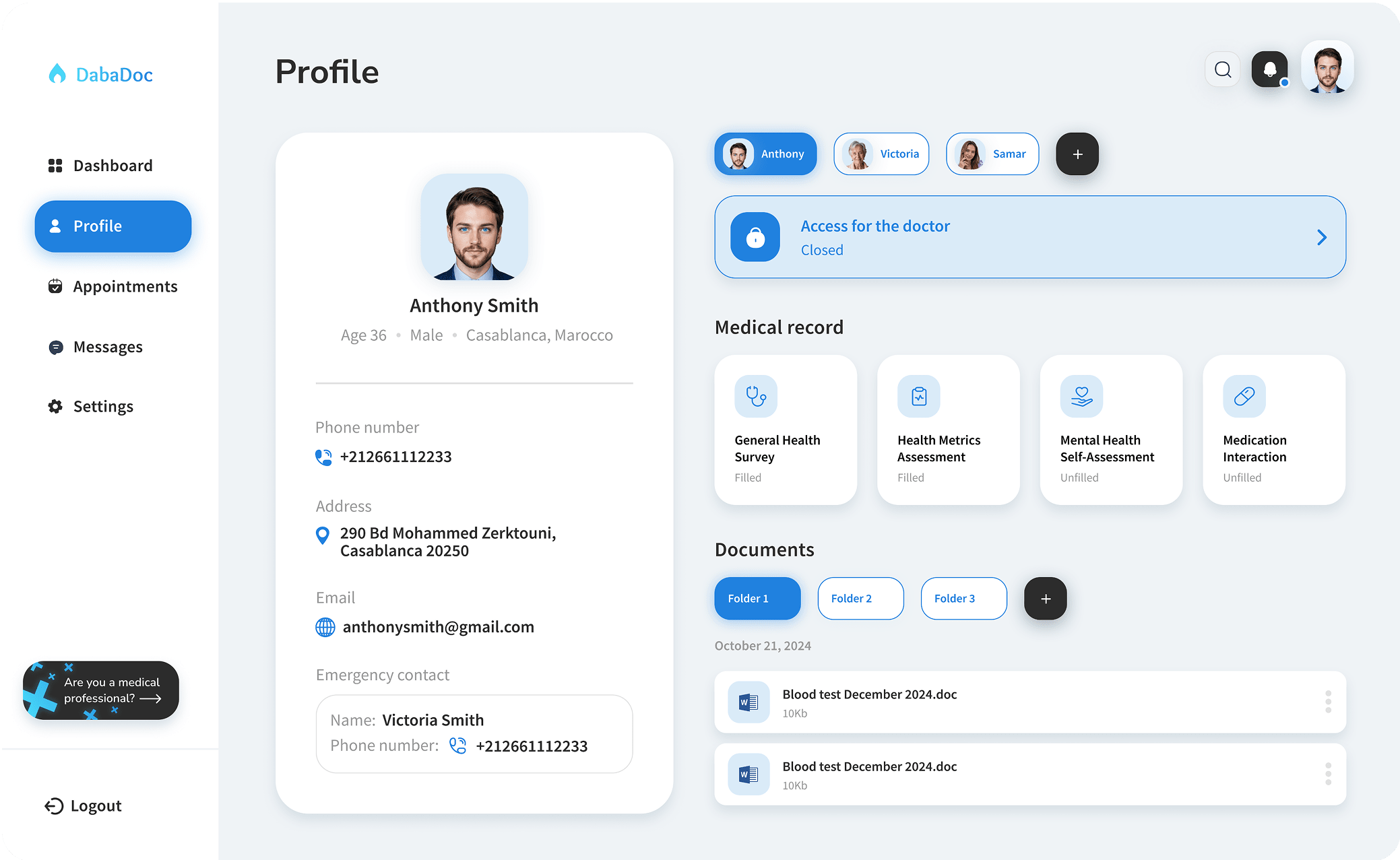
Health surveys
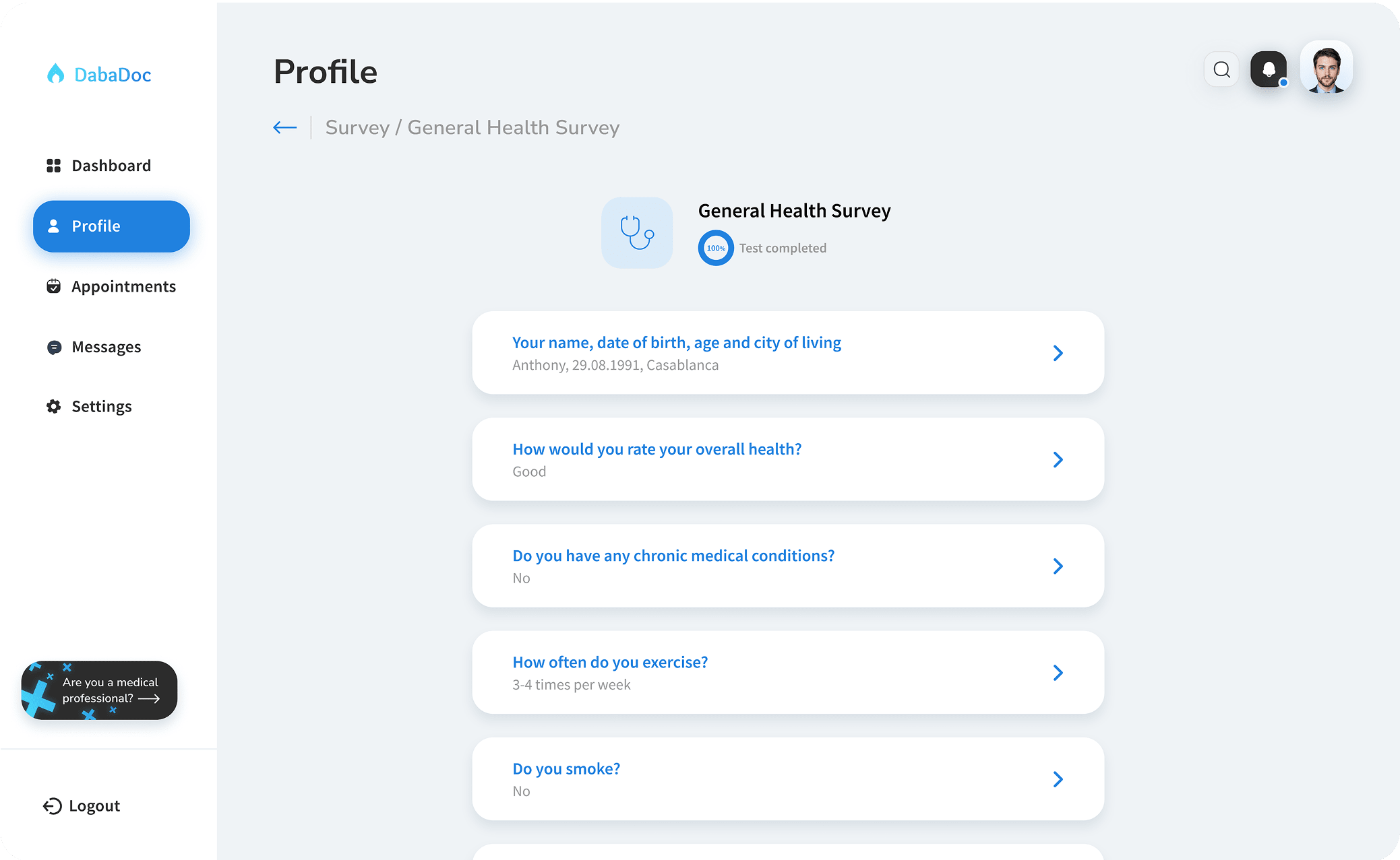
Medical records
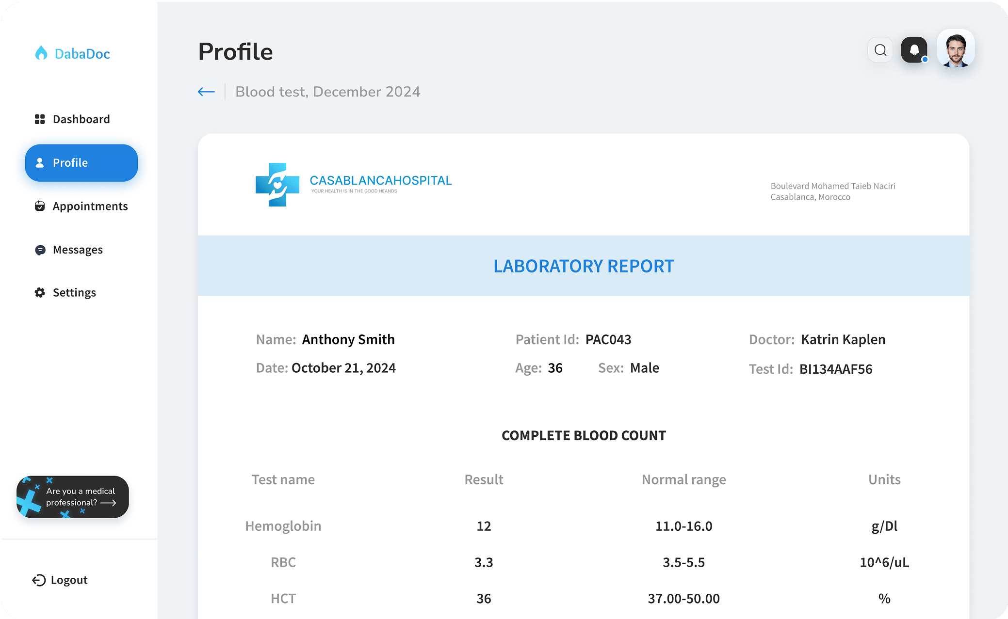
Adding a family member
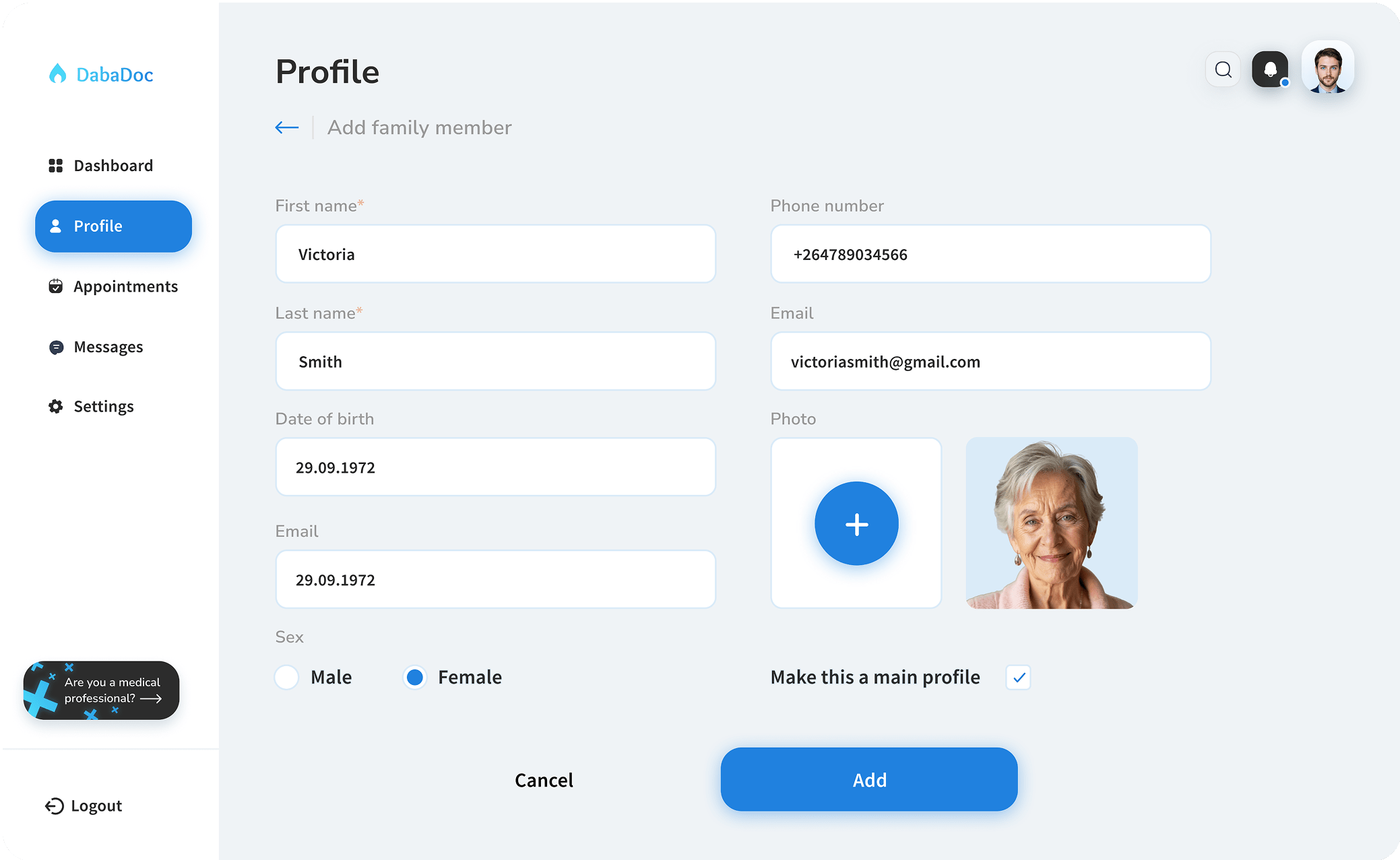
Users can effortlessly manage and share their personal health information with healthcare providers, while also maintaining and organizing their own and their family members' medical records.
Appointments
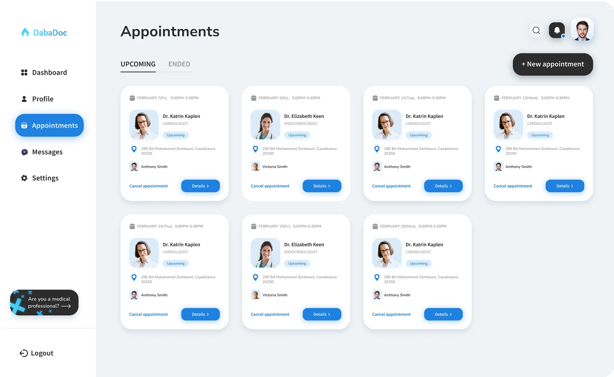
Appointment information
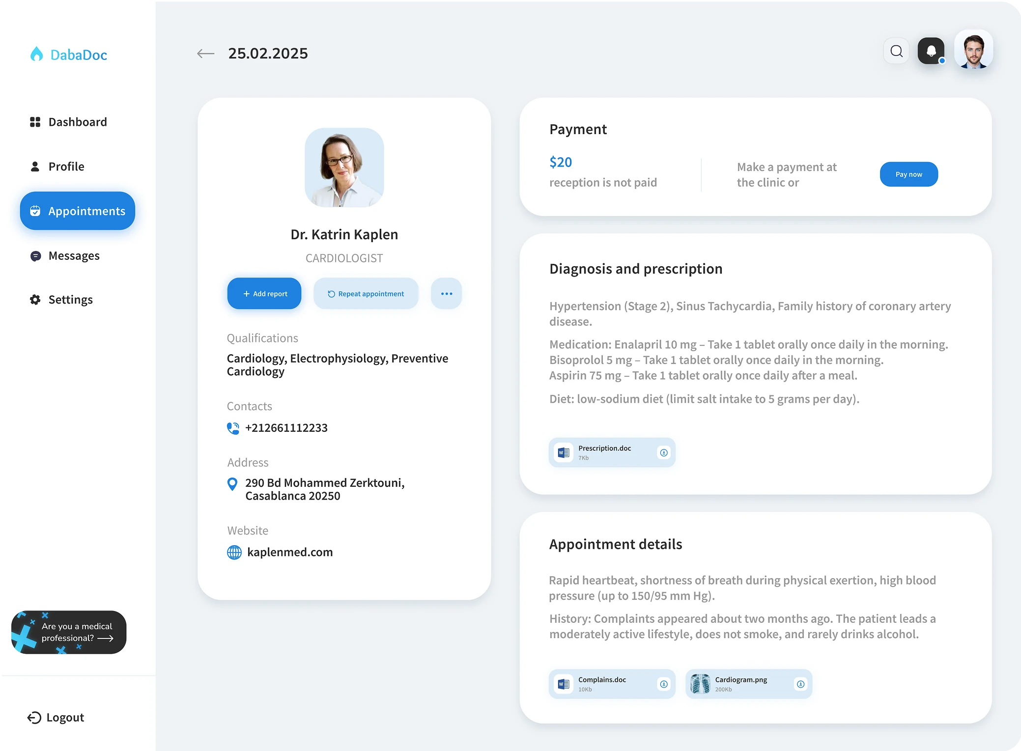
Users can manage future appointments, easily access information from the previous onces and make payments.
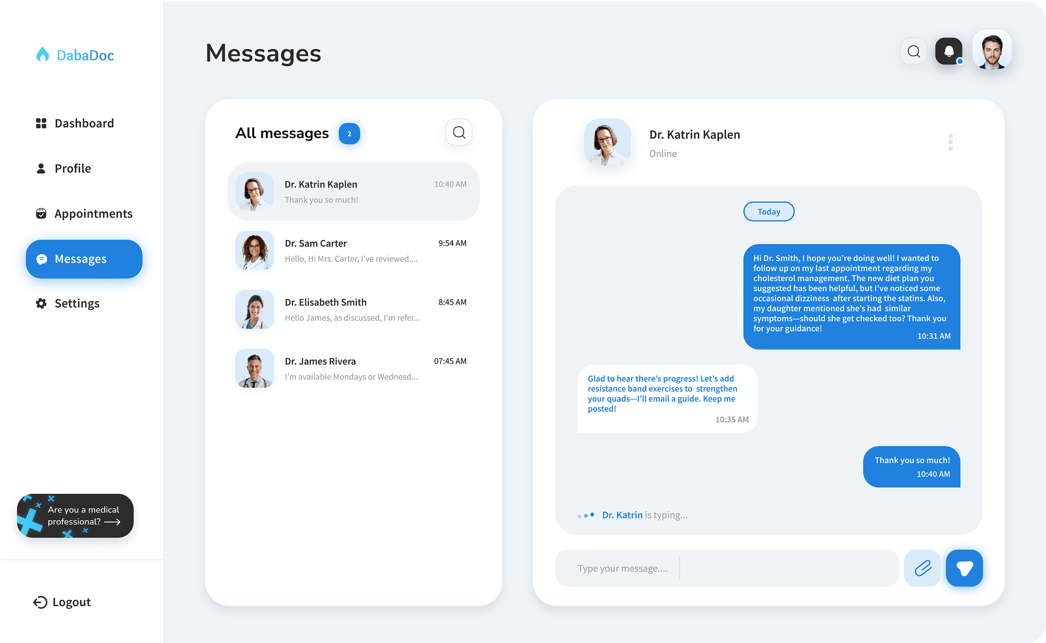
Messenger
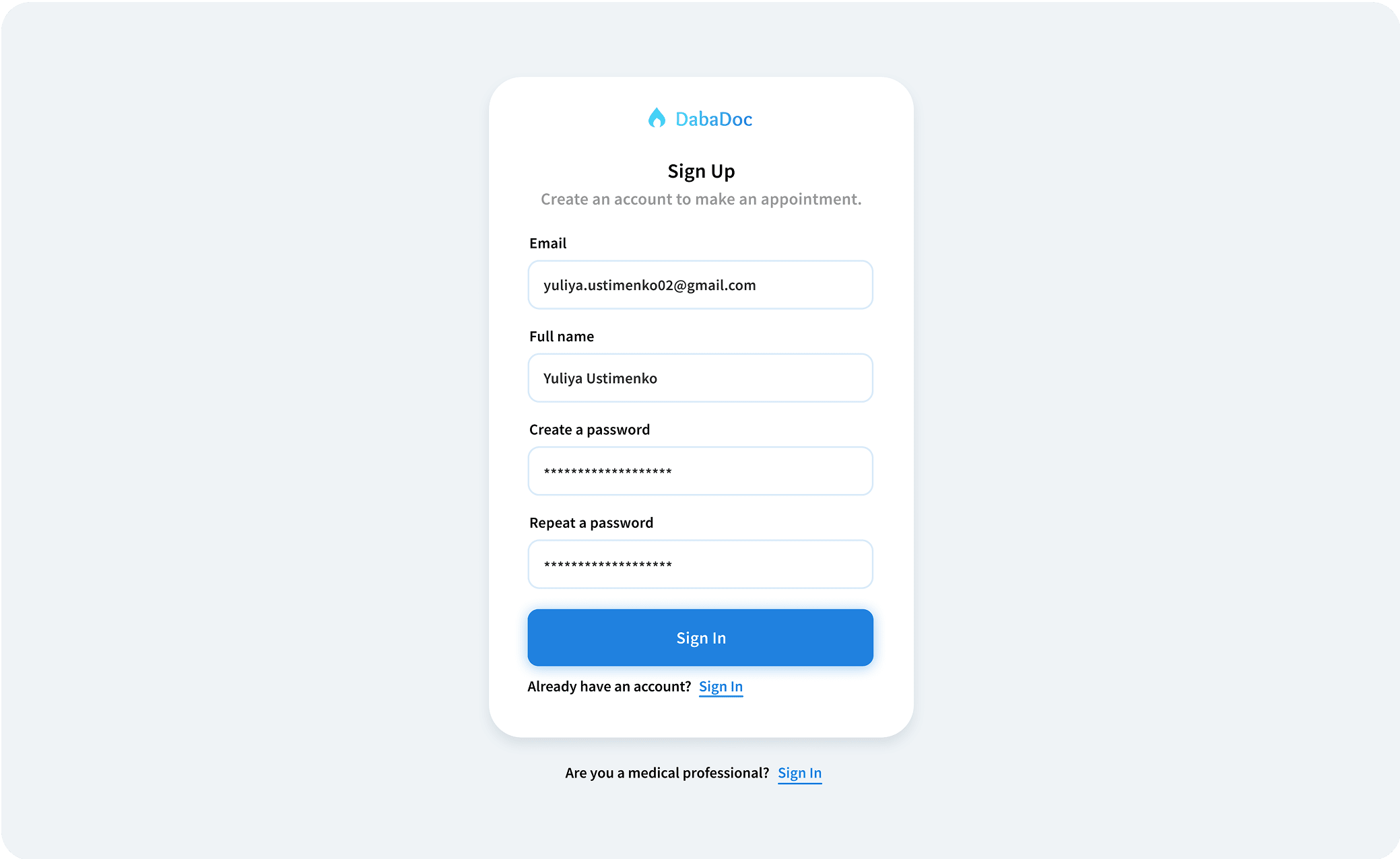
Log In page
Landing page
Impact
The redesign prioritized clarity and reliability, ensuring users could navigate the platform seamlessly during critical tasks like booking appointments. Introducing flexible editing options empowered patients to adapt to changing needs, while integrating family management features simplified caregiving responsibilities.These changes reinforced the platform’s role as a dependable, patient-first solution in a complex healthcare landscape.
What did I learn
Platform usability gaps can persist even when service satisfaction is high, direct engagement with the product is vital. Consistent design elements, like persistent navigation, are foundational for user confidence during high-stakes interactions.

Get in touch
Have a project in mind or just want to chat? Drop me an email.
How to Find Me
Email Me