.0wtcdguz5p7fu.png&w=1080&q=75)
Cratch
Scaling Web3 streaming service from website to app with a shared design system
Improving overall look, and user experience of the Web3 streaming platform and adopting the product into mobile.
Overview
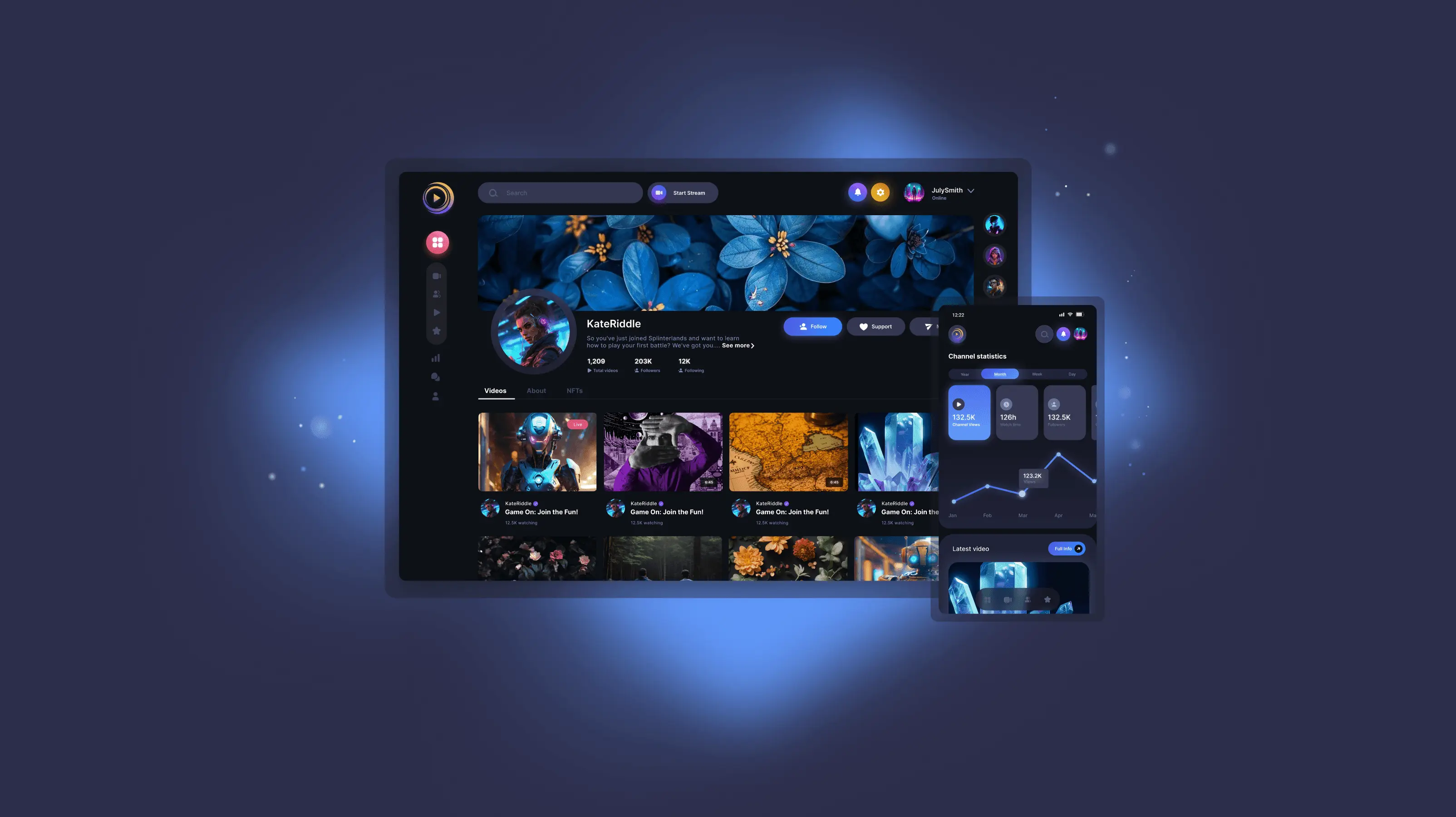
Cratch is a blockchain-integrated video-sharing and live-streaming platform that merges content creation, crypto rewards, and NFTs. It targets crypto enthusiasts, gamers, and content creators by offering monetization through tokenized incentives and metaverse integration.
Team
Two-person product team: Rais Youssef (Web developer) and me (Product designer).
My role
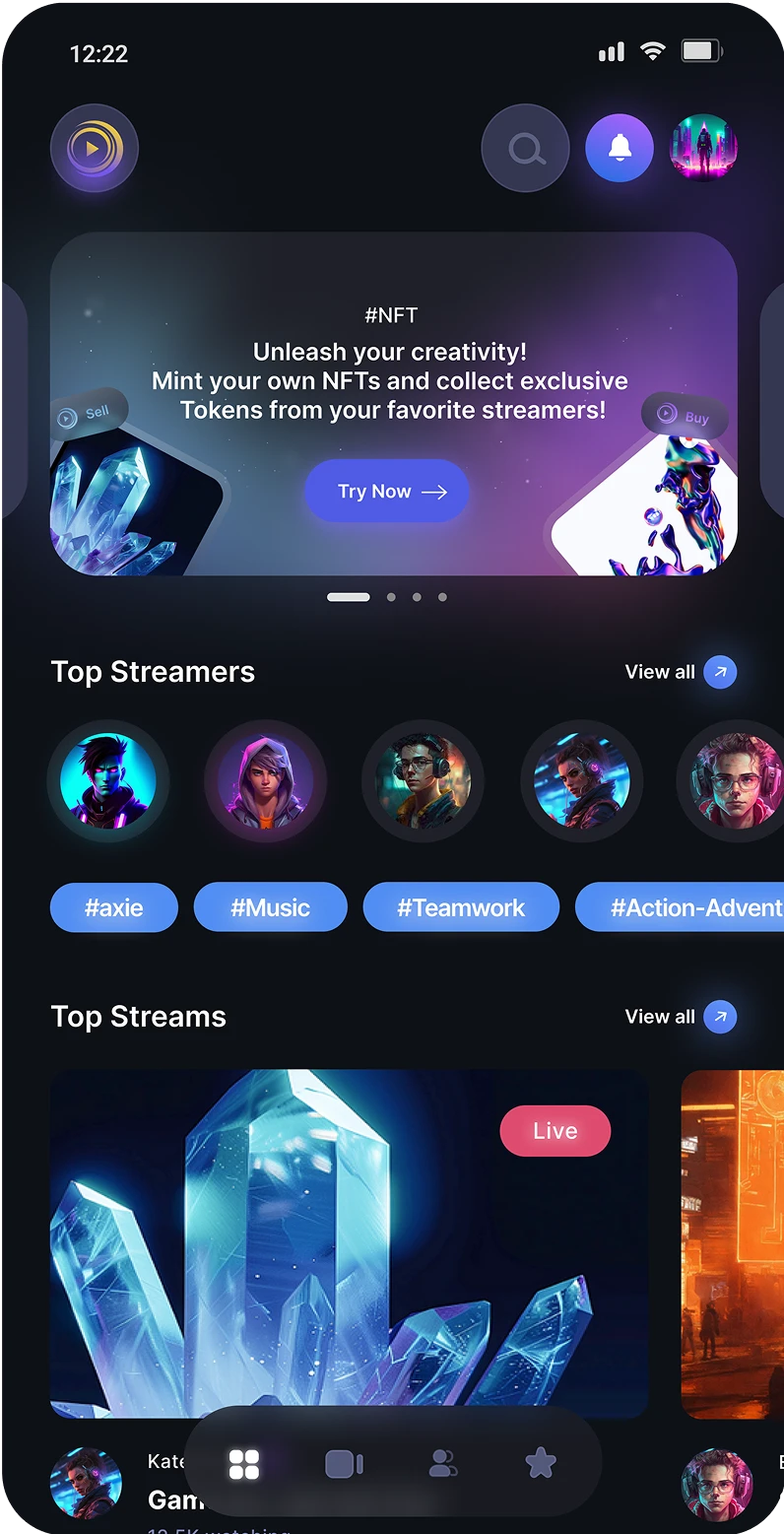
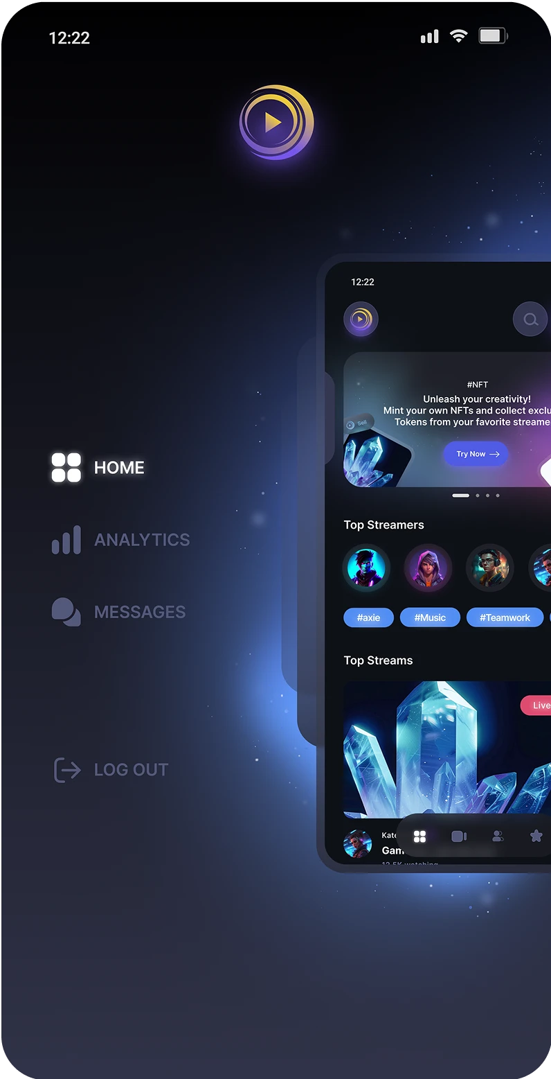
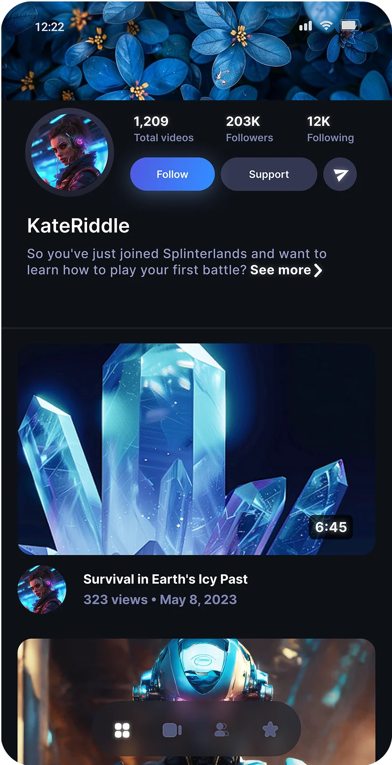
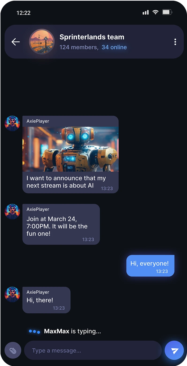
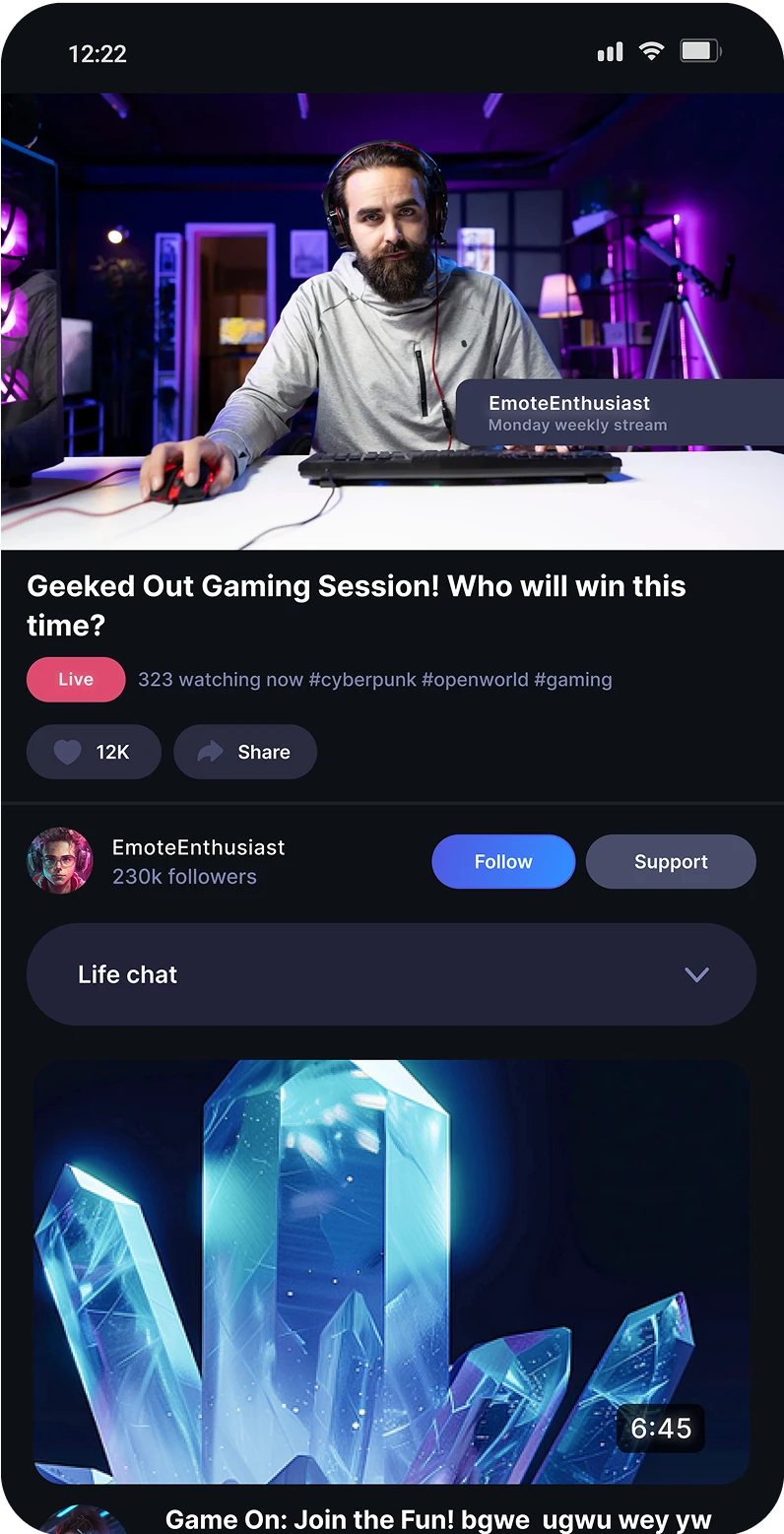
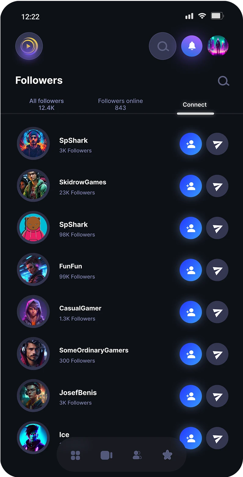
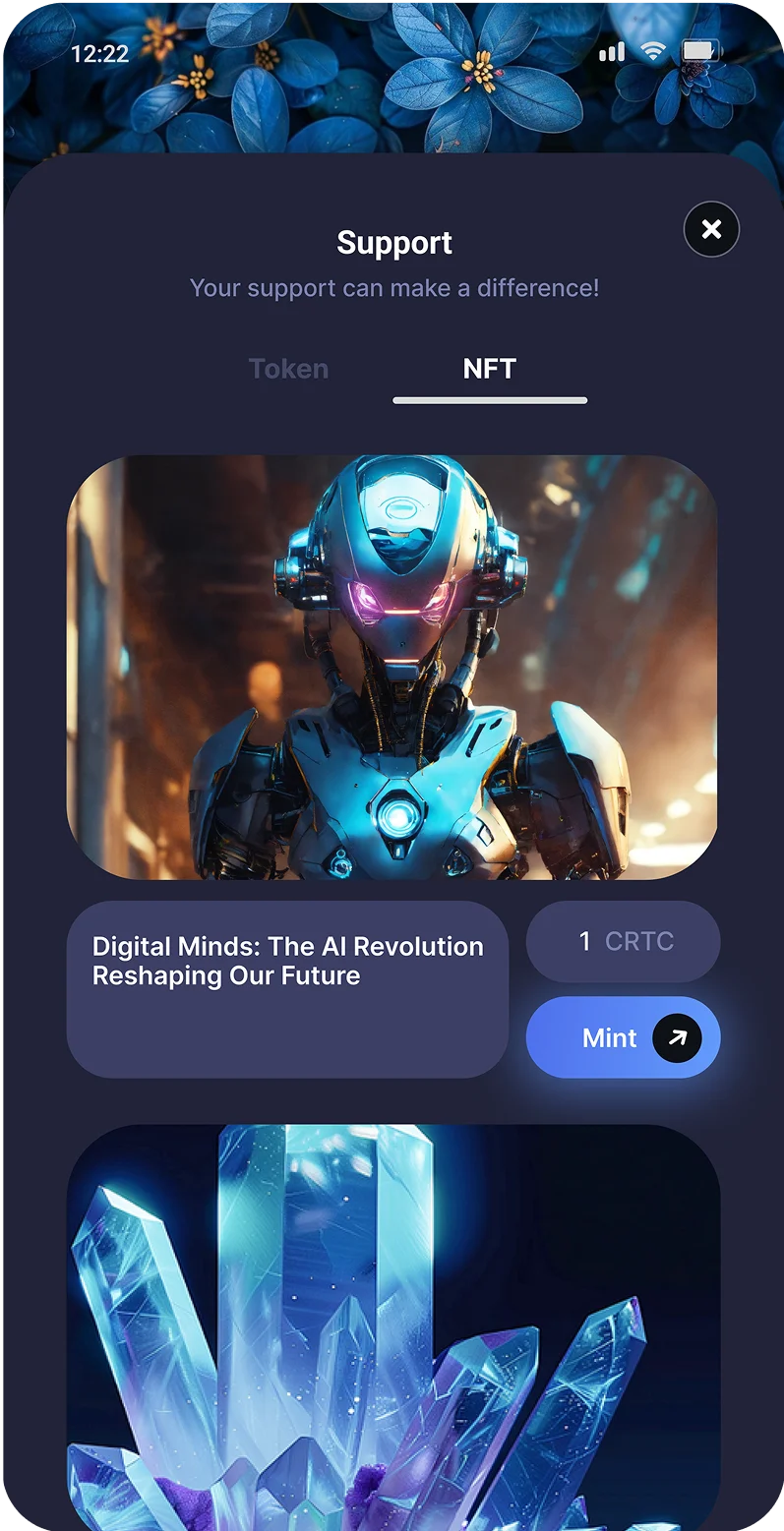
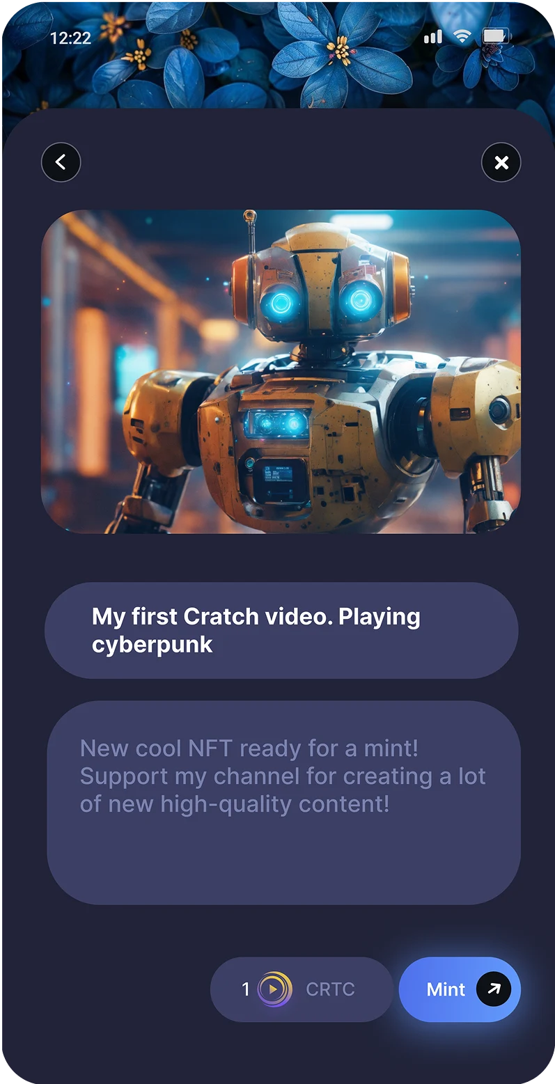
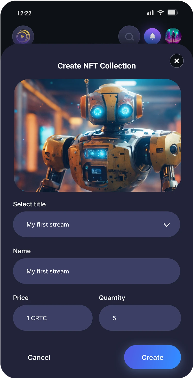
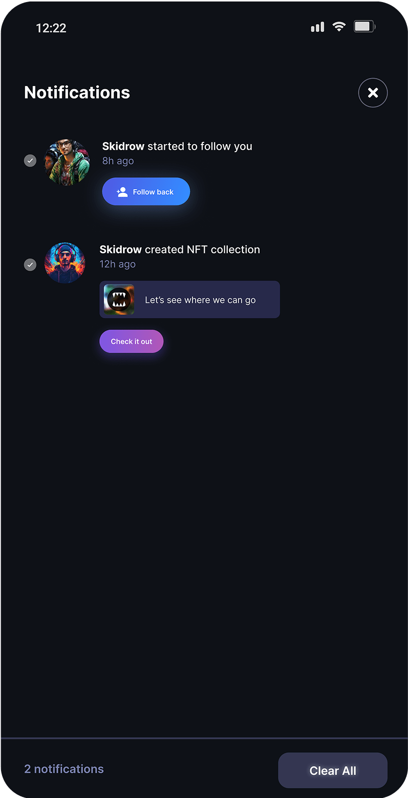
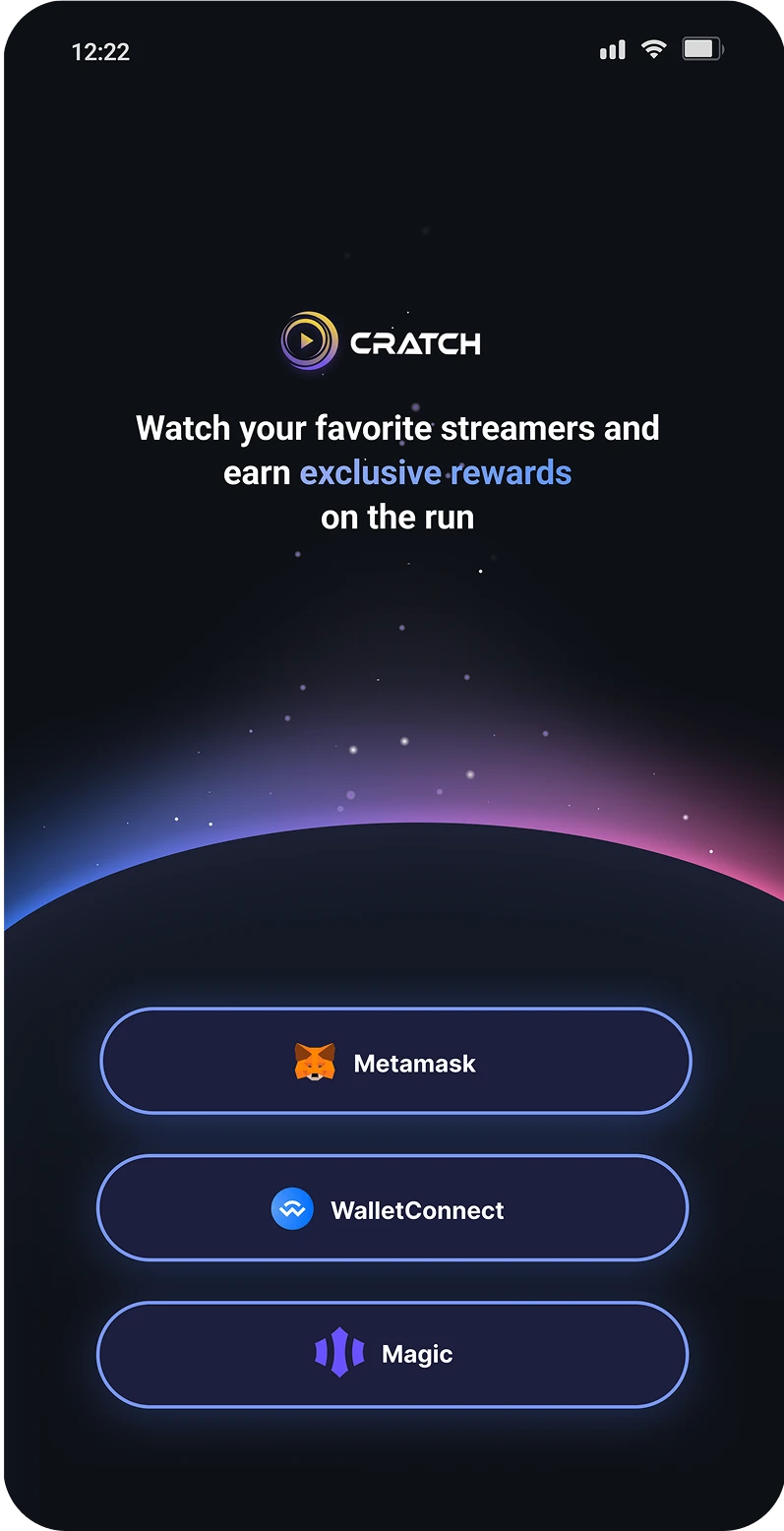
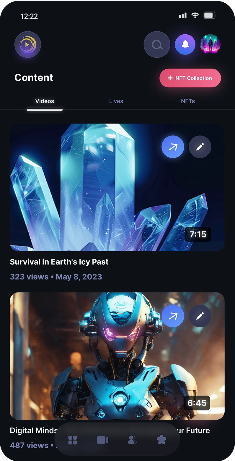
End-to-end product design including web platform visual redesign, design system documentation, and a full mobile application design from scratch.
The problem
Hypothesis
Constraints
1. Navigation, core user workflows, and platform functionality were already validated and must stay intact.
2. The redesign had to ship across web and a brand-new mobile experience with one consistent visual identity.
3. The design system needed to scale for upcoming features such as live streaming, NFT drops, and social sharing.
Why redesign?
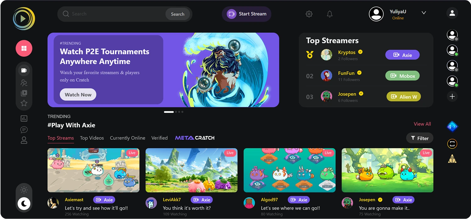
The existing interface felt outdated and misaligned with the brand’s evolving identity, resulting in:
- A lack of visual cohesion across platforms, weakening brand recognition.
- User feedback describing the platform as "generic" and "unpolished" compared to platforms like Youtube or Twitch.
- Founder had concerns about the platform’s ability to attract partners and new users.
Goals
1. Elevate Brand Identity & Professionalism
• Create a unified visual language (colors, typography, iconography) that reflects the brand’s premium positioning.
- “We wanted users to instantly recognize our platform, even from a screenshot.” -Founder
2. Align with Modern Design Trends
• Adopt 2023/2024 UI trends (e.g., dark mode dominance, bold typography, subtle gradients).
• Ensure accessibility to broaden audience reach.
3. Create a scalable design system to support future features (e.g., live streaming, social sharing).
Key UI changes
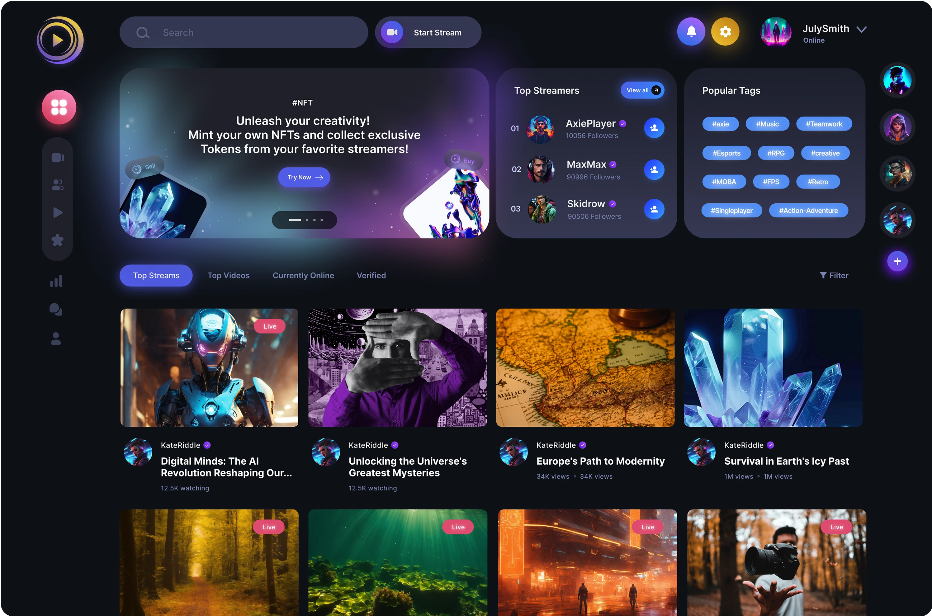
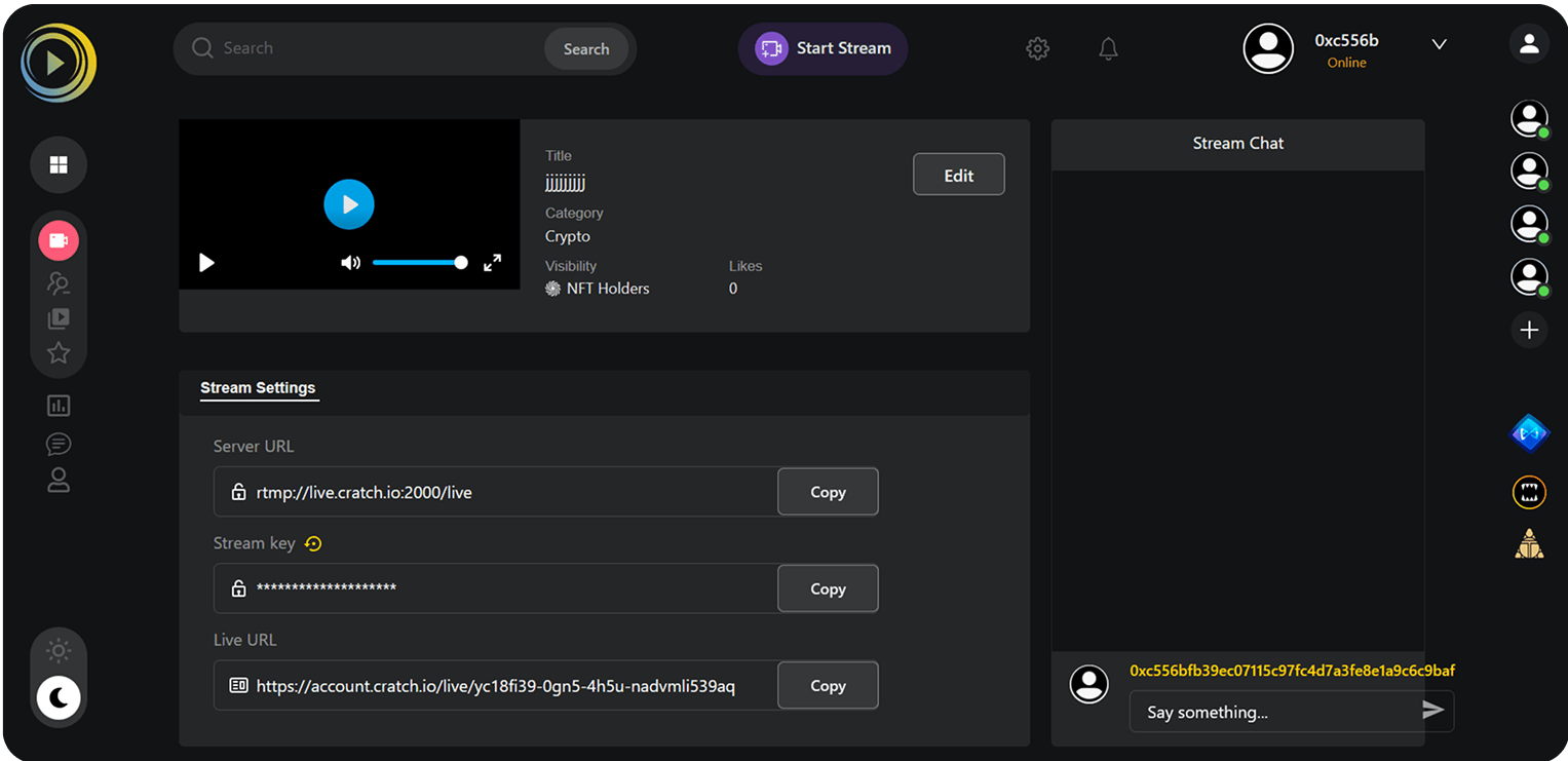
While the platform’s core user experience (navigation, workflows, and functionality) already received positive feedback, the visual design lacked the maturity to reflect the brand’s ambitions. The redesign focused on elevating aesthetics to match the platform’s usability strengths, transforming it into a polished, professional product.
UI Redesign
Stream page
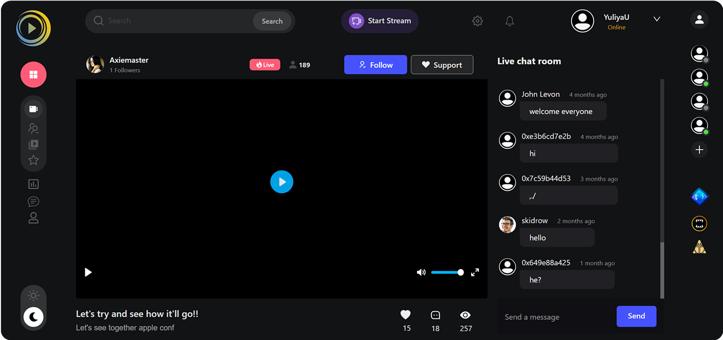
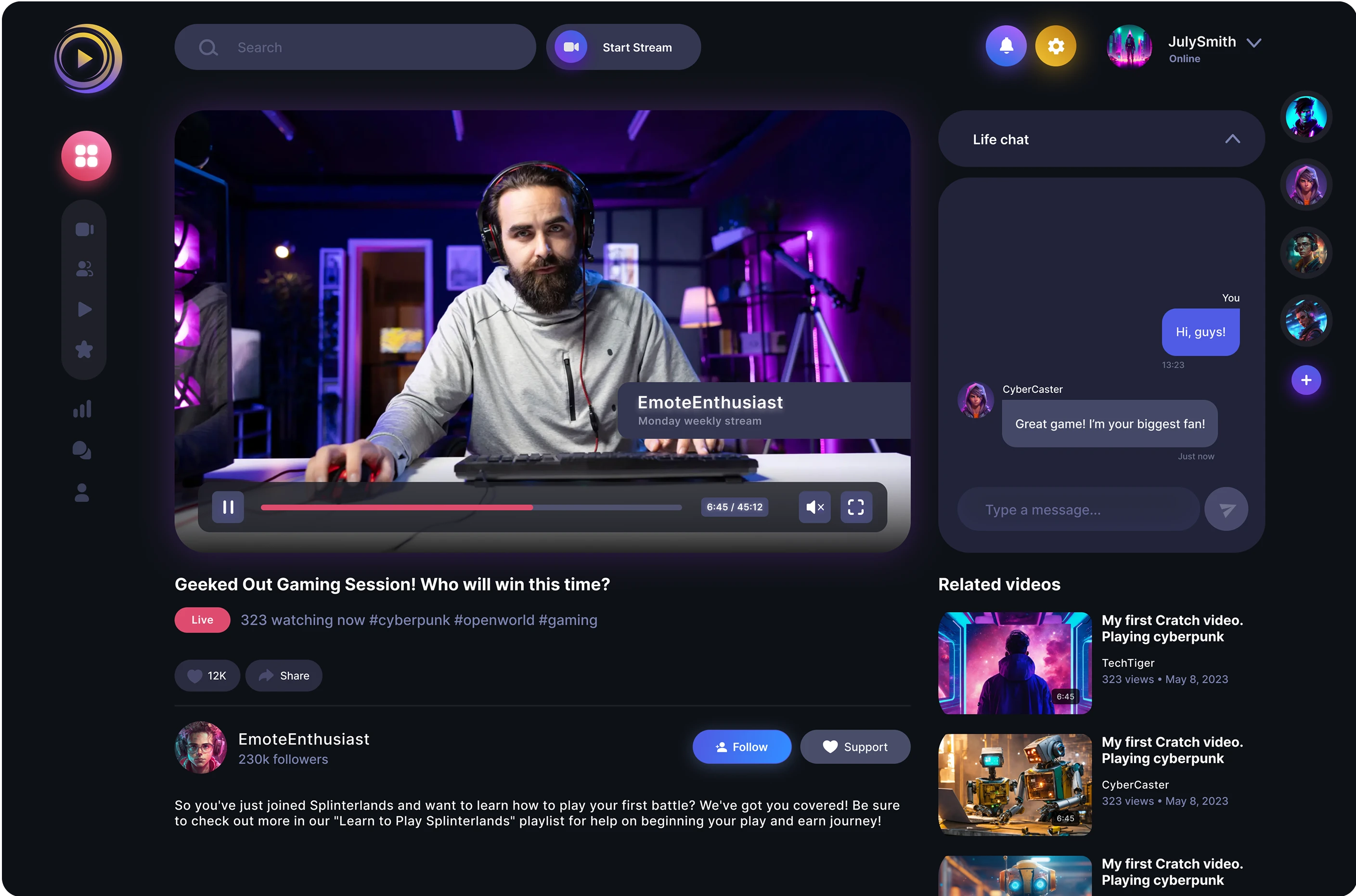
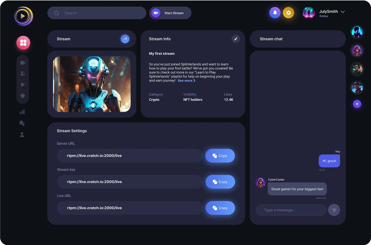
I improved visual hierarchy: visually separated live-chat, and put information about creator after information connected to stream. Made more accessible design for video player. Used more rounded corners and more white-space for creating a cleaner and more organized look. Improved contrast and readability.
Profile page
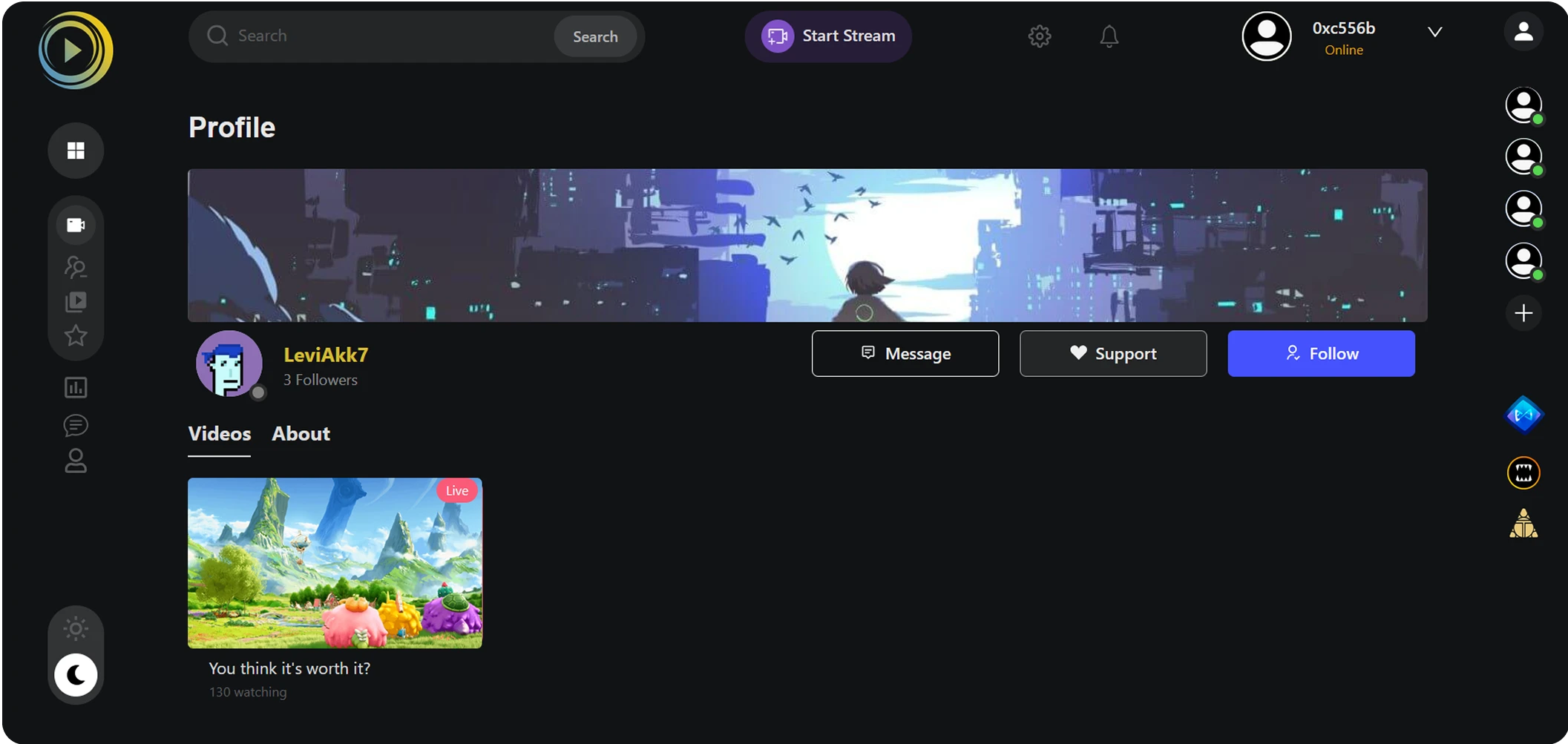
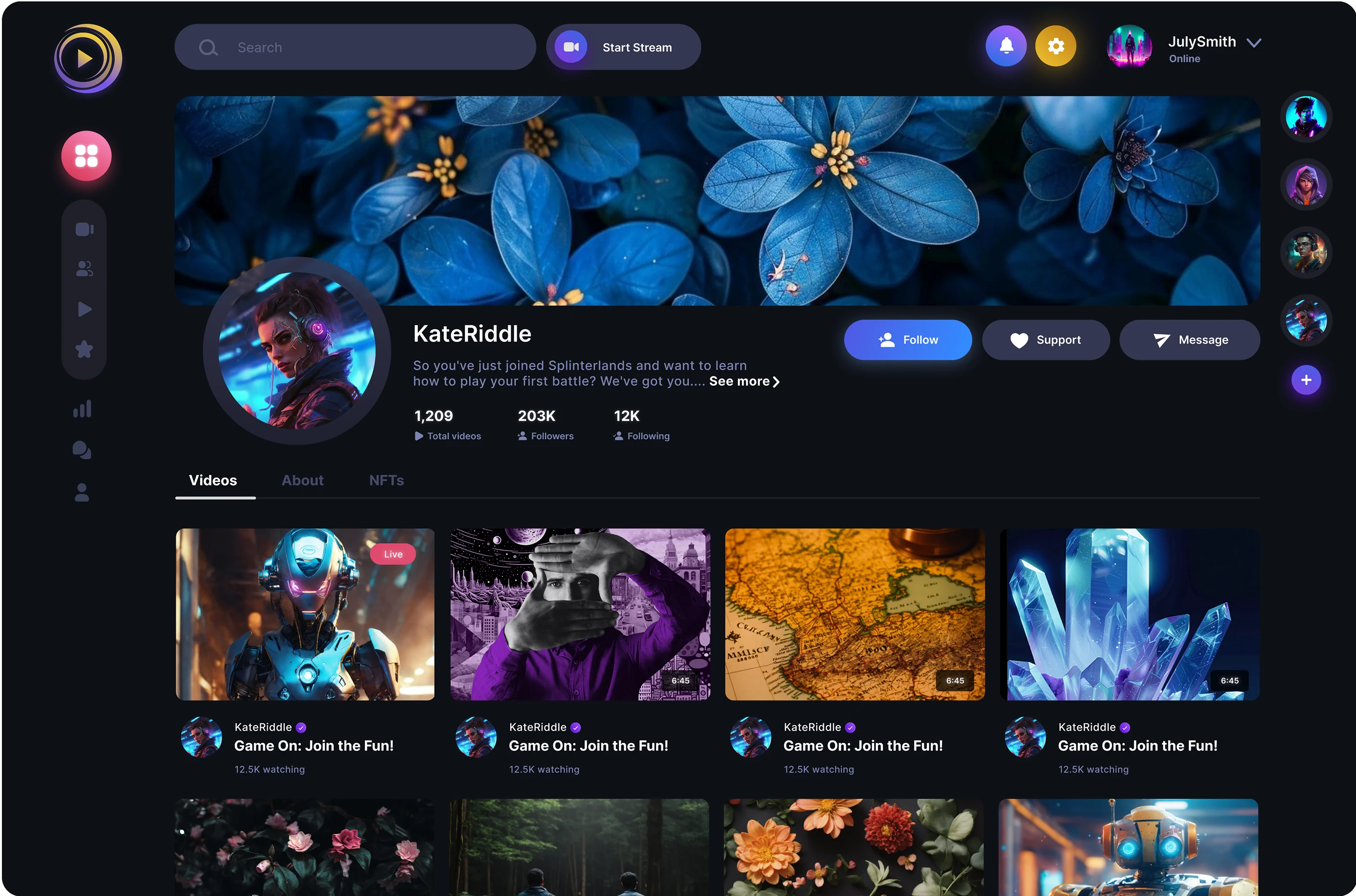
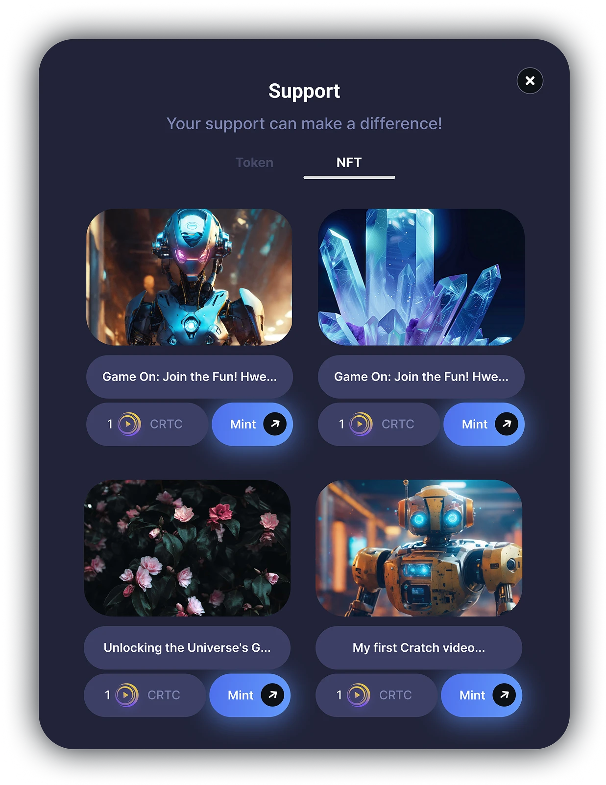
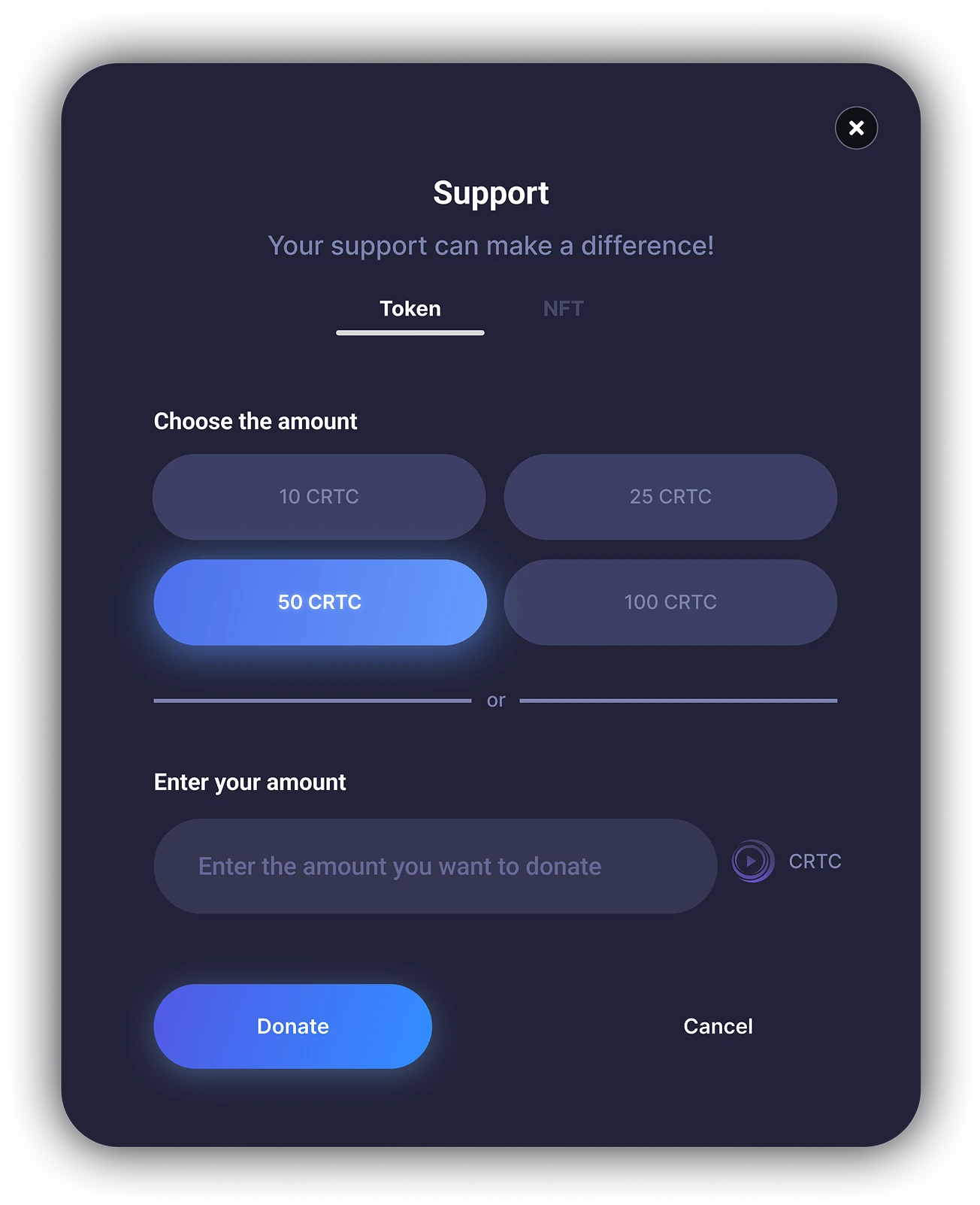
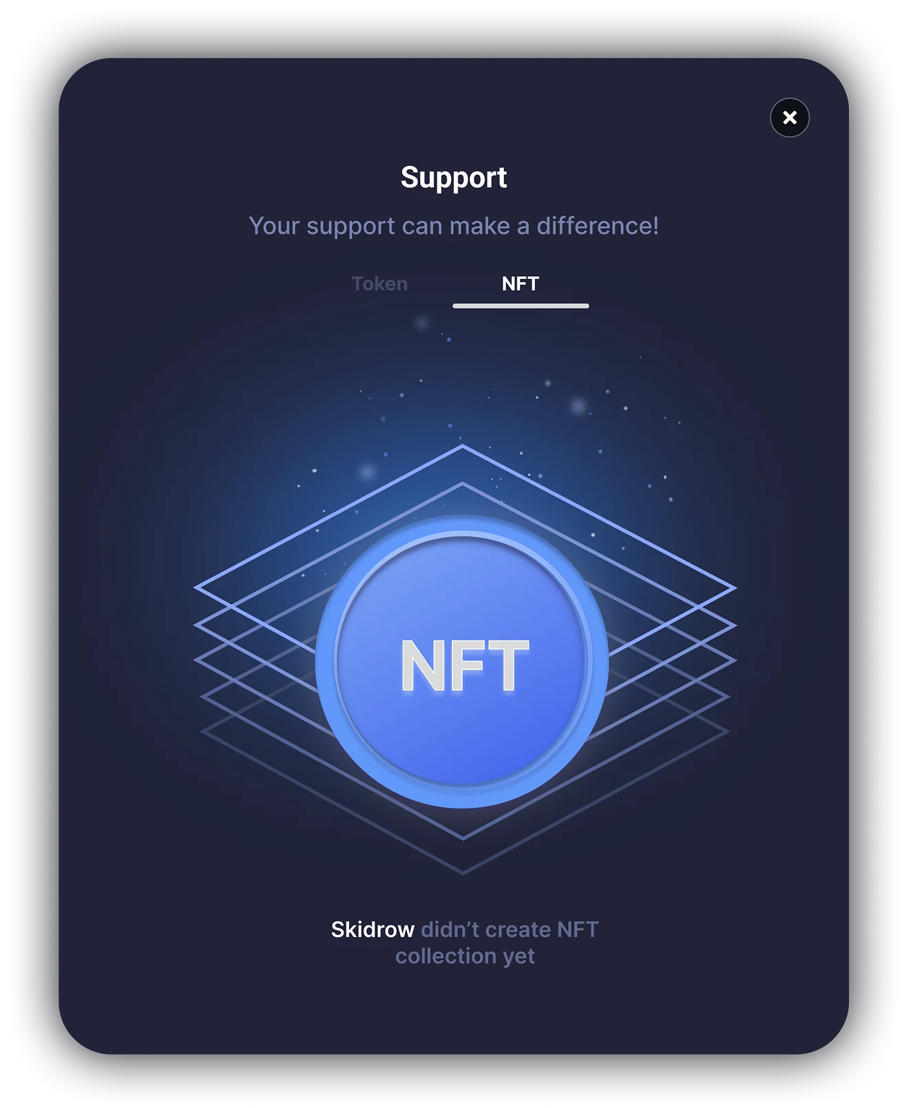
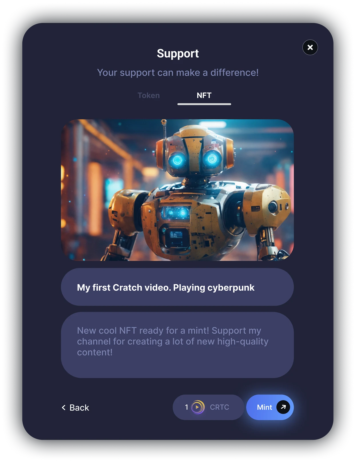
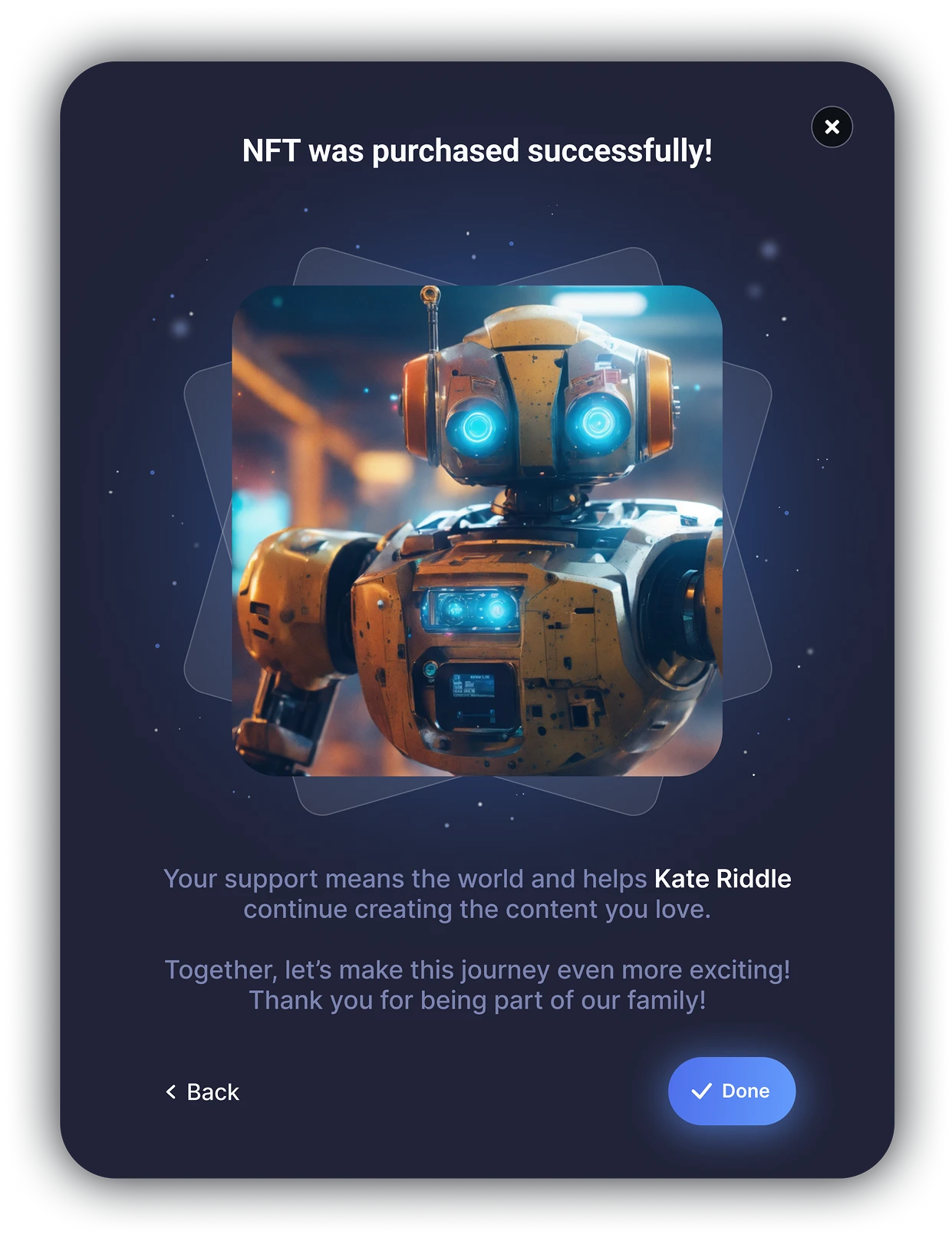
Made more accent on the profile avatar and cover image, as they are important for building user’s personal brand for promoting their content.
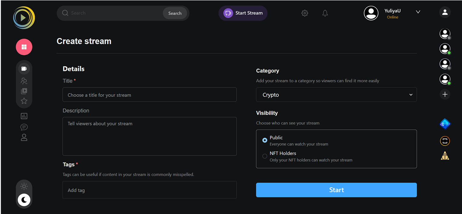
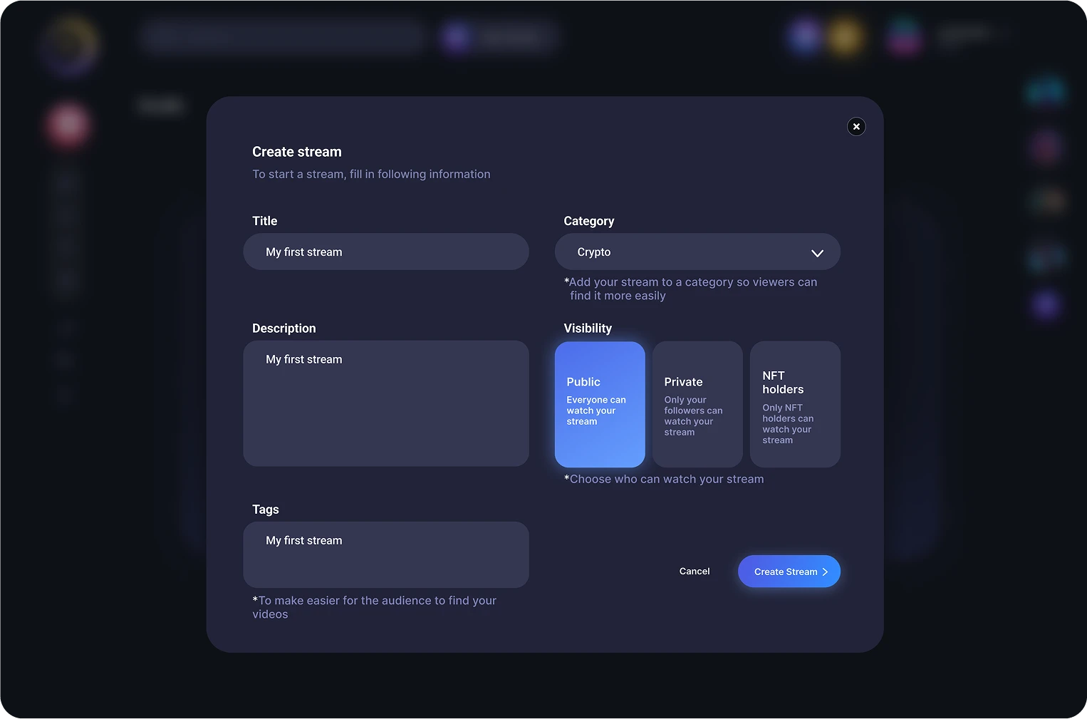
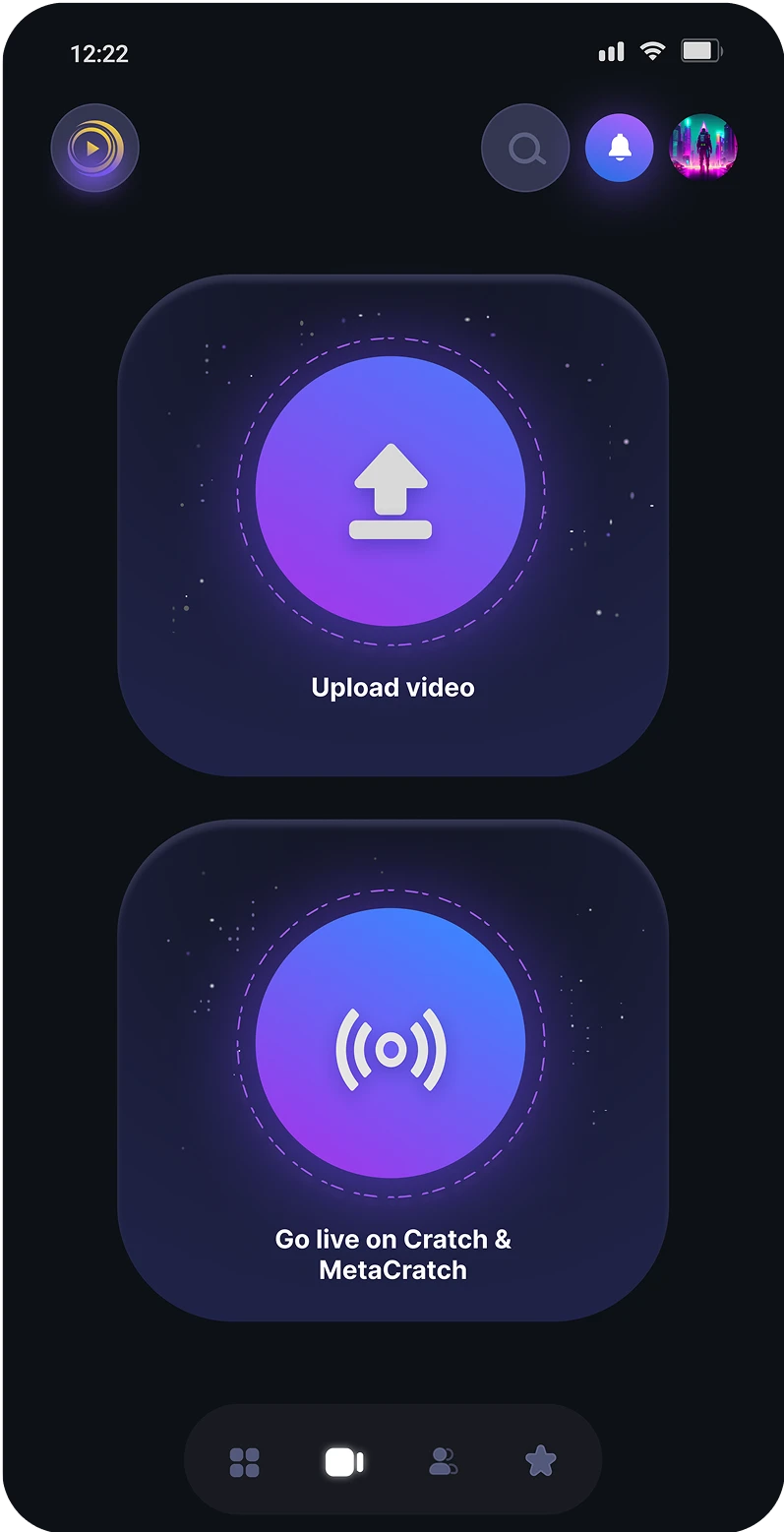
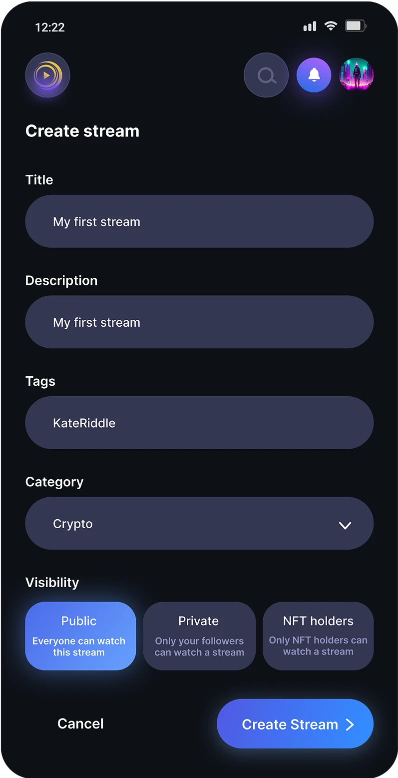
Page for creating stream/uploading video
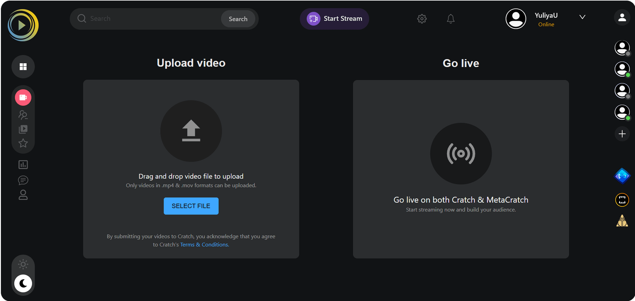
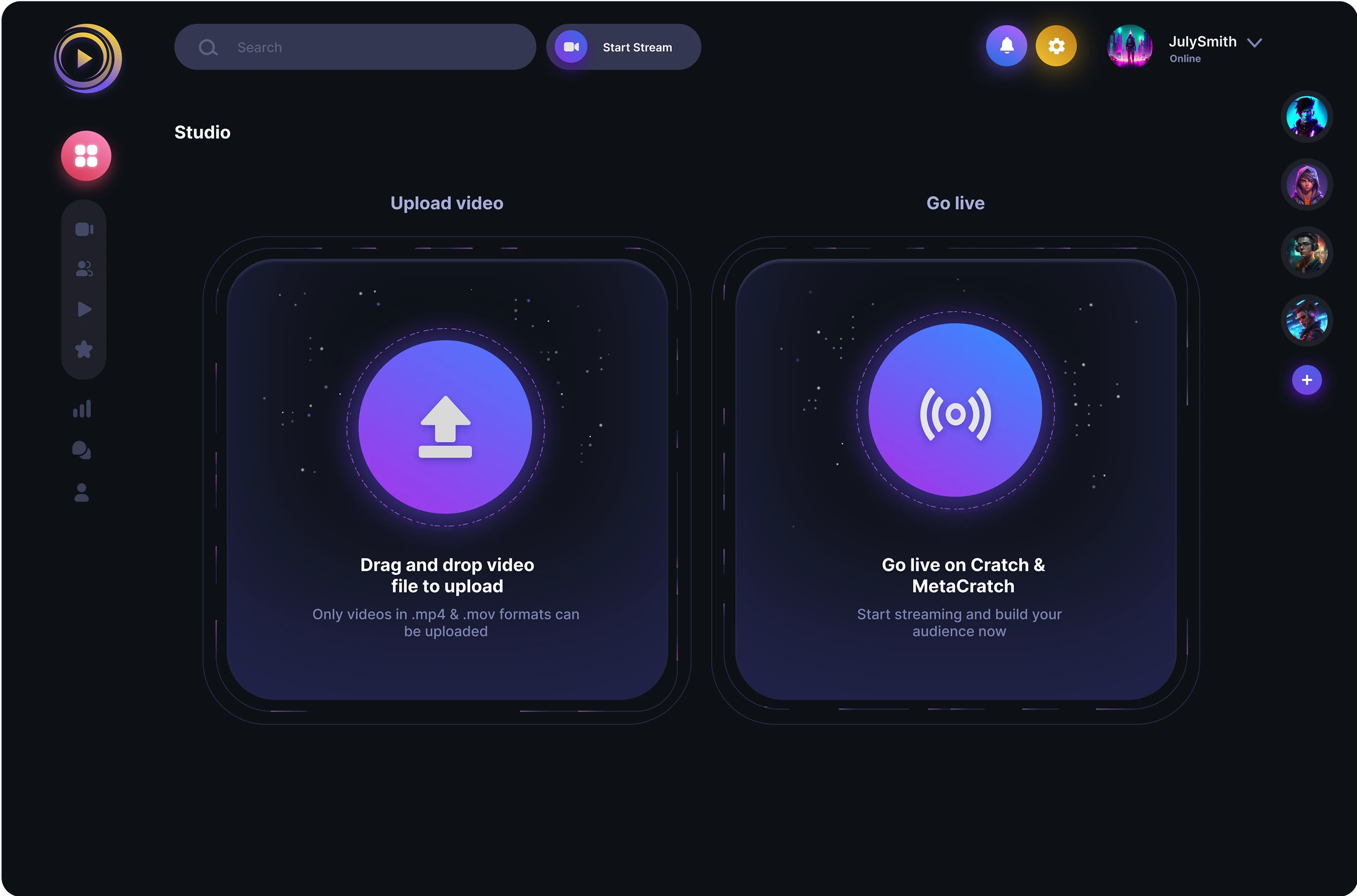
The visual hierarchy and readability of the text have been improved, ensuring better consistency across elements. In the previous version, the call-to-action (CTA) within the boxes was inconsistent. In the first scenario ("Upload Video"), the user had to click a button within the box. In the second scenario ("Go Live"), the user was required to click the box itself. This inconsistency could lead to confusion and hinder users from achieving their goals.
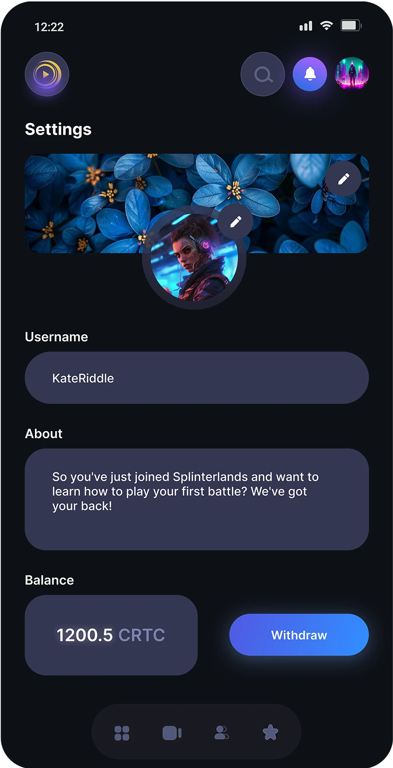
Settings page
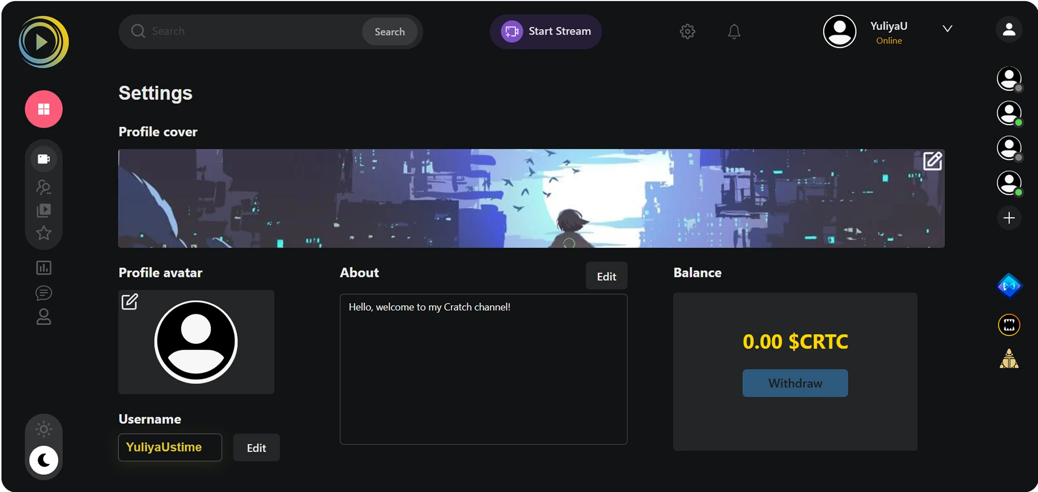
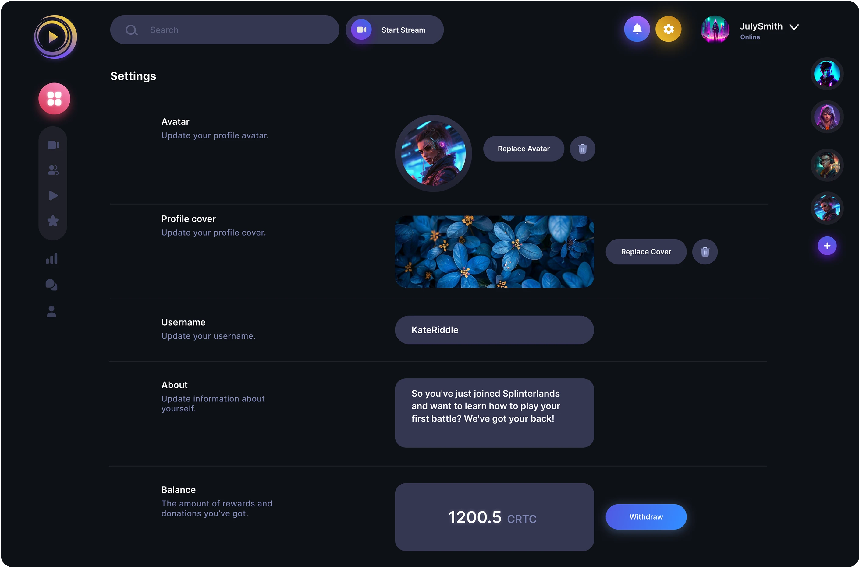
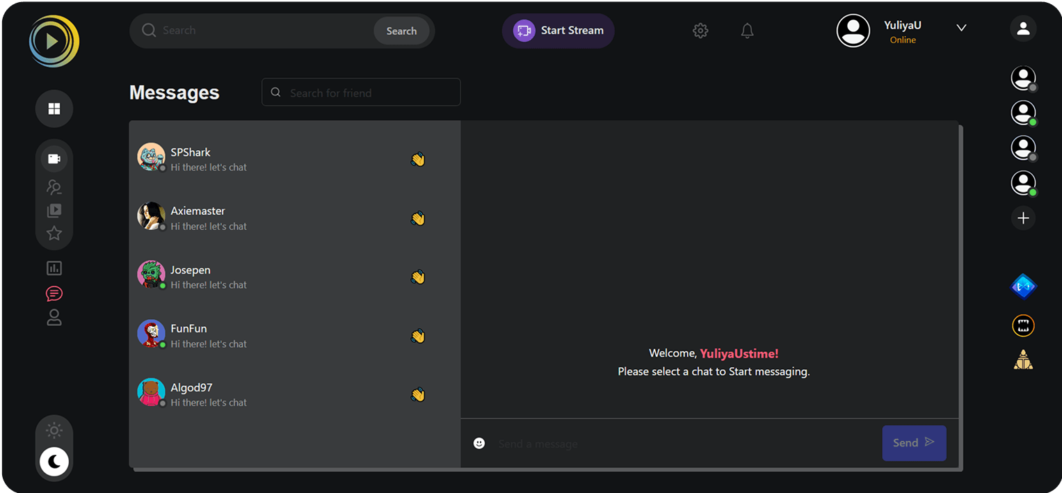
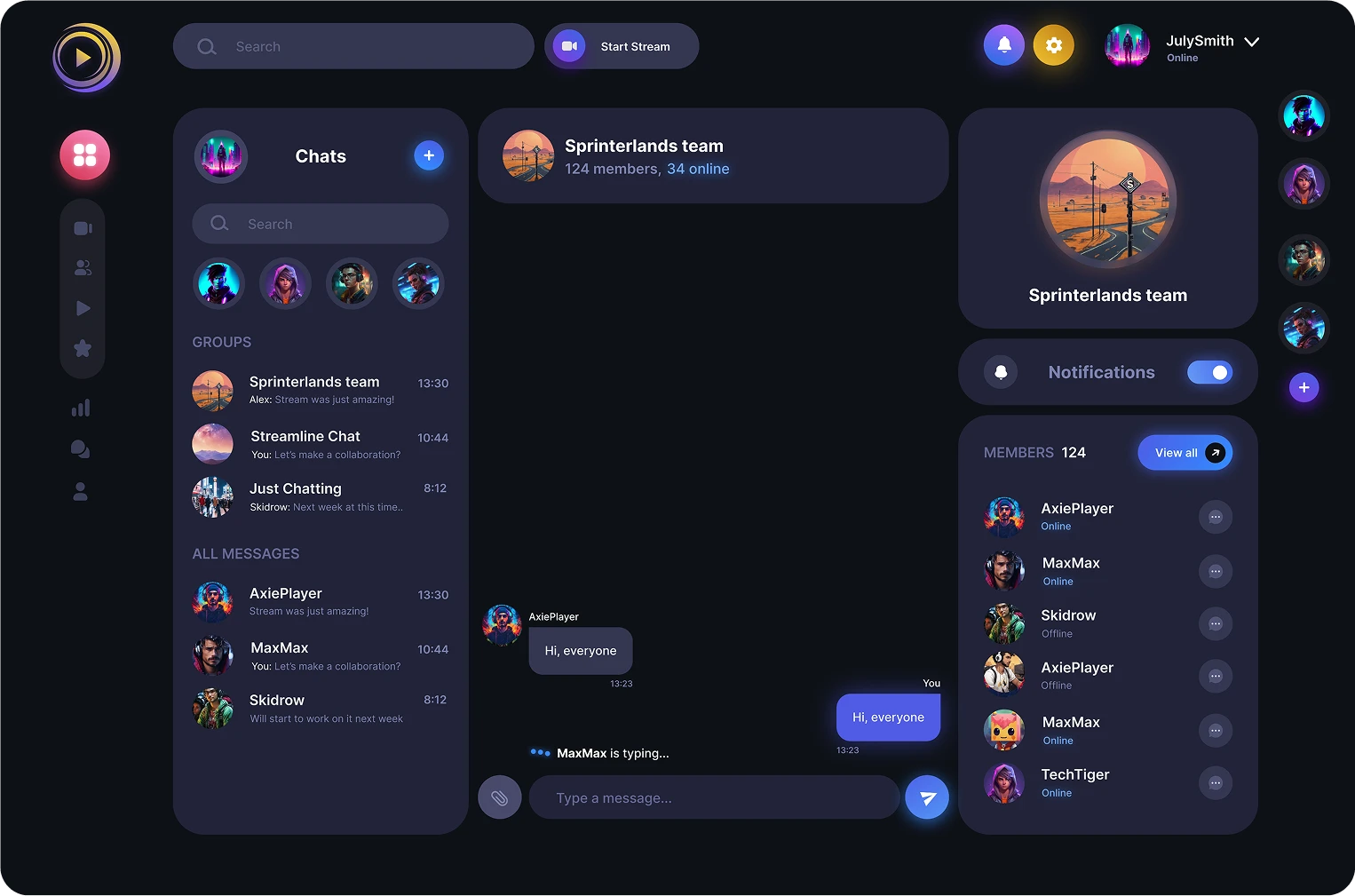
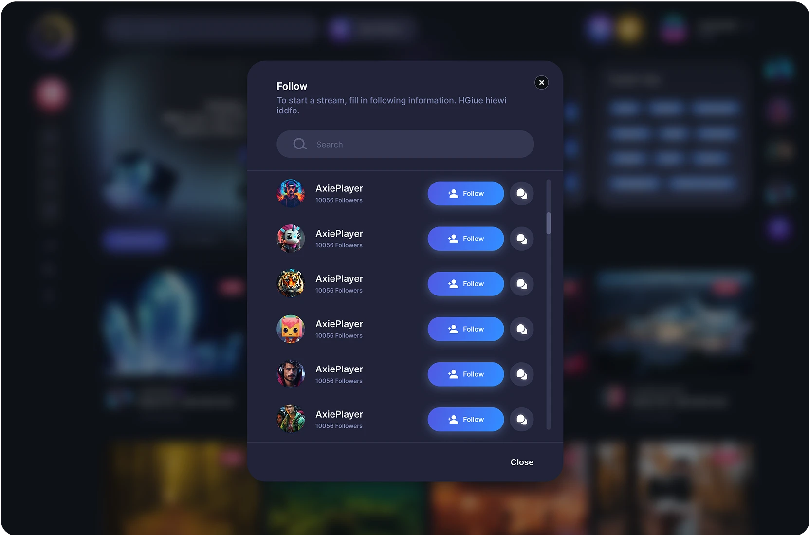
Other pages
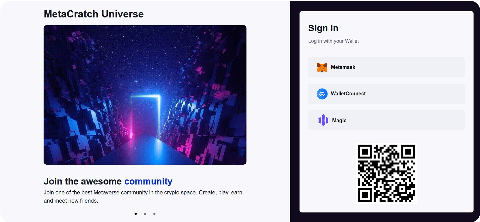
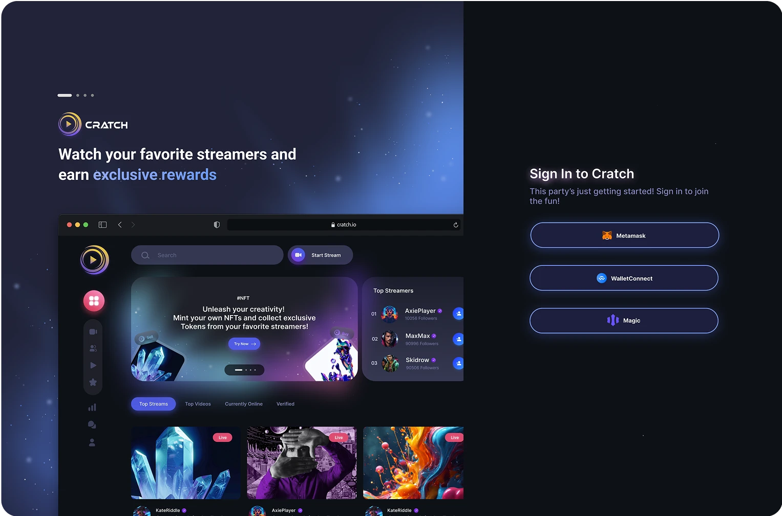
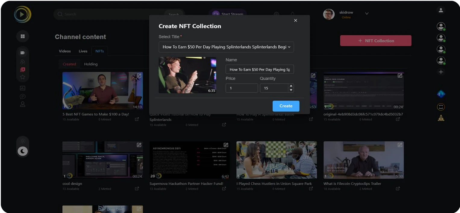
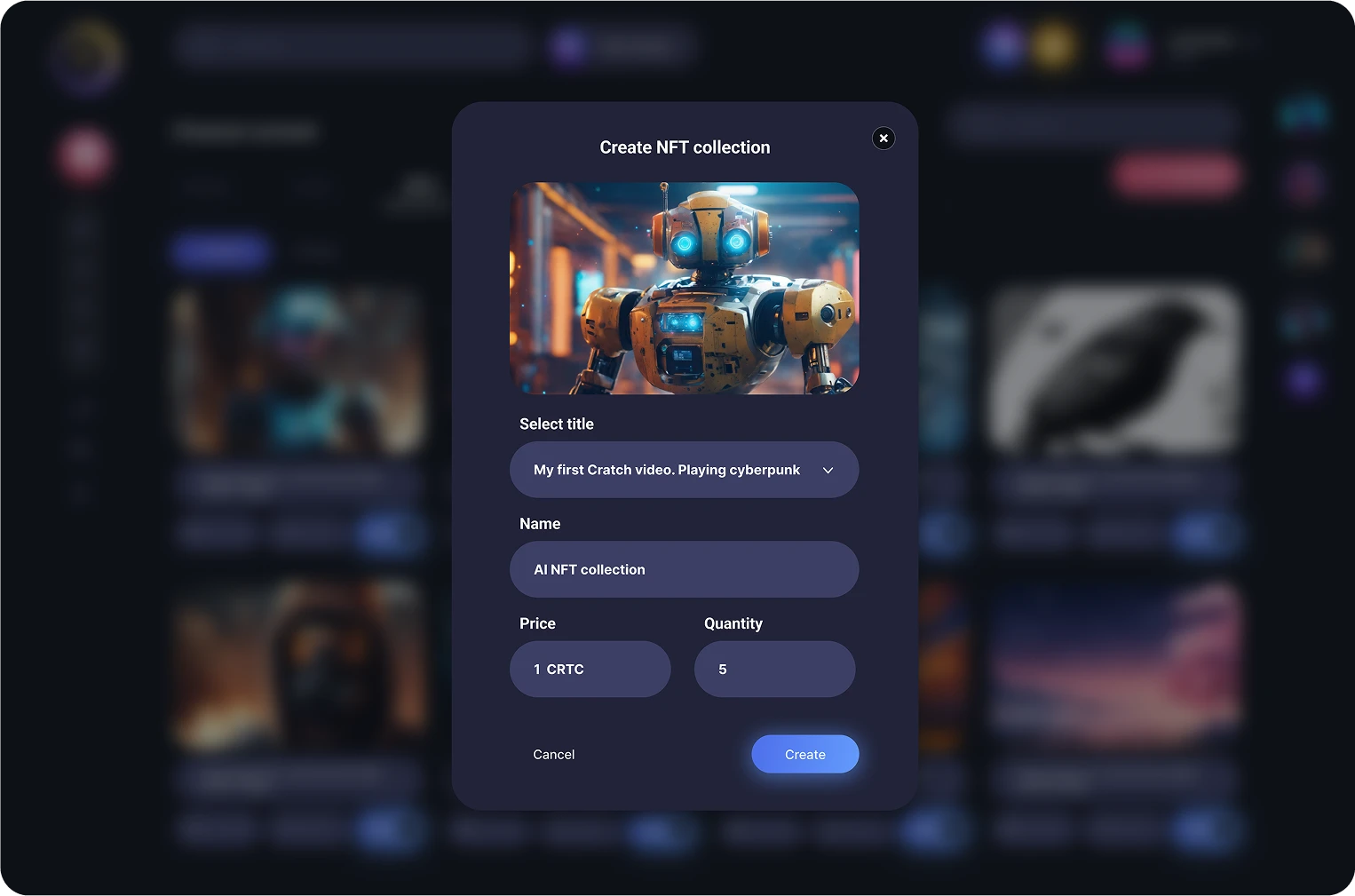
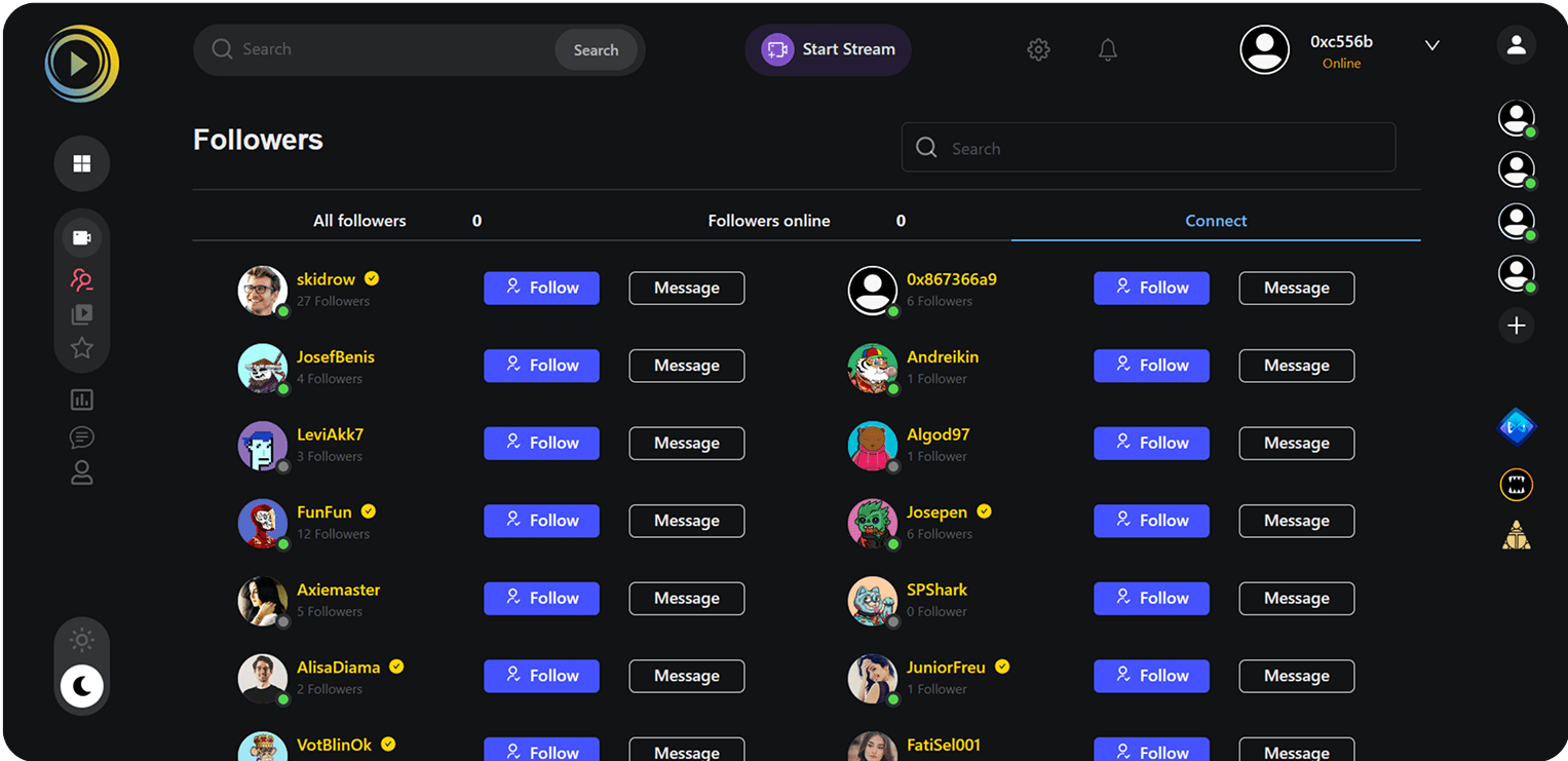
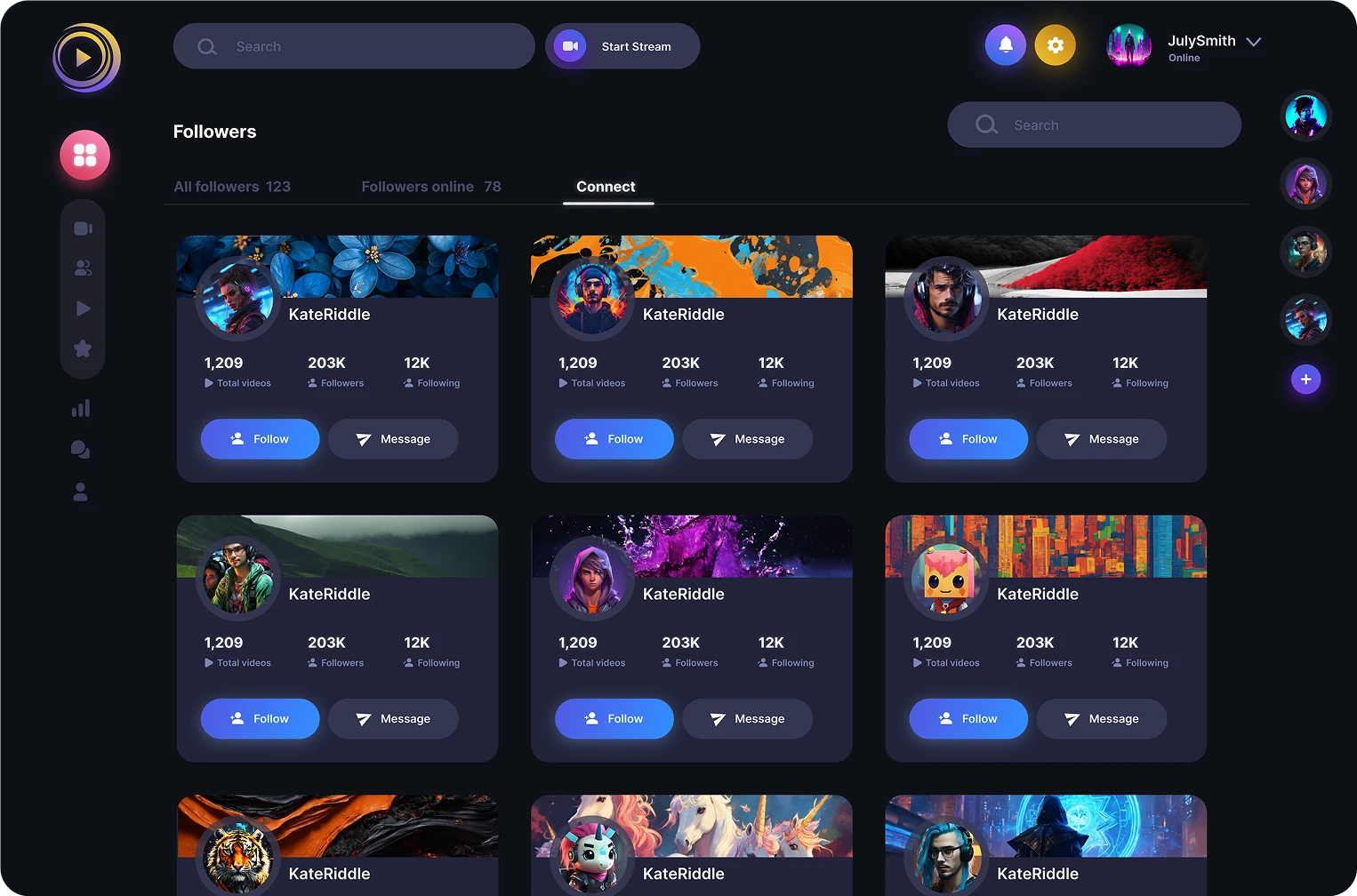
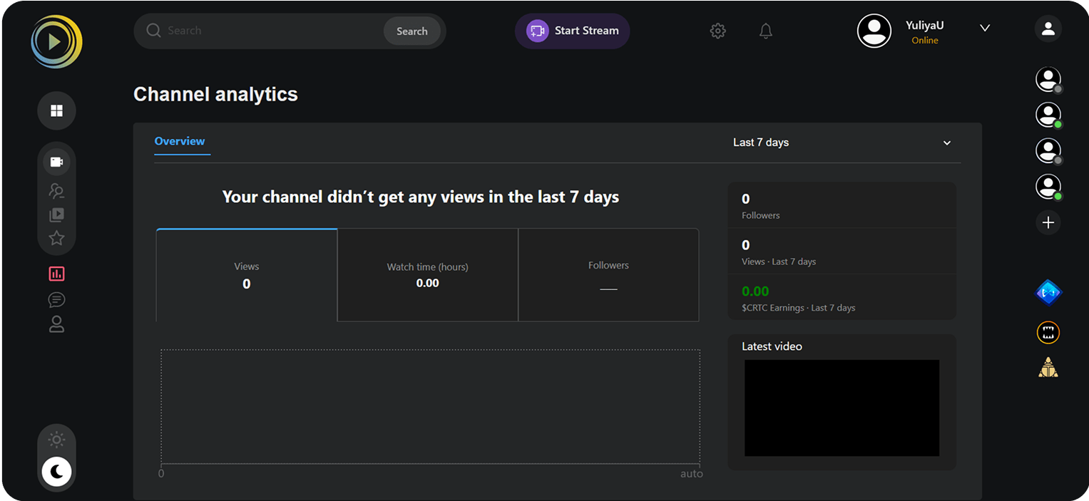
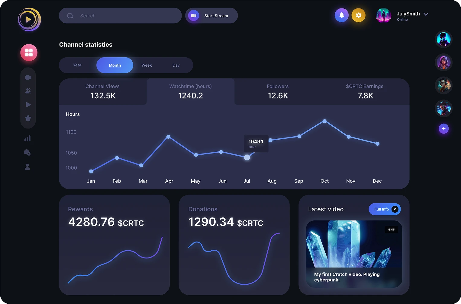
Result
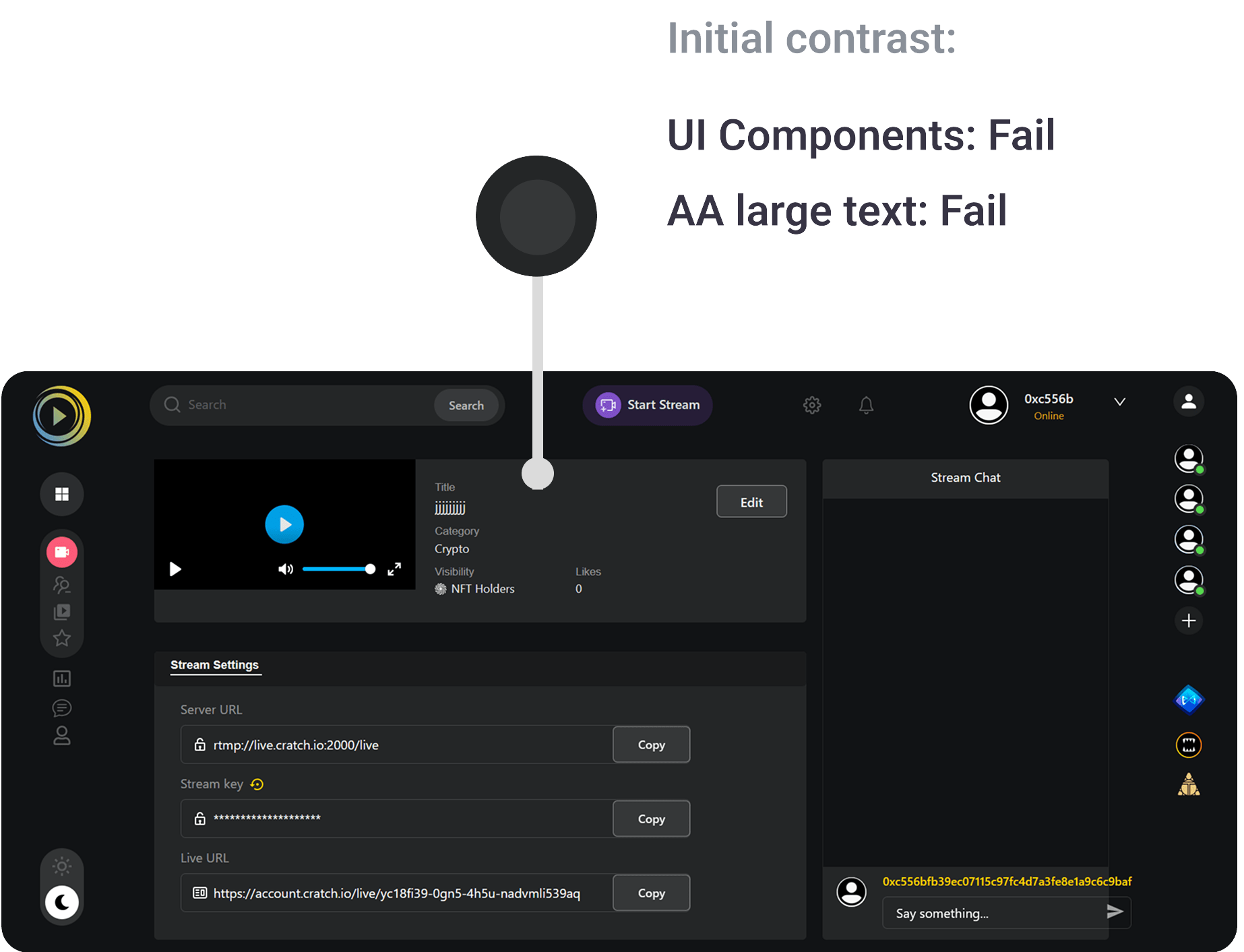
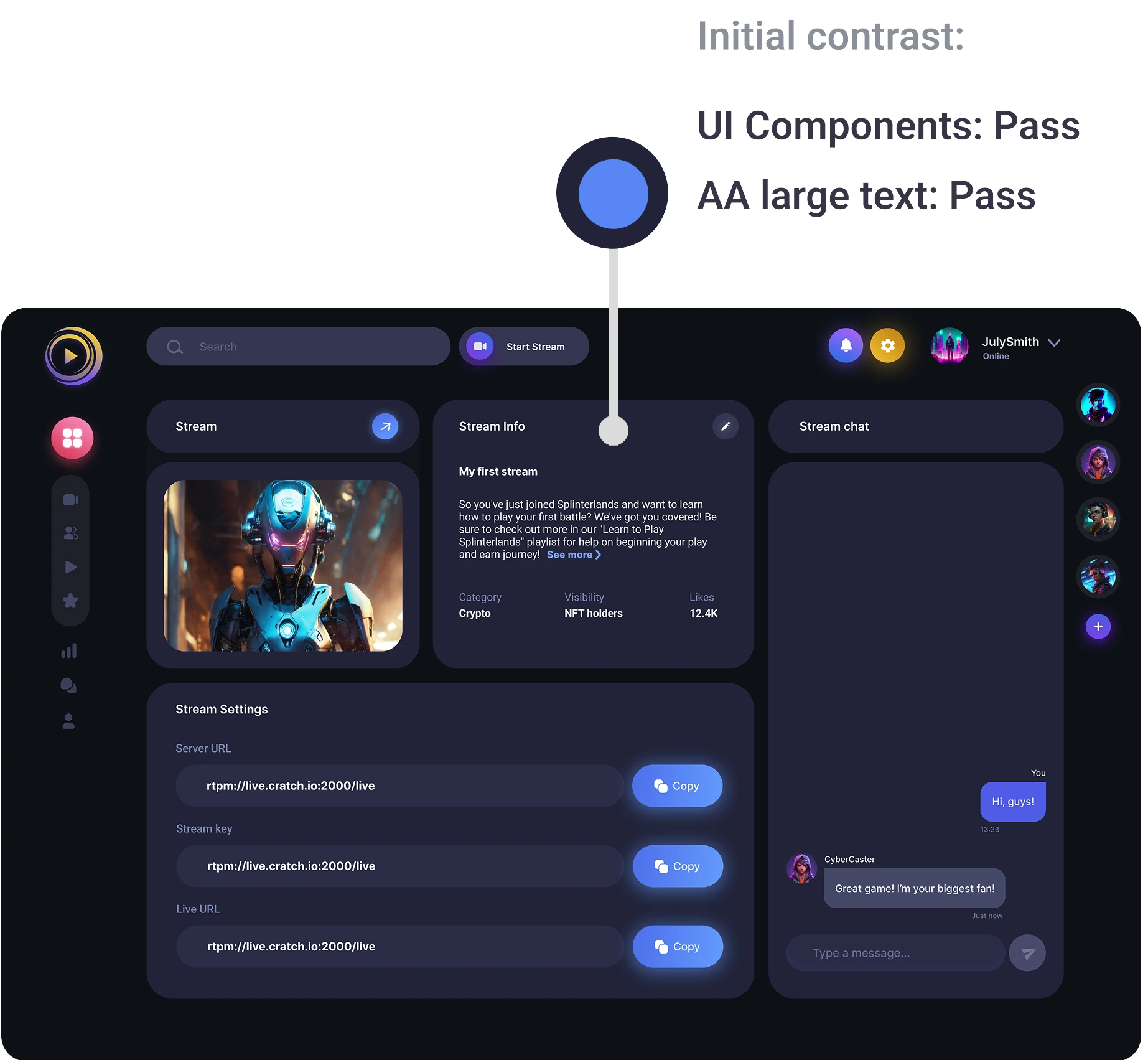
The platform redesign elevated aesthetics by rounding element corners for a friendlier appearance, ensuring greater symmetry in UI components, and adopting a minimalist color palette with enhanced contrast.
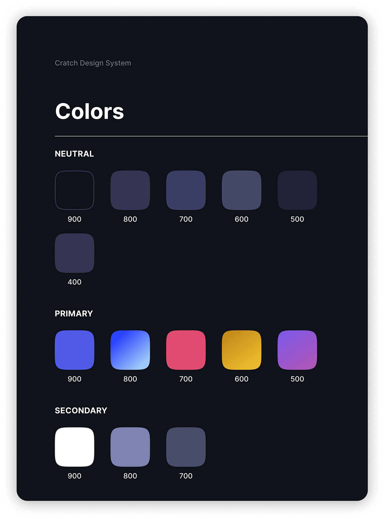
While the core brand color palette remains intact, color usage was minimized across most pages in alignment with the 10/30/60 rule, achieving a modern, balanced aesthetic free of visual overwhelm
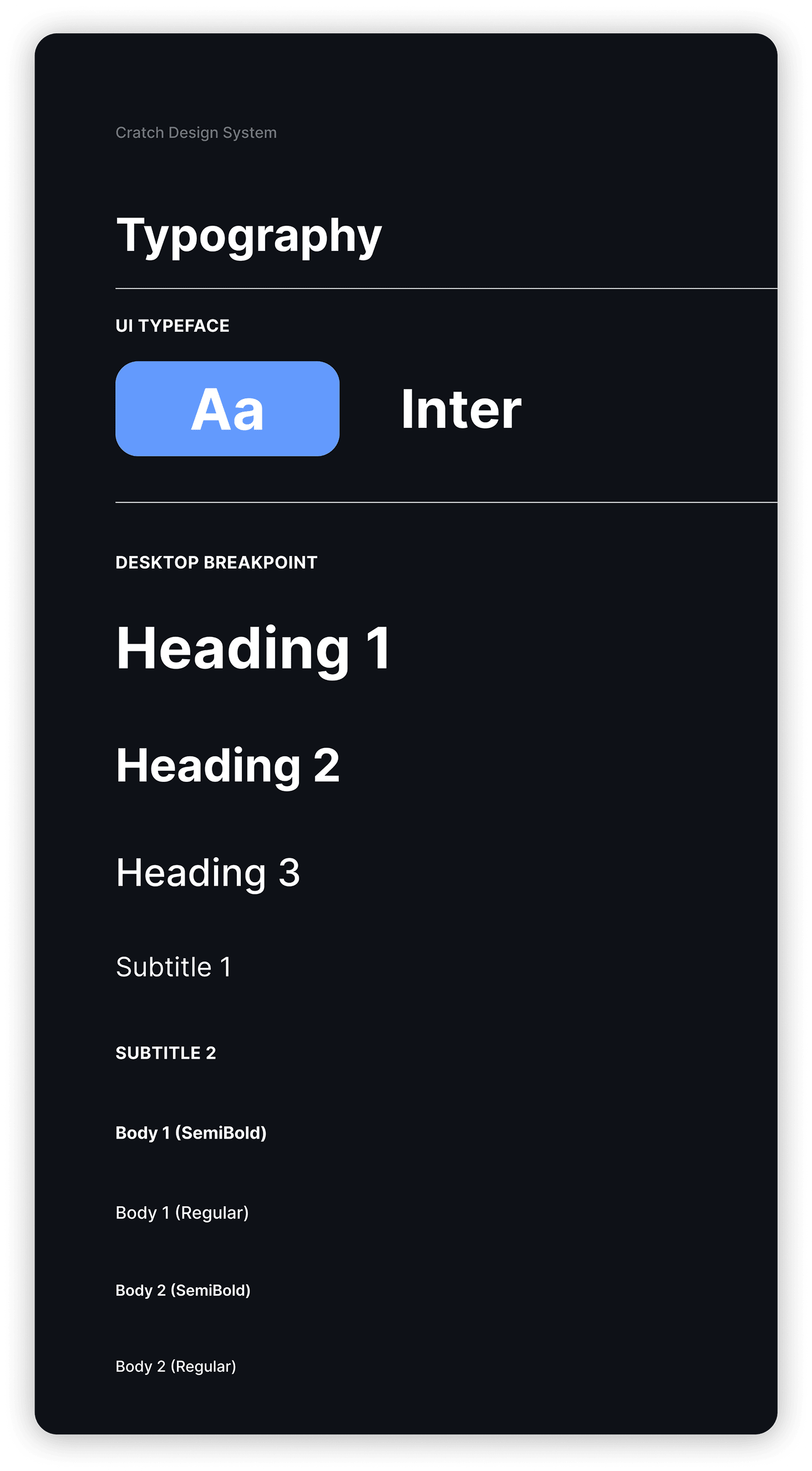
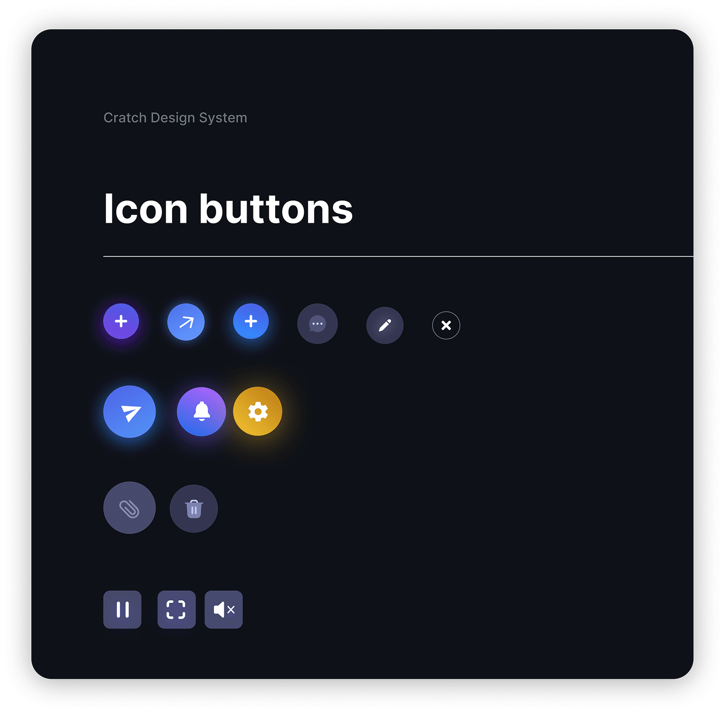
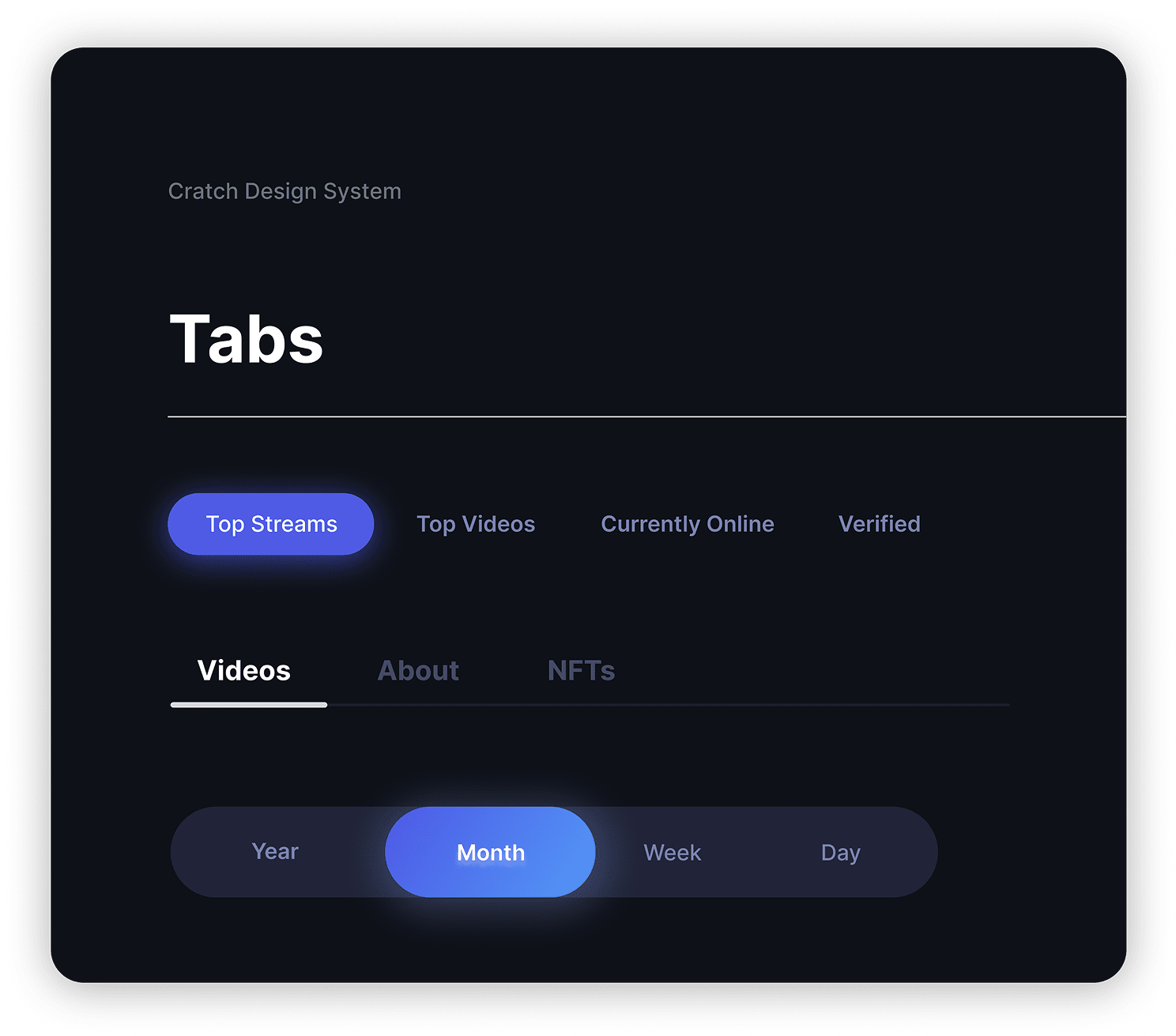
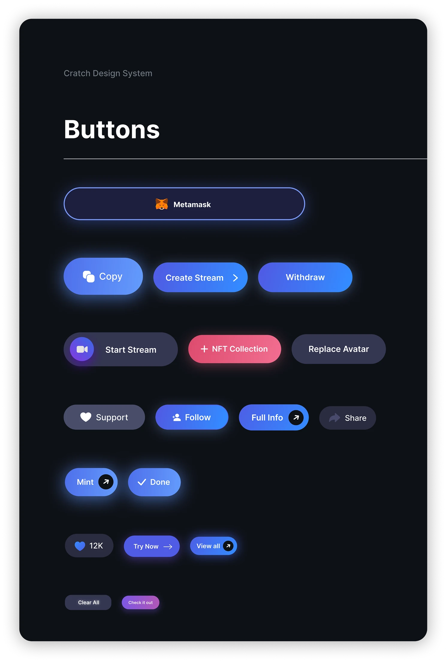
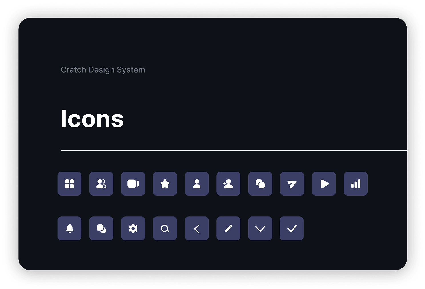
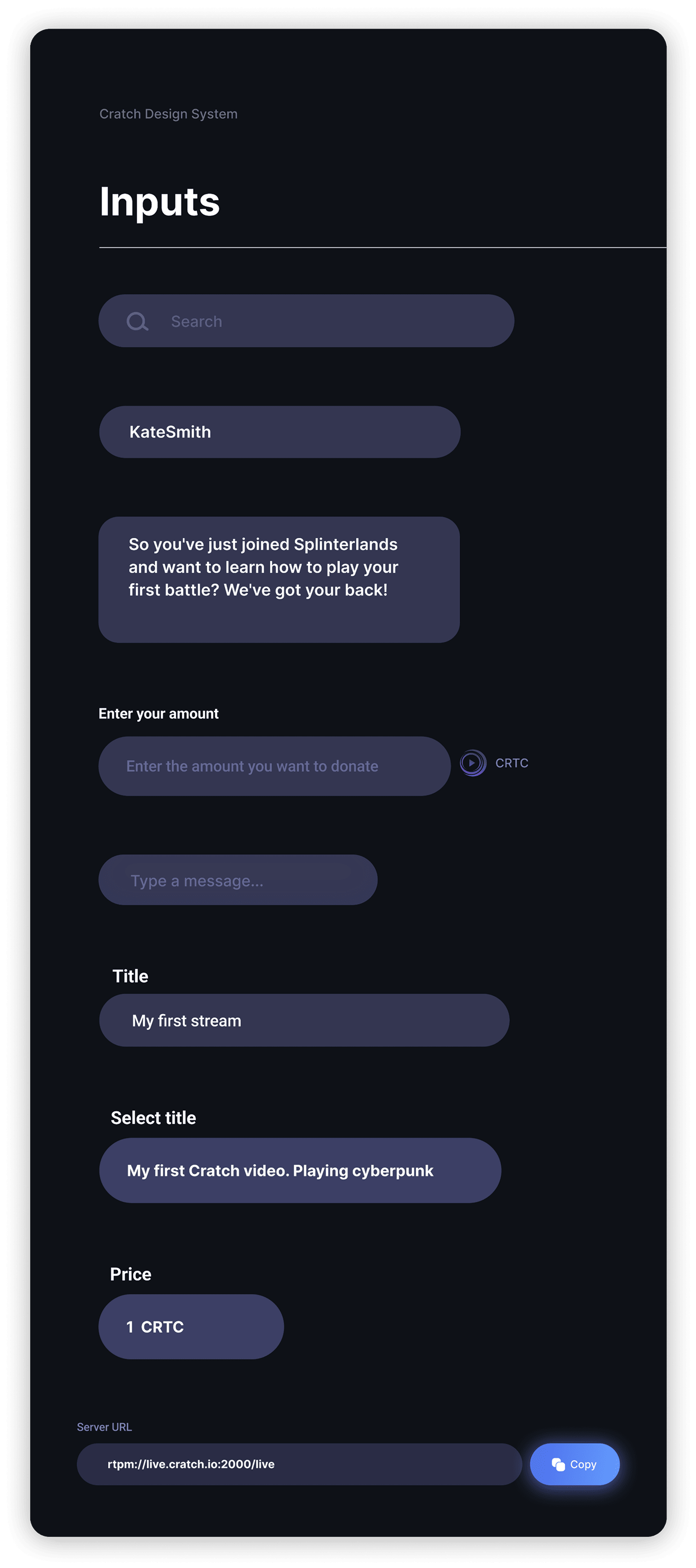
Design system
Documenting a design system for scaling and development.
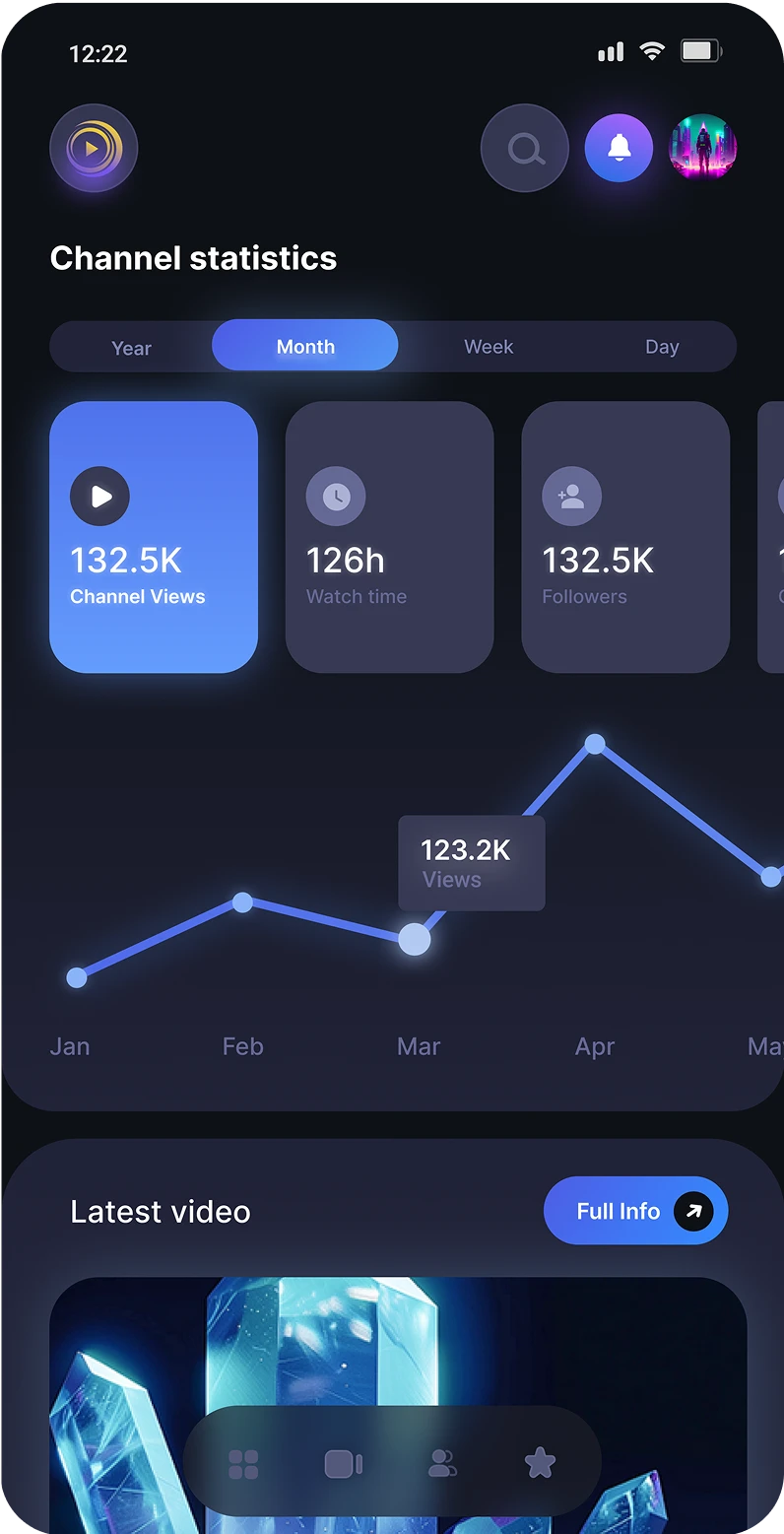
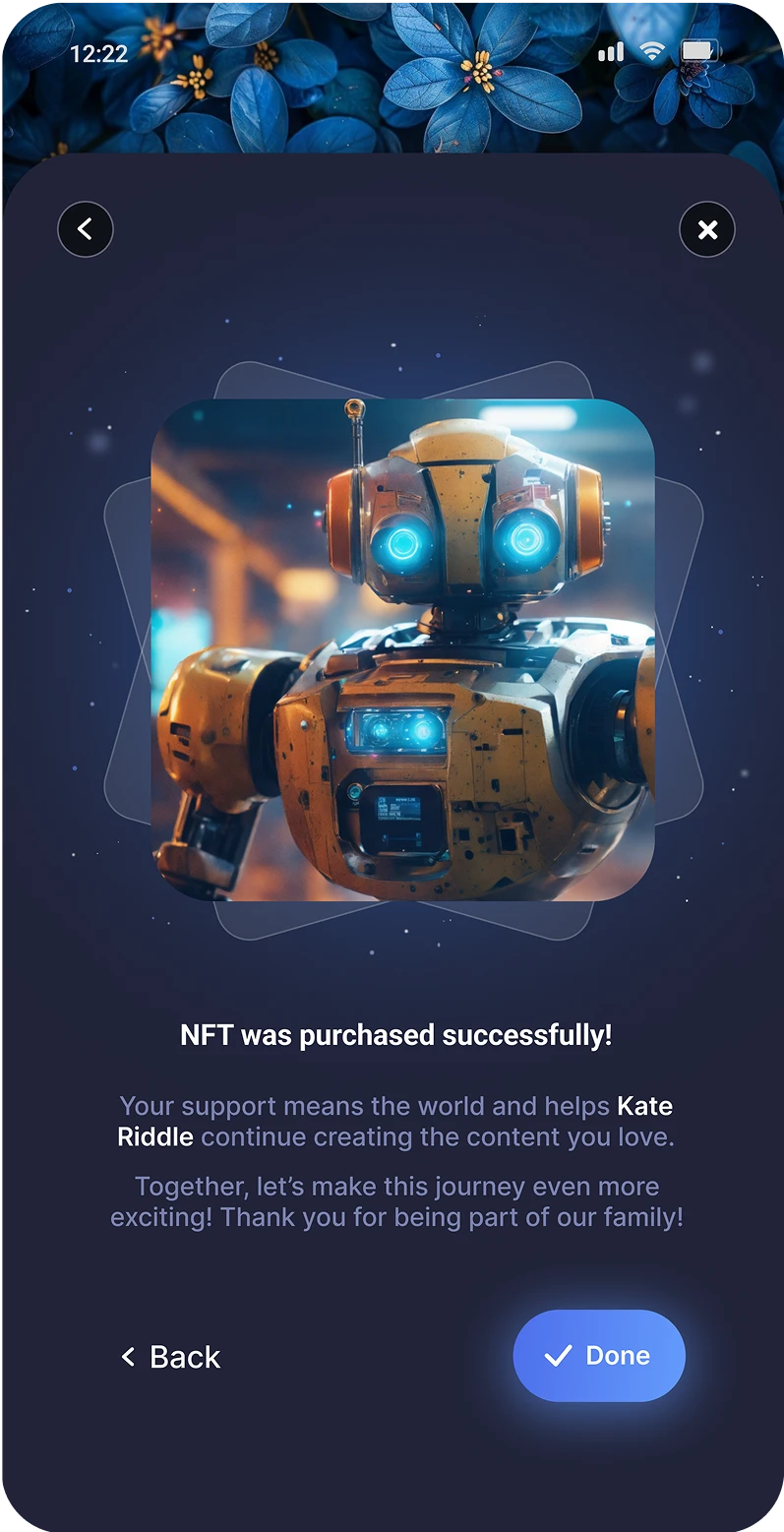
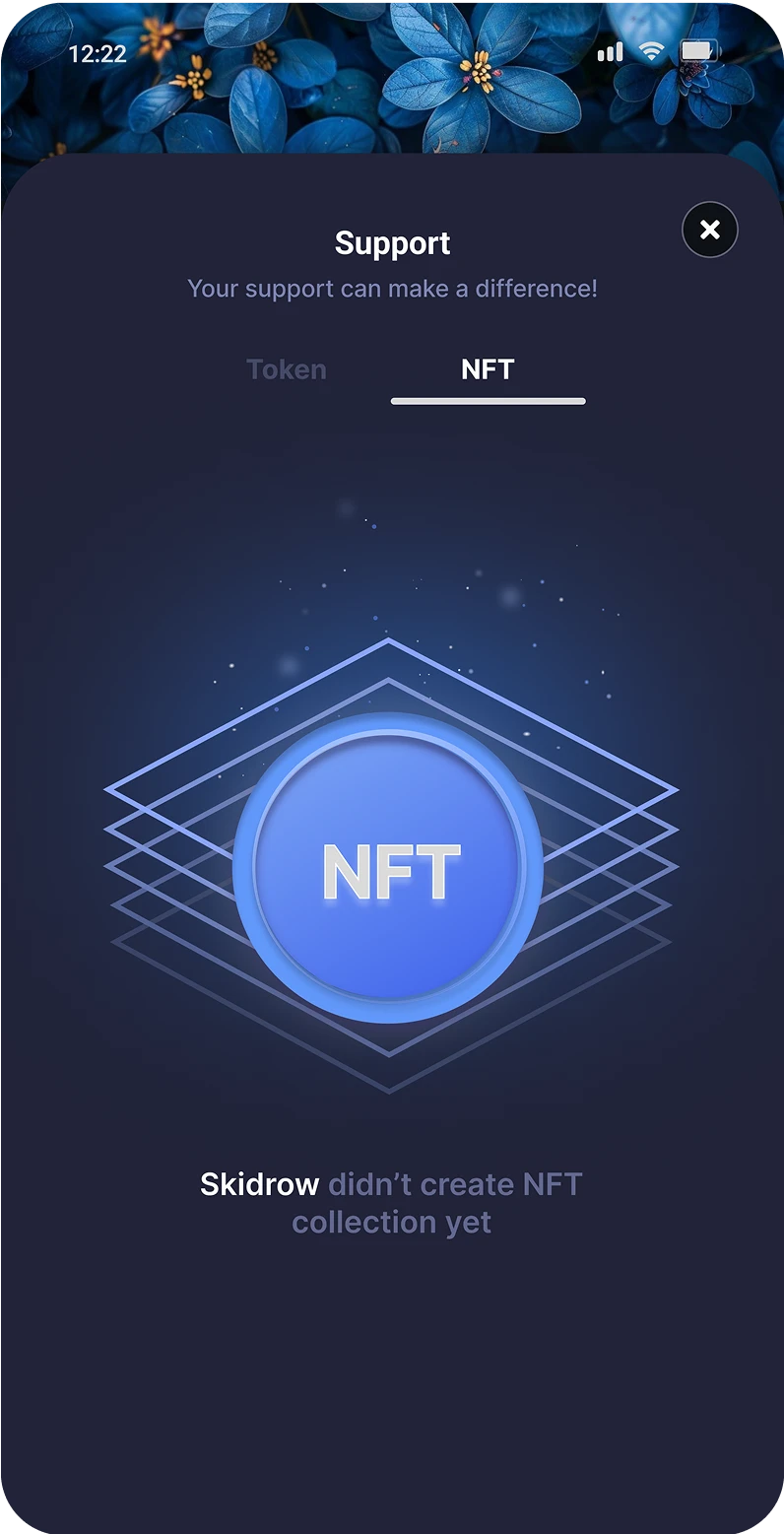
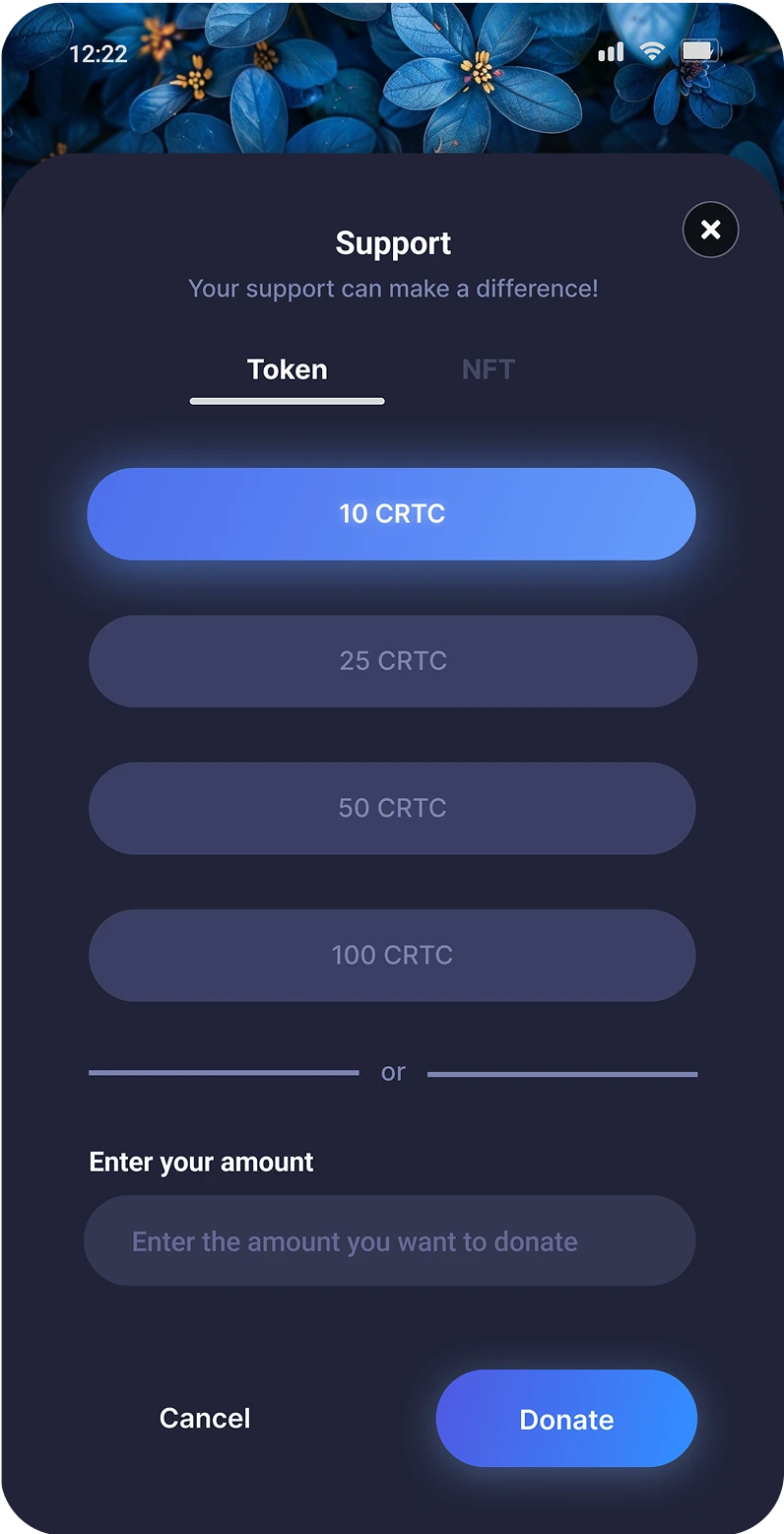
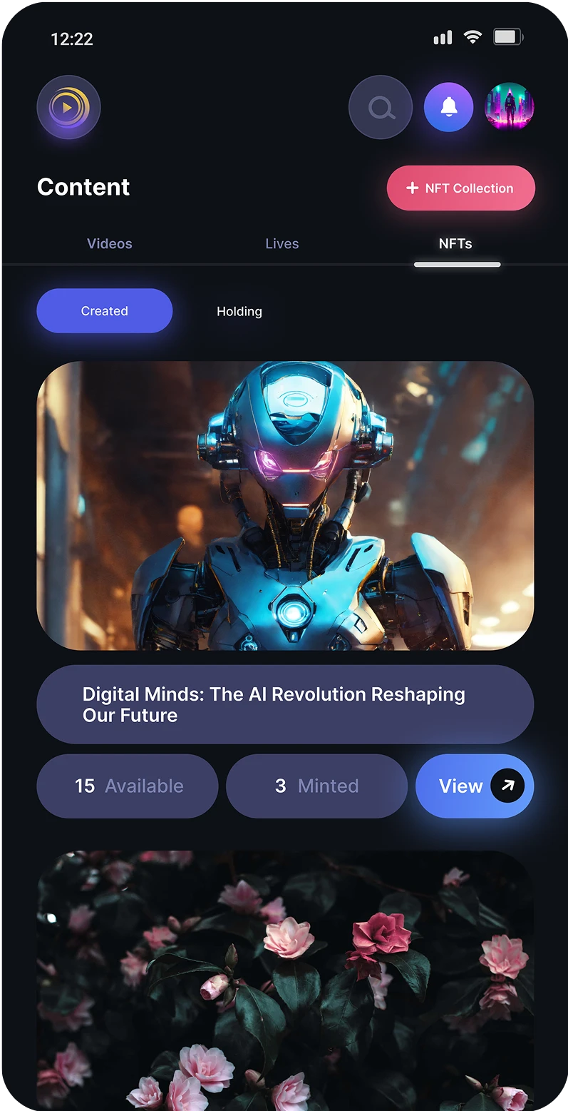
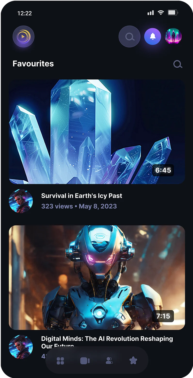
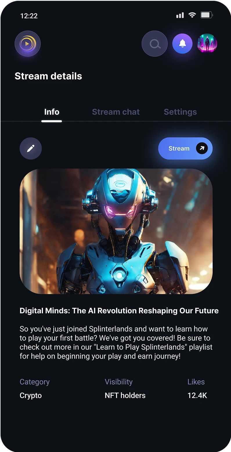
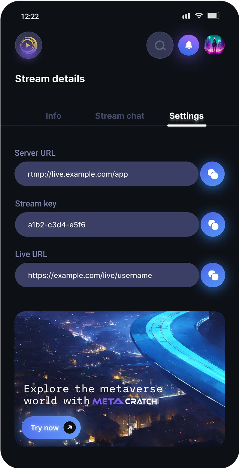
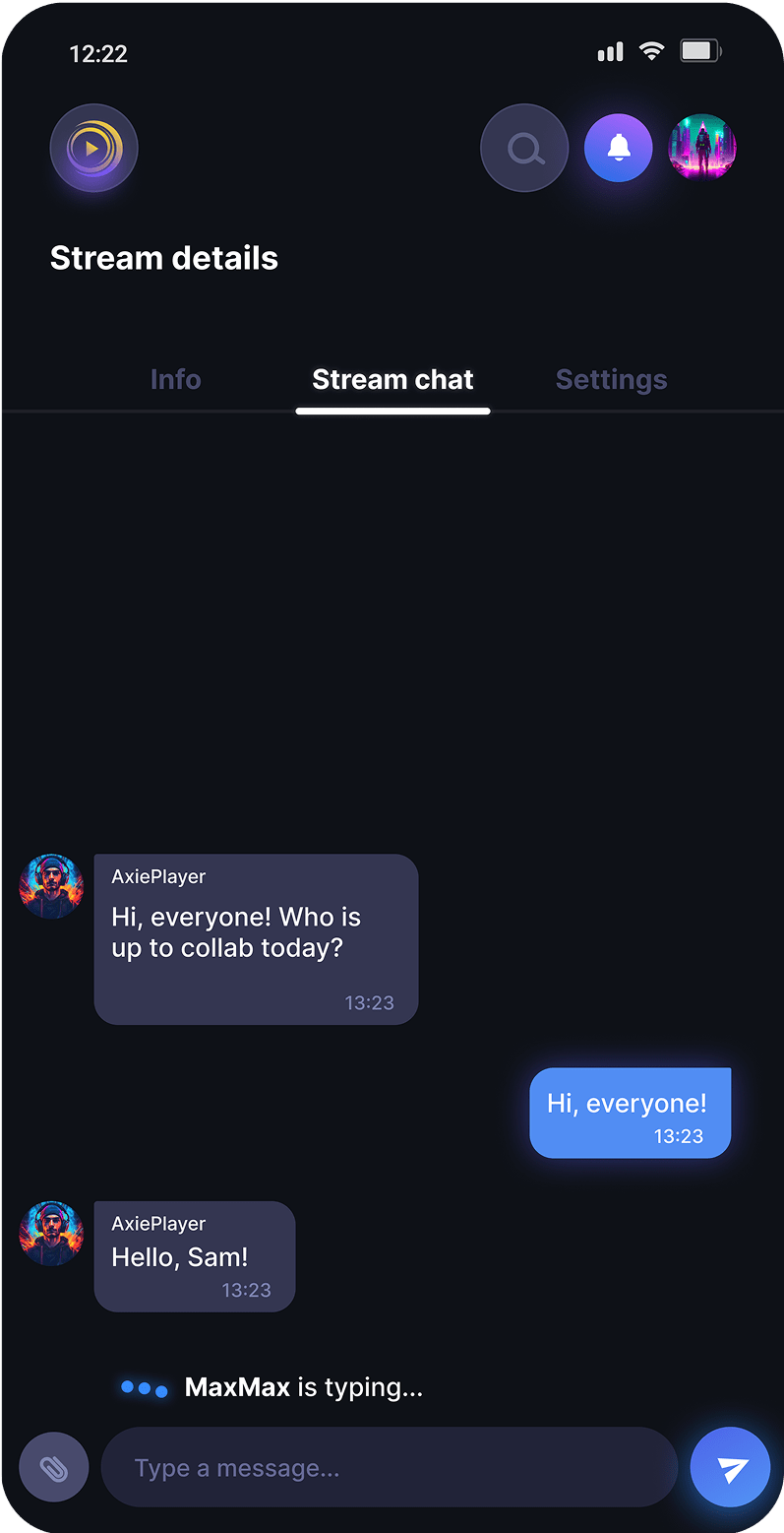
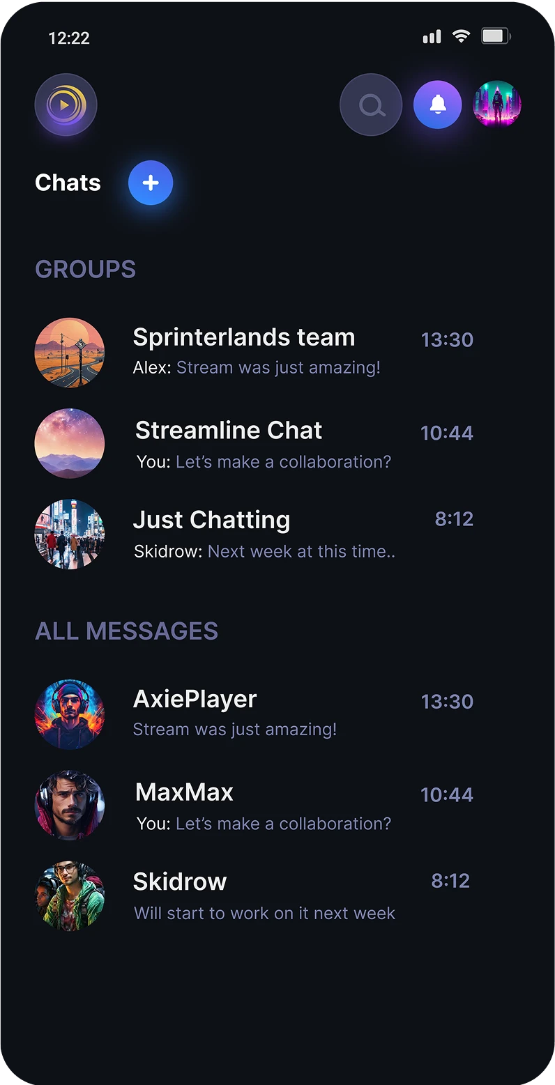
Mobile app design
Impact
During my work on this project:
-Revitalized the web platform’s outdated interface and designed a mobile app from scratch.
-Unified the visual language (design system) to make brand more recognizable and ensure all future products inherit a cohesive identity, preventing fragmentation as the company scales.
What did I learn
-Good design is intentional systems-thinking-not just aesthetics.
-Prioritizing contrast and minimalist layouts didn’t just meet standards-it made the platform more inclusive, broadening its appeal to diverse audiences.
-A documented design system isn’t just about consistency-it’s a scalable framework that ensures future products align with the brand’s core identity.

Get in touch
Have a project in mind or just want to chat? Drop me an email.
How to Find Me
Email Me